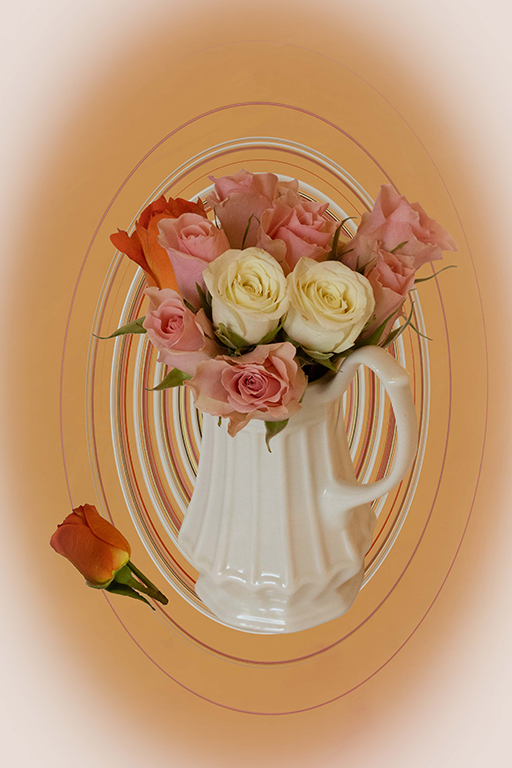
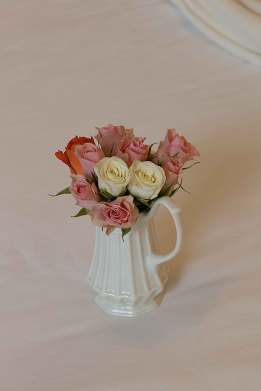
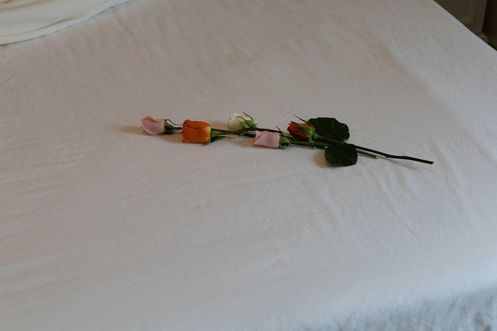
About the Image(s)
Canon RP with Canon RF 24-105 mm F4L lens
1/125 seconds exposure, f/11, ISO 2500
Natural window light, handheld
Basic processing in Lightroom Classic
In Photoshop I selected and masked the pitcher and roses and placed them on a new layer. This new layer was duplicated and with the original background layer turned off the Twirl filter was run for as many times as needed to achieve the effect I was seeking. Next a solid color layer was added and placed beneath the twirl layer. The remaining mask of the roses and pitcher was activated at the top of the layer stack.
Original 2 was opened in Ps and the one rose was selected and masked and created a new document which was then brought into the main document and placed where it now appears.
The new image was cropped and the Camera Raw filter was used to add the negative vignette.
Jim Hagan
I really like your image. The original image of the pitcher and flowers is not interesting. But, your additional of the color layer and the twirl layer adds so much to the image. My only suggestion is to consider using a darker tone for the four corners instead of the white tone. Posted: 09/10/2023 20:12:35
Chan Garrett
(Group 87)Thank you for your kind words. I will give real consideration to your suggestion. Posted: 09/11/2023 16:21:11
Chan Garrett
(Group 87)Thank you. See reply to Ian below. Posted: 09/12/2023 13:09:05

Ian Ledgard
A warm welcome to our group.
Great imagination to create this image from basic simple shots. I especially like the way the twirl filter has ceated those lines from the jug. I am with Jim regards the corners which being so bright distract me. Posted: 09/12/2023 10:57:45
Chan Garrett
(Group 87)Thank you for your welcome and comments. I will revisit this image and reverse the color of the corners. This kind of critique is what I joined for. Posted: 09/12/2023 11:38:39
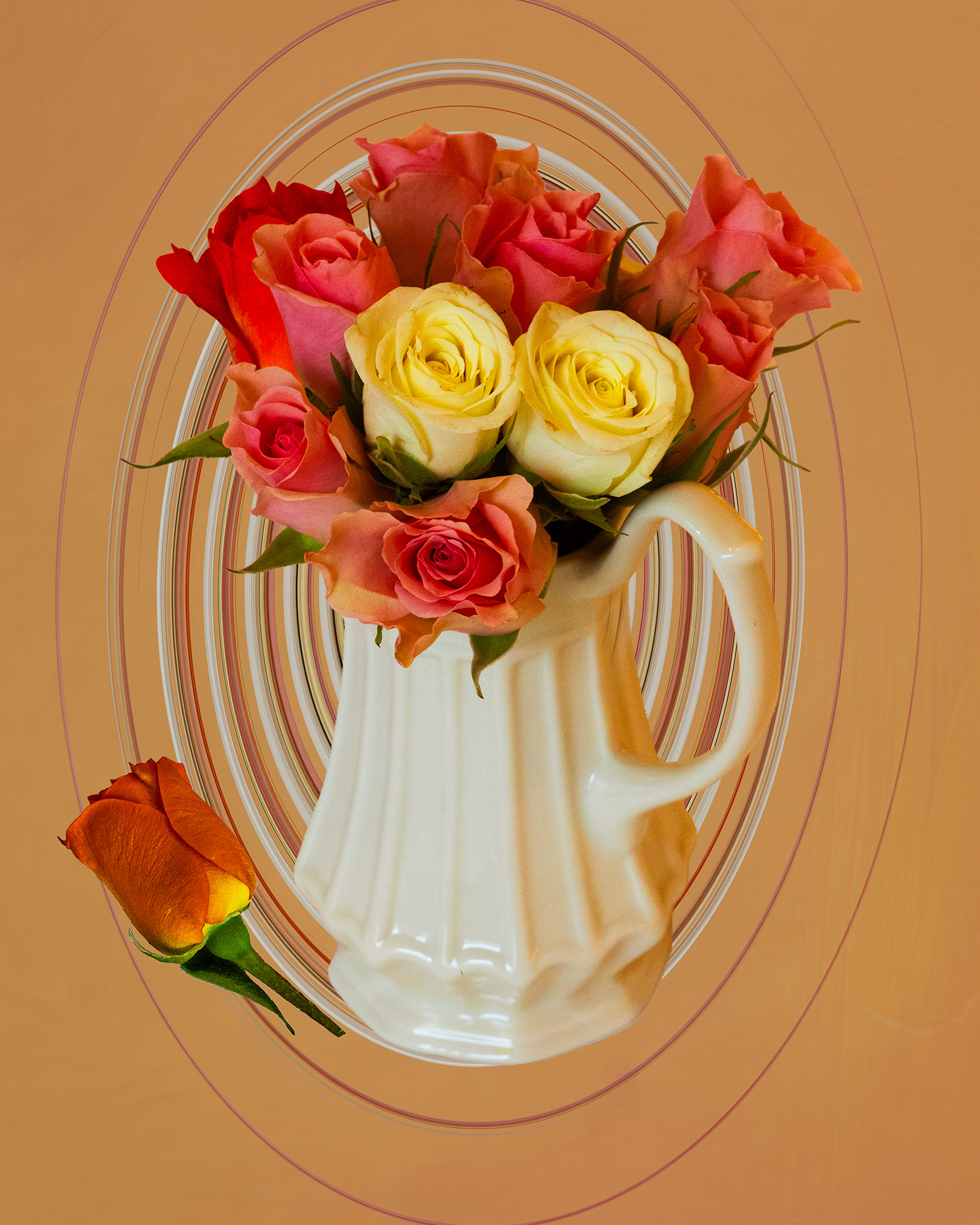
Chan Garrett
(Group 87)Thank you. How does this compare?
Posted: 09/12/2023 13:07:33
Ian Ledgard
Well, this is a very different image with deeper colours as compared with your original and useing the background to fill the corners works a treat. Could you do the same with your original to exclude the white corners yet retain the softer pastle colours? Posted: 09/13/2023 02:55:15
Chan Garrett
(Group 87)Here is the first image without the neg. corners.
Posted: 09/13/2023 08:44:02
Ian Ledgard
Yes,that is what I was looking for. Posted: 09/14/2023 02:39:21
Gunter Haibach
A very nice, soft and muted image. Really like the background as well, although I think the swirls could be a bit larger as it seems to crowd the vase - must try that feature! I agree with the comments re: white vignette. Not sure of the free-floating flower - personally it does not add anything to the image. I like both the muted colour and saturated colour versions.
Welcome to the group and looking forward to more of your work. Posted: 09/13/2023 12:17:51
Chan Garrett
(Group 87)Thank you for the welcome and comments. My first processing of this image was as a high key B&W without the swirls and the single rose at the base. I like it very much, but this is a more creative version. I may still carry it through different renditions. Posted: 09/13/2023 12:41:31

Andrew Hersom
(Group 40)Welcome to the group. Unusual picture, I think darkened corners would work better than lightened ones, but that's just me Posted: 09/18/2023 02:17:43
Chan Garrett
(Group 87)Thank you for your welcome. Most commenters agree with you on the light corners. I went back and corrected that in the post above. Yes, a matter of taste and I will always be open to suggestions. I look forward to learning from this group. Posted: 09/18/2023 08:07:53
Joan Field
Yes, welcome Chan.
There's always one who disagrees with the majority. I prefer the white vignette to the black, altho I never saw what I would call a black vignette around the picture. You did a lot of interesting work on it and it appeals to me as is. However, you know that it is a cliché to have a flower or petal fallen to the side of the vase for many still-lifes, so the addition of the curved rose on the. bottom left has that feeling. Maybe that rose should have been left realistic, instead of curving it around. Another thought. Posted: 09/25/2023 16:23:07
Chan Garrett
(Group 87)Thank you for your welcome and comments. My first rendition of this image was a high key B&W without the rose at the base, or the swirls. Some people I shared it with felt that it needed a fallen petal or blossom. I did not swirl the rose, just the background. Posted: 09/25/2023 17:40:29