Gunter Haibach

September 2023 - Petals galore
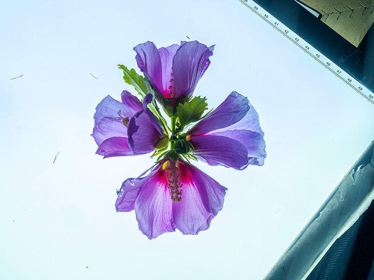
Original
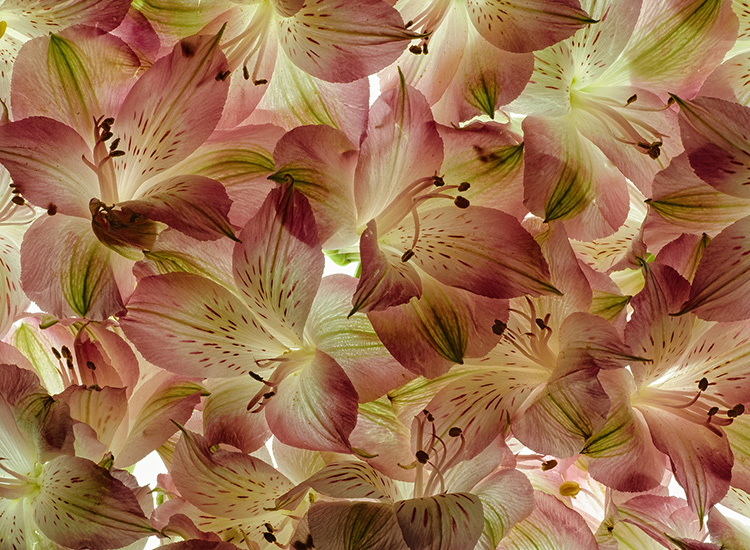
Original 2
About the Image(s)
As much as I liked the Original 1, I thought a creative touch might be to add the element of confusion, with no specific focal point.
I personally like this kind of image as it makes me explore the aspects of colour, tones, and shapes. It's sometimes a timely task, but often worthwhile. Certainly not for everyone.
As always, very much appreciate your feedback and suggestions.
This round’s discussion is now closed!
9 comments posted
You have created an interesting image with numerous shapes and patterns. But, I am bothered by the dark green area in the center of your image. My eye is drawn to that area to the exclusion of the rest of the image. Also, while there are numerous interesting shapes and patterns, they don't seem to combine to create an especially interesting image. Posted: 09/10/2023 20:06:37
Thanks, Jim
I actually wanted you to look in the middle, and that's why I surrounded the green with a bit of light. The intent I had for this picture was to show a mix of colours, shapes, textures in no particular order - the opposite of a nicely balanced photo.
I'm aware that this is not everyones taste. Thanks for viewing it, and your feedback - much appreciated. Posted: 09/14/2023 20:03:36
(Group 87)
I like the addition of the original image to original 2. To my eyes it seems to hold the resulting image together. As I view the image the green, with the outreaching purple gives the feel of an explosion from the center. Did you experiment with different blending modes? I think I would like the image brightened up a bit. Very interesting image. Posted: 09/11/2023 16:37:54
Thanks, Chan
I'm glad you found it interesting.
As for blending modes - I use them a lot. I have a rough idea how they work, but 99% of the time, I scroll through all of them. I narrow it down to 2 or 3, and pick one. Surprisingly, especially for Altered Reality, I sometimes find one blending mode that changes the pictures to such an extent I never thought of, that I end up with 2 images. I also use the opacity sliders a lot.
Posted: 09/14/2023 20:10:51
This is a very interesting image with the petals blending well and showing a wide colour range. I would really like to see it much brighter and took the liberty of making that change by boosting the yellow channel in hue/saturation. Posted: 09/12/2023 10:49:57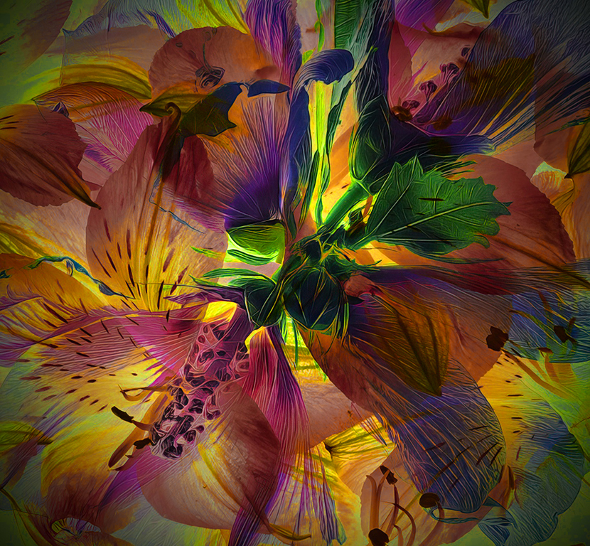
Thanks, Ian
Your suggestion has certainly improved this picture - the additional focus on the yellow is great.
In hindsight, I would still brighten the whole picture a bit more. Posted: 09/14/2023 19:52:42
Your suggestion has certainly improved this picture - the additional focus on the yellow is great.
In hindsight, I would still brighten the whole picture a bit more. Posted: 09/14/2023 19:52:42
(Group 40)
Very impressive, my only suggestion would be to lighten it a touch. Posted: 09/18/2023 02:13:31
the combination photo is much more interesting than either of the two separate originals. I like that you have achieved a translucent look in the petals some what like Harold Davis' work. The wide variety of colors appeals to me more than a basically two-tone yellow and reddish look. The lighting coming out from behind in tge center of the image helps a lot, but I agree that the whole image should be lightened. Or, perhaps, some parts cold be lightened and some left as is, producing an artistic example by the maker. This image could have many things done to it to match the views of the onlooker.
Posted: 09/25/2023 16:09:24
Posted: 09/25/2023 16:09:24
Thanks, Joan
Agree with everything you suggest and happy you found it interesting Posted: 09/26/2023 07:12:33
Agree with everything you suggest and happy you found it interesting Posted: 09/26/2023 07:12:33