Carole Kropscot, FPSA
March 2025 - Complementary Colors - Autumn Tree
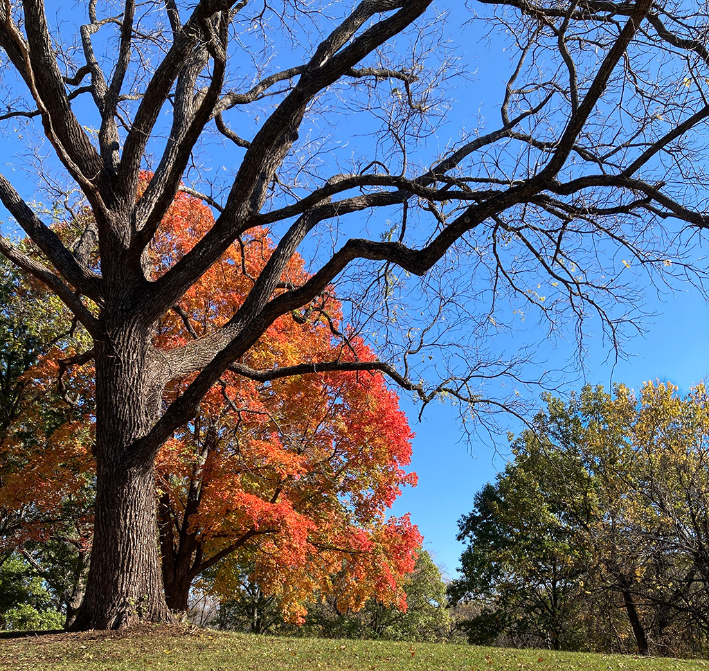
About the Image(s)
Autumn orange leaves with intense blue sky. I never realized that the complementary colors helped give impact to an image. I definitely learned something new this month. And for my own future reference, I printed the color wheel and also put it on my phone. It'll take me a while to be able to remember the color combinations and their variations.
This photo was taken with my real camera (not phone!) last fall when I drove to several parks looking for fall color shots. The lighting was good that day. When I saw this bare tree, I was very happy that the orange tree was behind it. Until now, I hadn't realized the impact of that blue sky. In addition, I think the composition was helped by the fact I was looking up a slight hill incline.
This round’s discussion is now closed!
2 comments posted
Hi Carole,
When it comes to complementary colors, the sky and autumn leaves hit is out of the park. What I love about this image is how the wonderful structure of the tree in front has the color backdrop. The tree limbs give an aesthetic balance to the image and the colors make everything pop. Well done! Posted: 03/09/2025 14:01:39
When it comes to complementary colors, the sky and autumn leaves hit is out of the park. What I love about this image is how the wonderful structure of the tree in front has the color backdrop. The tree limbs give an aesthetic balance to the image and the colors make everything pop. Well done! Posted: 03/09/2025 14:01:39
This is a wonderful photo Carole. The bare tree in front of all the orange leaves is such a stark contrast. I agree that because you were on an incline below the trees they are all the more imposing. I might bring the saturation of the sky down a tad - you would still have the complementary colors, but the trees (the stars of the photo) might pop even more. Posted: 03/15/2025 18:00:09