Gerard Blair
September 2023 - Fallen into a leaf
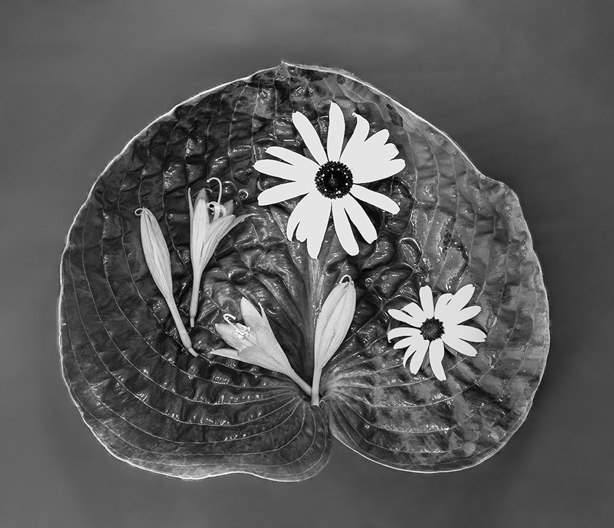
Original
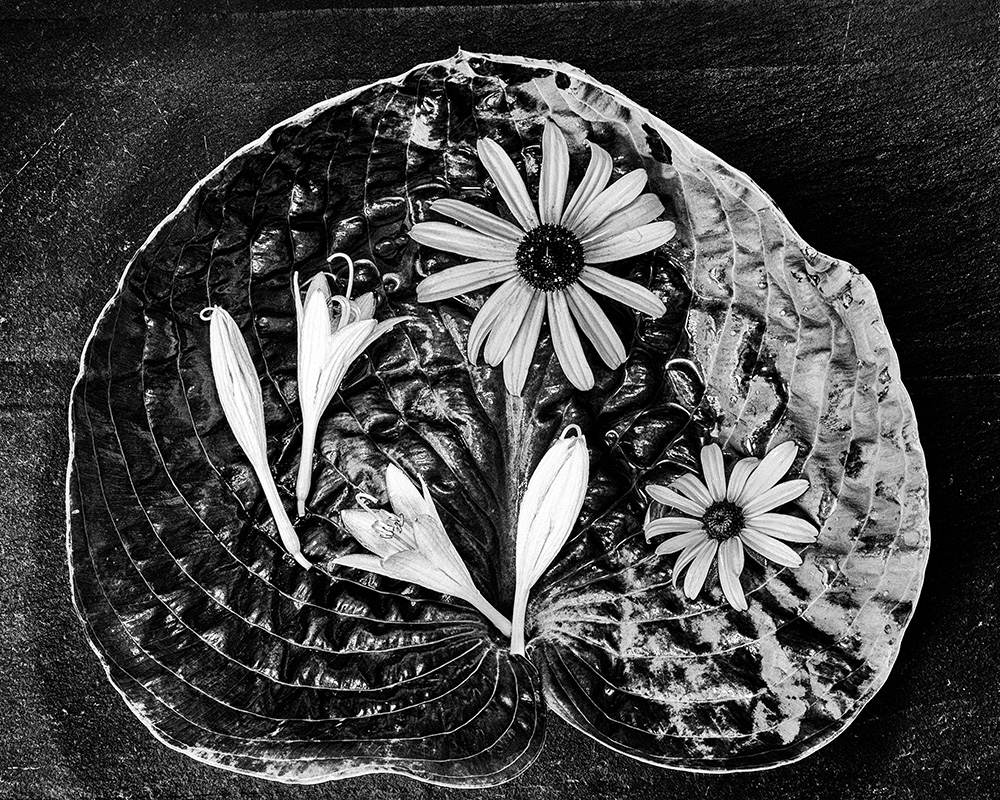
Original 2
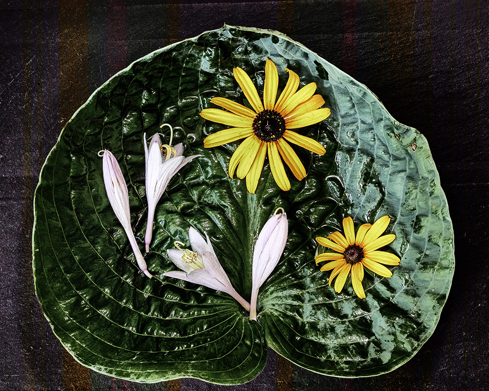
About the Image(s)
There is a new PSA analysis (?) group starting out this December : "still life" which is like the existing portrait or creative groups to which one can send two pictures into three sessions and get feedback (and points, and points mean prizes!). So I wanted to start gathering some images together to see what I might enter.
This image was taken indoors - with natural and additional light (by a window with an LED to augment). The camera was fixed on a tripod pointing straight down on subjects over a slate table mat.
My goal was to exploit the texture in this hosta leaf while contrasting it with the smoother petals and shapes of the flowers.
I include both a color version and the original for your viewing - with a plea for guidance: if I enter this image to the competition, should it be color or B&W?
f/18.0 0.5 ISO320
Canon EOS 6D Mark II - TAMRON SP 90mm F/2.8 Di VC USD
This round’s discussion is now closed!
5 comments posted
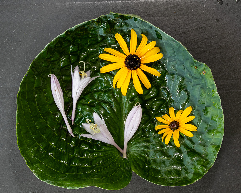
Creative and well presented flowers on a leaf.
Your original 2 sooc image is tack sharp and well exposed. Perfectly captured. I like the contrast of the sharp, colored flowers against the matte grey background. I agree with Peter to remove the water droplets. The color of the flowers in your original 2 looks great. My vote is the original 2. Your original colored version is my second choice. Color is definitely a better choice. It looks like a ceramic plaque. Nicely done.
Posted: 09/09/2023 09:07:42