Michael Hrankowski
May 2022 - Hellebore Study In Monochrome
Original
About the Image(s)
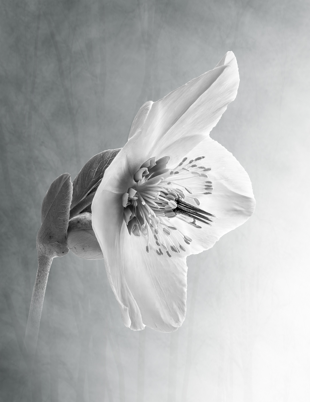
Backyard outdoor studio setup. 1/125 sec; f/18; ISO 800
I have been doing a project since last year with flower portraits in B&W.
(Last month's image was another example.) It seems counter-intuitive to many people to take something that in Nature has bold color and render it colorless. As I explained to one friend who met my image with a bewildered stare, B&W forces one to appreciate the detail and form of the flower
without being "distracted" by its color. Editing included DeNoise and Lightroom for basic edits, including monochrome conversion. Then into Photoshop for addition of the background texture layer and gradient.
Finally into Gigapixel for a 2X up-res.
This round’s discussion is now closed!
10 comments posted
Michael, the project is going well. I am struck by the pin-sharp focus across the whole array of elements in the center - and the absence of noise is remarkable. I particularly like the tilt of the flower and the use a petal to provide the textured background. Lovely image.
I would darken the shadows for greater contrast - but I think we have established that our tastes diverge on this point. Posted: 05/01/2022 19:24:38
I would darken the shadows for greater contrast - but I think we have established that our tastes diverge on this point. Posted: 05/01/2022 19:24:38
(Groups 3 & 83)
Gerard, thank you. With reference to the suggested edits, I must admit I tend to take my final sliders with an eeny-meeny-mine-mo approach. I did play with the shadows and contrast and decided on this version as I didn't want to eliminate the detail in the depth of the flower. Posted: 05/06/2022 16:57:01
I also have been playing with flowers for a while. I started by watching some of Harold Davis's youtube stuff. I like your image, particularly the flower (obviously), the background in the top left of the image and the manner in which the stem of the flower "disappears" into the background lower left. I find the brightness of the background lower right is too bright with no discernable detail (as far as I can see). I do like that the background reverse fades(?) from top left to bottom right but perhaps a slight darkening overall would show the same effect but with some more detail bottom right. Very well done! Posted: 05/06/2022 15:23:05
(Groups 3 & 83)
Thanks for your comments, Randy. I originally was going to go with a strictly white background. But on the advice from my monochrome mentor, Lance Lewin, I added a texture (actually a highly modified image of some trees) and then applied a diagonal gradient which resulted in the lower right corner being almost completely white. The idea was to balance the light direction between the background and the flower. Posted: 05/06/2022 17:07:09
Michael, this is a beautiful image and I like your treatment and final composition. I like the way the flower appears out of the textured background and the lighting ion the flower head. I feel that it's rather nitpick to suggest an improvement as I think this is well done but you might consider bringing back up slightly some of the detail, if possible, in some of those stamens towards about two o'clock on the lower head as they are disappearing a little - but hey, it's perhaps a step too far! Posted: 05/07/2022 12:39:48
(Groups 3 & 83)
Thanks Peter. I appreciate your comments and your nitpicks, for it is in the paying of attention to the details (the nitpicks) that make the difference between a photograph that is great and one that is merely good. Posted: 05/08/2022 10:54:06
Hi Michael,
Lovely. You presented this flower in a beautiful light. The sharp details of the flower against the soft, textured background worked well. The stem fading into the background creates a dreamy, calm effect. I love it. Posted: 05/09/2022 09:00:14
Lovely. You presented this flower in a beautiful light. The sharp details of the flower against the soft, textured background worked well. The stem fading into the background creates a dreamy, calm effect. I love it. Posted: 05/09/2022 09:00:14
(Groups 3 & 83)
Thank you, Barbara. Posted: 05/10/2022 16:03:04
Michael, This is an artistic piece. The trees as the textures is a great idea. The only thing that I would look at to maybe change is there is a few blemishes on the stem of the flower I would clone out. I also took this image and cropped it to just show the flower. All my attention went to the inside of the flower, it is so sharp and interesting. Great job. Posted: 05/10/2022 13:50:12
(Groups 3 & 83)
Thank you, Linda. I appreciate you pointing out the blemishes. Good eye. I like how the masking function works in Topaz Studio 2. You can add an effect to the whole image and then erase the effect where ever you want and it always seems to give a nice, gradual blending from mask to no mask. Posted: 05/10/2022 16:07:21