Linda M Medine

February 2022 - One More Cup of Coffee
Original
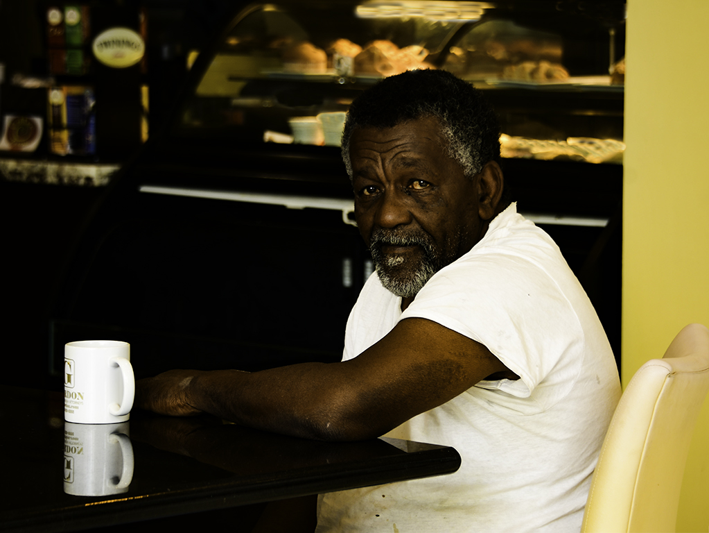
About the Image(s)
My Camera Club was having a field trip downtown Baton Rouge on a Saturday. It was in January 2021 and the weather was a little cold, so me and my friend ducked into this little coffee shop and saw this man drinking his last cup of coffee before he went home. We started talking to him and he told us he was the short order cook for the coffee shop. He was taking a break, the rush was over from breakfast. To me he looked like he got up really early to get all pastries etc. ready for the hungry locals and visits that are staying in the surrounding hotels.
This was taken with window light. 280300mm lens, with Nikon D500, 1/8 sec, 157 mm, F5.3 ISO 100.
This round’s discussion is now closed!
17 comments posted
Linda, this is really nice. I chuckled when I saw his coffee cup. Nice lighting! Posted: 02/03/2022 06:11:44
Hi Linda,
Well done. His eyes and expression tell a good story. Perfectly exposed. You captured sharp details on your subject. I like it. I think I'll try street photography too. It's perfect for monochrome. Posted: 02/04/2022 08:37:41
Well done. His eyes and expression tell a good story. Perfectly exposed. You captured sharp details on your subject. I like it. I think I'll try street photography too. It's perfect for monochrome. Posted: 02/04/2022 08:37:41
(Group 83)
Linda, what a great story your image tells. I really like everything about it - the pose, the expression, the reflection of the coffee mug on the table, the edit. I hope you will make a print and give it to the gentleman as a gift. Really nicely done! Posted: 02/04/2022 09:45:53
(Group 32)
This is a great personality shot, showing your cook's life experience and immediate exhaustion.
My only suggestion is to slightly lighten his complexion, and darken the highlights in the scene. I worked from your original. Posted: 02/04/2022 11:42:30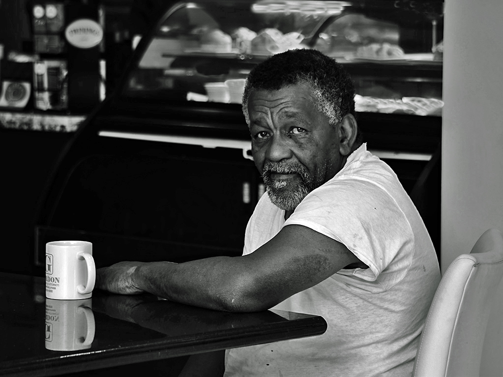
My only suggestion is to slightly lighten his complexion, and darken the highlights in the scene. I worked from your original. Posted: 02/04/2022 11:42:30
Stephen, if I compare the color image to yours, I think your change to the skin tones has greatly reduced the fidelity of the image Posted: 02/05/2022 23:49:00
(Group 32)
Oh gosh, I didn't want to do that; I just wanted to suggest lightening the skin tone a bit. How can that be done? Posted: 02/06/2022 17:03:34
I am not sure we can or indeed should - perhaps instead we should build on the high contrast that the subject has with his own clothing and therefore lighten the background so that his natural dark tones are offset more strongly. Posted: 02/06/2022 19:18:42
This would be my version with that strategy Posted: 02/06/2022 20:59:10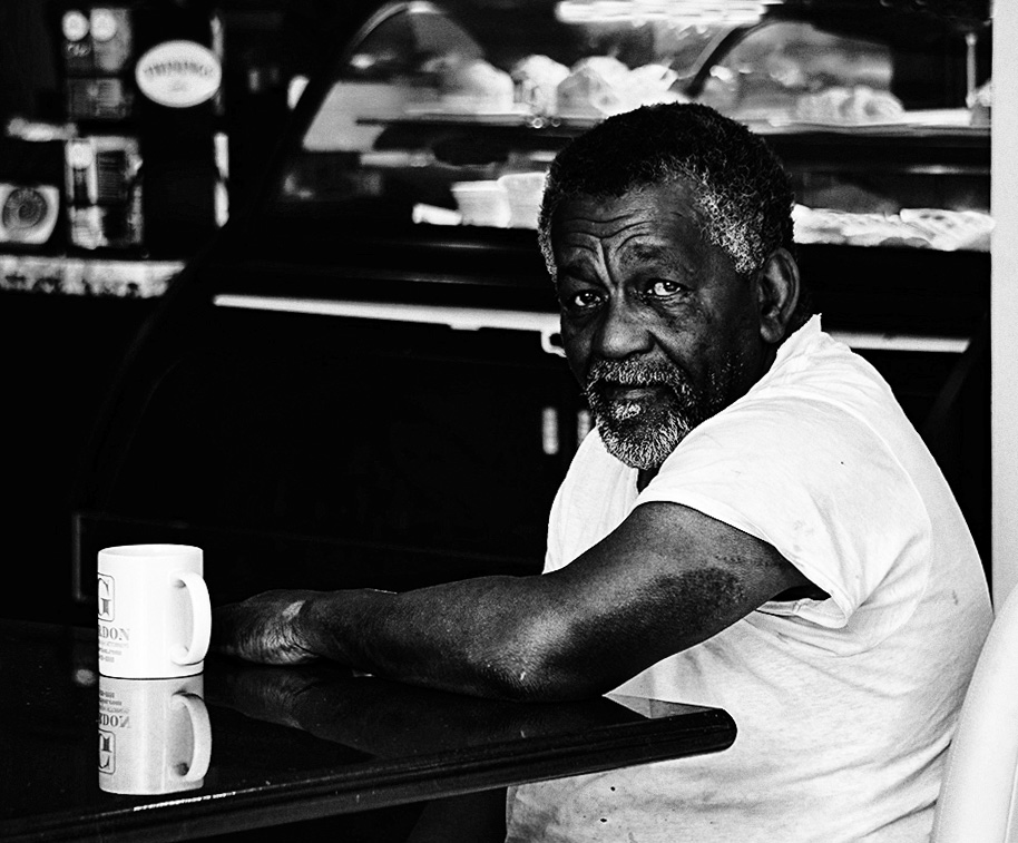
(Group 32)
Ah, excellent. I see what you mean and agree. Thanks. Posted: 02/07/2022 11:09:24
Linda, a nice piece of informal portraiture, I think you have captured this subject well in context,
In my opinion this image is better in color. I see the foreground as a contract between the dark skin tones and the so white T-shirt and mug, and I think the yellow wall and the not-white light in background help both these to stand out. Posted: 02/05/2022 23:33:02
In my opinion this image is better in color. I see the foreground as a contract between the dark skin tones and the so white T-shirt and mug, and I think the yellow wall and the not-white light in background help both these to stand out. Posted: 02/05/2022 23:33:02
Yes, I like it in color too. But this is BW PSA PID so. I love Black and White. Posted: 02/07/2022 14:04:56
Yes, I like it in color too. But this is BW PSA PID so. I love Black and White. Posted: 02/07/2022 14:04:58
Yep I can always use another cup of coffee. I also like street photography in b/w and this image is great. Nicely done. Posted: 02/06/2022 10:32:56
Randy, Me too, always use another cut of coffee.
Posted: 02/07/2022 14:03:47
Posted: 02/07/2022 14:03:47
For me this works better in the mono version. This is a greta character study of a man taking a break. I like the crop you have done but find the bright white line running down the back of his shirt distracting probably because the background is so dark behind him. I also think there is no definition in the black of his hair on the top of his head and it would be good to see that if you can pull the blacks back. I also think you have been caught between a rock and a hard place with the cafe in the background. You don't want it to distract but at the same time the solid black is very intense which in turn drives the viewer up to the items on the shelves. So maybe play around with the blacks but I'd also clone out or darken more the oval sign top left.
Posted: 02/06/2022 12:01:32
Posted: 02/06/2022 12:01:32
Thank you Peter, good constructive advice. Will try that. Posted: 02/06/2022 17:37:55
Good day, Linda! Indeed, a fine portrait, and enjoying your use of "space" to define a sense of "place": the subject is off-center, but I think, I would also have included the back of his chair and wall: Why?
I feel it will add even more in defining the subject by giving the viewer more to assimilate in helping to form some type of interaction with the subject, the whole scene.
The B&W conversion is well designed with the exception of a, slightly heavy hand on the sitters complexion. Just a tad back the other the way (like the example from Gerard, which also maintains more background detail) I too, suggest is a pleasing alternative.
Overall, and most important, your visualization and final design (or crop) is well balanced, with the exception of my crop-alteration about the chair, great work, Linda! Posted: 02/26/2022 08:13:50