Chris Reinecker
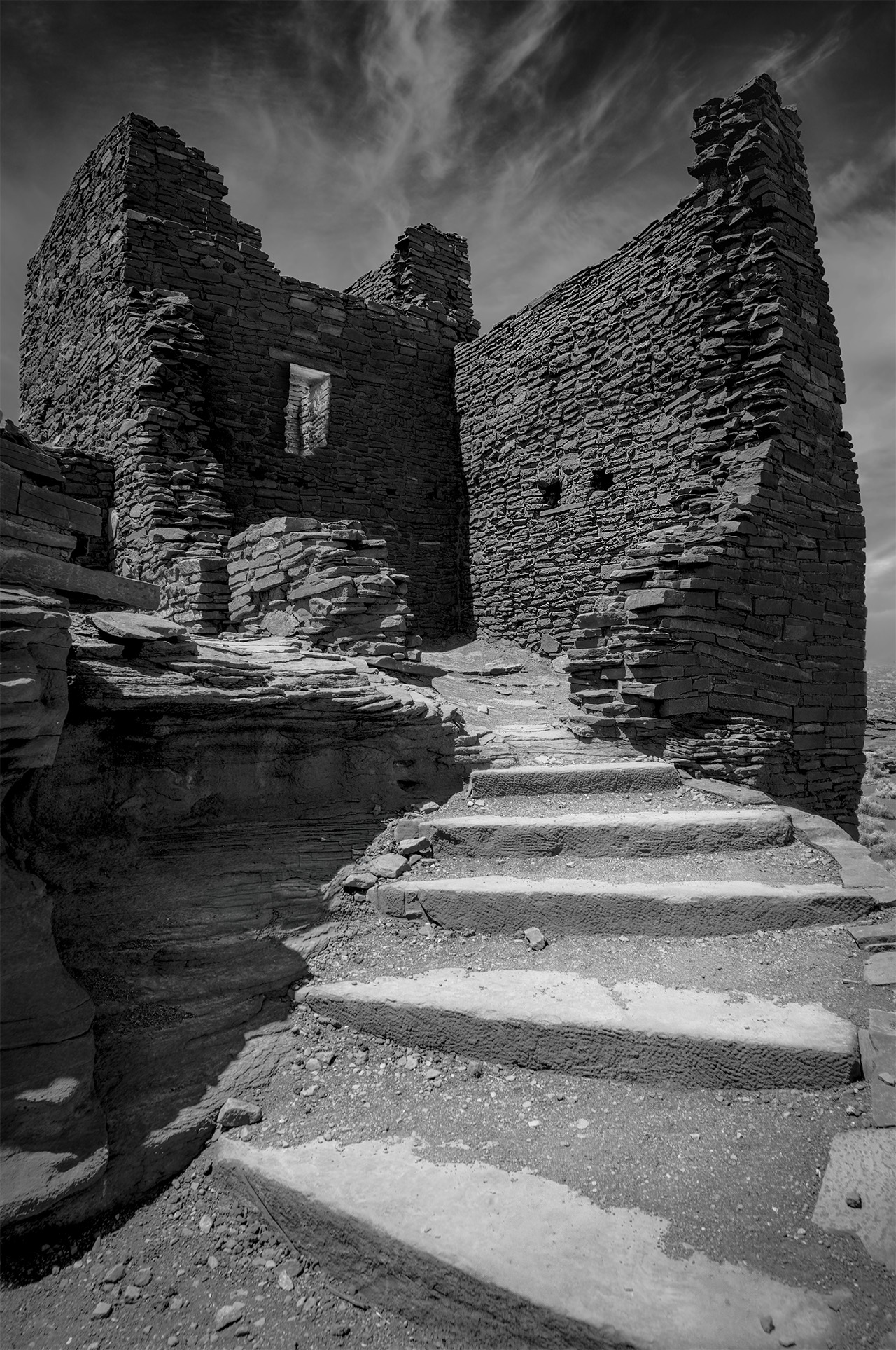
August 2026 - Desert Shelter
About the Image(s)
Pueblo ruins in the Arizona desert. I used the stone steps as a leading line toward the window of the remaining brick shelter enclosure, emphasizing the sense of refuge. The image was converted to black and white in Camera Raw using selective adjustments to the blue, red, and orange channels to shape tonal separation. Multiple brightness exposures were then blended to balance the light and reveal details in different parts of the scene.
8 comments posted
Great perspective. It gives the brick shelter a strong presence in the frame. Good tonal variation. The bright steps lead my eye up to the window. You captured sharp details throughout the image. Love the light and shadows. The dramatic sky adds impact. I like everything about this image. Good job, Chris. Posted: 08/05/2026 23:56:41
Thank you so much. Posted: 08/08/2026 21:21:47
This reminds me of the many ruins I have visited and brings back the sounds and sensations of such visits. It might be in the desert, but looks very much like a ruined English castle in a green field. The use of the steps to provide a lead in is strong, inviting the eye to explore further. The textures are brought out well and the tones are interesting. I can imagine this as a print but would like to see it a little brighter as a screen image. Posted: 08/17/2026 08:48:18
Thank you. Very good point about the brightness. My monitor, although color-calibrated, is way too bright. Also it is 10-bit. I am constantly fighting too dark BW when printing or for submission here. Posted: 08/17/2026 17:56:57
That's interesting. I don't know your print setup. I use an iMac that I have never calibrated, an Epson P700 printer (with oem inks) and Epson Matte papers or Permajet Oyster. I print (mostly) using Epson Print Layout software and the prints are fine. I do sometimes tweak by eye after a test print. Posted: 08/18/2026 08:12:22
I finally figured this out. The monitor is a Asus Proart PA32QCV. It is running at luminance up to 400 cd/m^2. I am usually at 200-300 for work and editing (50% brightness). For printing 100 cd/m^2, white point D65, gamma 2.2 is much closer to the output on a printer. In my case a Canon Pro-310. It appears many print shops have two hardware-calibrated SDR preset one for printing and one for representation on screen for which 100 would be rather dim in well lit environments. Posted: 08/21/2026 16:33:49
Chris -- I'm finding the discussion about your monitor calibration and printing setup very interesting. Even though I've been shooting digital since 2006 (and film for much longer) I'm late to the party when it comes to these kinds of technical issues and I really want to learn. Looking at your image, I love the window and the overall atmosphere of timelessness. I find the first step at the bottom to be somewhat too prominent; if it were my shot I'd crop it out. Just a thought. I will be interested to see how you resolve your darkness issue. Posted: 08/22/2026 16:54:44
The issue is finally solved. I set my monitor to 100cd/m^2 luminace when editing and printing and all is well. For other work I use 225 cd/m^2. Easy switch through the asus display widget. color callibration stay the same. On the 10 bit monitor I see a little finer gradation in the grays compare dto 8 bit monitors but that doesn't matter for prints. I try some cropping and see how I like it. Cheers
Posted: 08/23/2026 18:12:28
Posted: 08/23/2026 18:12:28