Robin Mellor, QPSA, BPSA
July 2026 - Steps
About the Image(s)
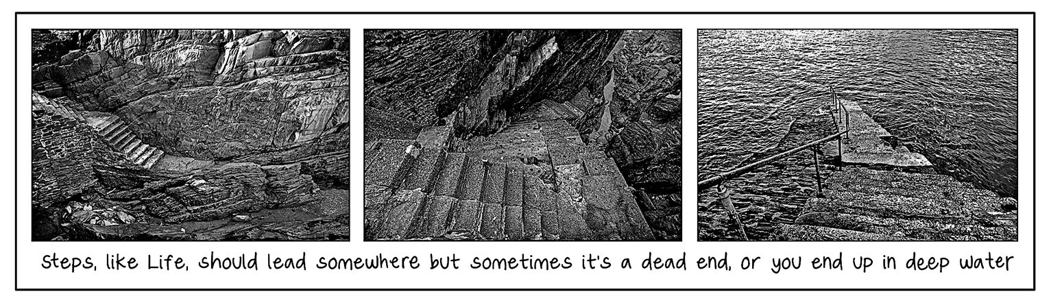
Ilfracombe, again. There are many of these flights of stairs, quite a few now redundant and leading nowhere, others that are still part of active slipways. I quite like triptychs since you can expand a little on what a single image can say.
3 comments posted
I love triptychs, and I think the idea of combining the three staircase images into a visual narrative works very well. I'm not entirely convinced by the tonal treatment, though. To my eye, the images sit a little too much in the midtones, which flattens the overall impact. The middle image is the strongest for me, but I think even that could benefit from slightly deeper blacks to add more depth and separation. In the right image, darkening the water a little might help the steps stand out more, while in the left image, deepening the shadows above the stairs could give the composition more contrast and direct the eye more effectively. Just my thoughts-it's a creative concept that I really enjoy. Posted: 07/01/2026 21:22:29
Yes, I think you are right Chris. An unlikely scenario when I'm encoursged to increase contrast, but this image would benefit from some improvements. Thanks. Posted: 07/10/2026 09:36:54
Love the story of the steps. Nicely presented in a triptych. However, the steps in the three frames seem to blend with the surrounding elements. As the subject of the story, the steps should stand out in each frame. If you darkened elements around the steps as Chris suggested it would improve the image. I would also try lightening the steps a bit. I like the framing. Posted: 07/09/2026 23:47:19