Rick Hulbert
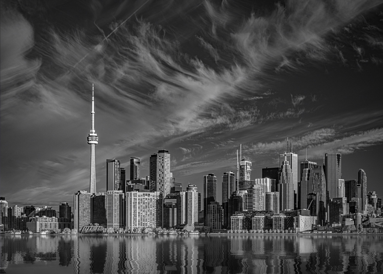
July 2024 - Toronto, Canada Urban Waterfront Cityscape
About the Image(s)
I think of an urban cityscape among the largest human created KINETIC SCULPTURES on our planet.
My intent was to capture a single moment in time as the recorded cityscape continues to evolve.
Editing Process: Lightroom Classic Software . . . Steps in order:
Lens Corrections Panel
Consider AI Masking
Select Subject
Select Inverse of Subject
Select Sky
Basic Panel
Convert to Linear Profile
Reduce Highlights if appropriate
Increase Shadows if appropriate
Consider Texture and Clarity
Calibration Panel
Adjust Hue and Saturation
Color Mixer Panel
Adjust Luminance
Detail Panel
Increase Sharpening
Increase Masking to only emphasize key element edges
Effects Panel
Increase Post-Cropping Priority short of being detected
Basic Panel
Consider Whites and Blacks
Black and White button
Revisiting Color Mixer Panel as appropriate
Gear:
Sony a7R IV Camera with a full frame sensor
24mm Tilt Shift Canon Lens
Aperture set at f/8
Very Stable Tripod
Exposure Bracketing employed to initially select the brightest RAW file without clipping any highlights
This round’s discussion is now closed!
10 comments posted
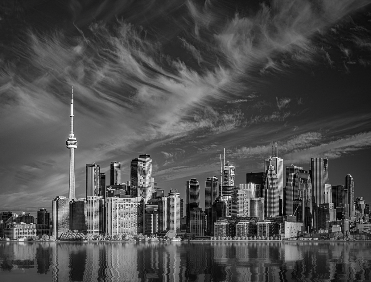
I'd just raise a few things that you might consider to further strengthen an already strong image. First, the thin line in the upper left - a fresh contrail I'd assume - seem incongruous with the otherwise soft clouds. It tends to grab my eye and distract. Easy enough to clone out. Second, the large "blob" of cloud in the upper left (on the edge) also is not keeping with the airy nature of the other clouds. It has a fair amount of visual weight. This one is a little harder to deal with. But one option is cropping some from the left (perhaps combined with cloning). I might explore a crop on the left side anyways since to me the interesting stuff is pretty much all to the right of the needle tower; the buildings from the needle to the left are less impressive. You need some of them to allow the needle breathing room, but not sure you need as much as you have. Also even if not cropping substantially, you might think about cropping off the "half building" at that edge; I find that distracting. Finally, I think you could selectively give it a little more light - perhaps in the clouds as well as perhaps the buildings near the needle to give a little more strong focus. These are of course matters of taste. I took a shot at these things in the attached. Beautiful image and fun to work with... but not much to do as you've processed it wonderfully.
Thank you for your detailed list of steps in processing the image. One caught my eye, namely "Convert to linear profile". I've never run into that. What is it, and what does that accomplish?
Posted: 07/15/2024 20:56:52
Thanks for your cogent response to my image.
Honestly, it is among the most perceptive comments I have received over the past many years. Thanks for your observations!
I enjoy scenes embodying high dynamic ranges of light. While I don't expect to see the surface of the sun or any detail within a specular highlight reflected off a chrome car bumper, I nevertheless would ideally want to start with a RAW data file that is as bright as possible without blowing any highlights. The reason for that desire is to maximize the amount of data collected. When am faced with a data file that expands beyond what the histogram can record, I find that a Linear Profile most often is my best bet.
A linear image profile (tone curve) is for images containing a dynamic range of data beyond what your sensor can record. The conventional profile is non-linear (not a straight line).
The main drawback of the linear profile is that, at least initially, the image
looks worse onscreen . . . usually more dull. The big advantage for me is that I can preserve all the data and be able to control the Tone and Color to my desired preference.
The "Auto" button in Lightroom or Photoshops ACR filter generally does a very good job of restoring the image to a more "normal" appearance after applying the linear profile.
In fact, the "Auto" option with a linear profile often looks better than the
"Auto" option combined with one of the standard Adobe Raw profiles. After optionally clicking on the Auto Button, you can just go through your editing workflow as usual.
You can download the linear profile for your specific camera model from Tony Kuyper's website. Every camera model requires its own specific Linear Profile.
Once you have it on your computer, it will always show up as an editing option in the profiles section of your RAW editing software.
https://goodlight.us/Installing_and_Using_Linear_Profiles.pdf
Posted: 07/15/2024 22:36:22
In reviewing my response to you, above, I realize that I forgot to mention that your improvements to my image are much appreciated. I actually never thought of removing anything from my images. Your suggested edit definitely improves the overall scene!
Cheers, Rick Posted: 07/16/2024 00:10:11
A great shot!
It is "The moment" of the city.
I like the contrast of tight texture vs. soft texture of the cloud. It is balanced well. The diagonal line created by the cloud add the uniqueness to the image. It looks like a phoenix is flying out through the sky. Nice!
On the other hand, it looks heavy in right side, I feel good space in left side looking distribution of the building. I am not sure what's there in right side but I need more space in right, may be the same volume of the space in left. If I looked at the edited version by Robert, it looks too tight after cut of left. I feel it needs space to breathe in right.
Posted: 07/16/2024 00:57:38
Thanks for your considered comments. I appreciate your thoughts.
It is great to hear what other photographers think about composition.
I look forward to possibly interacting with you in the future. Posted: 07/16/2024 01:14:57
(Groups 15 & 95)
Thanks for your thoughtful comments.
I appreciate your notion of cropping on the left side to eliminate the half building.
Posted: 07/23/2024 16:57:20