Robert Atkins

July 2024 - Against the Storm
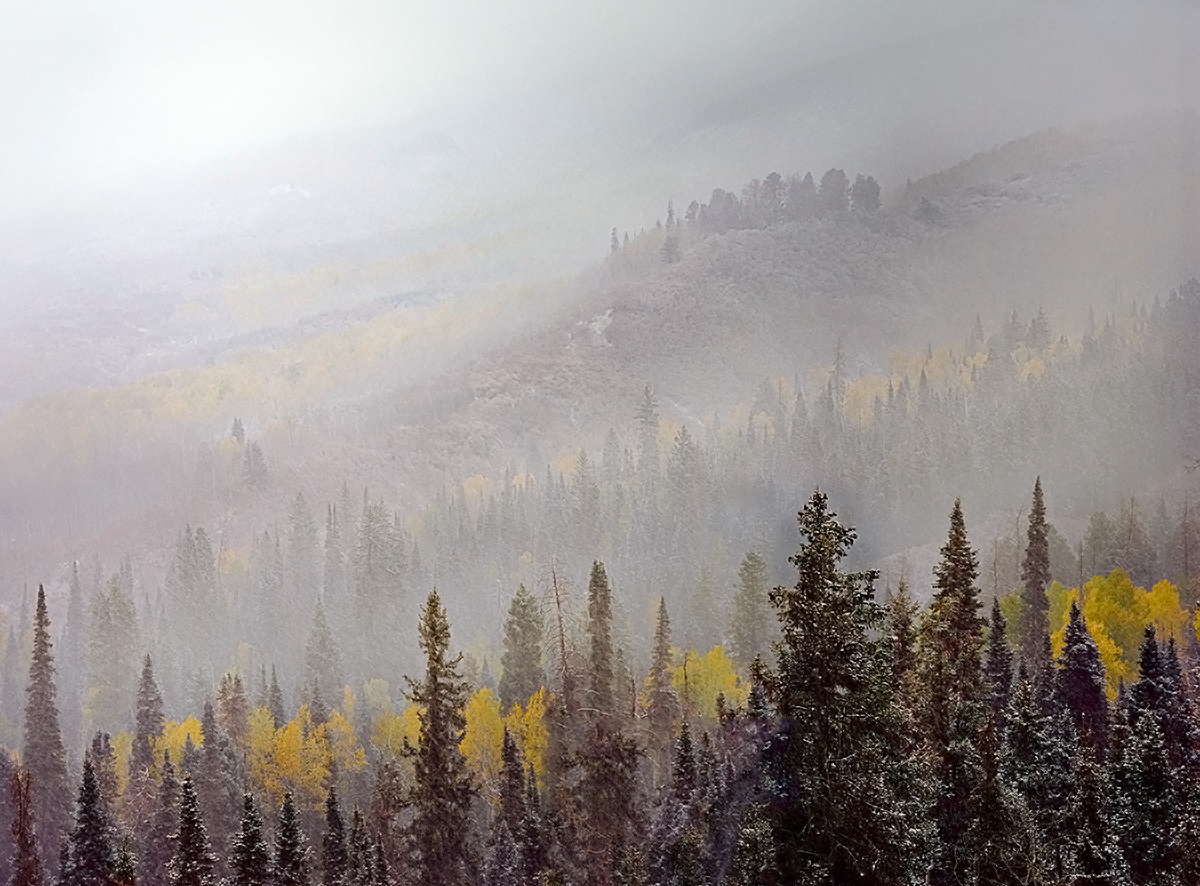
About the Image(s)
This month’s image is a re-processing of an image that I took several years ago. I would have to go back to look and see if I presented it here in Group 96 before, but if I did, the new version looks significantly different, and is a more compelling image.
The image was taken near Ridgway, Colorado, in the Owl Creek Pass area. It was that year I believe the first storm of the season, and I got a couple of interesting images that day. In this one, I was excited by the layering of the landscape, and was pulled in particular by the cluster of trees on the mid-distance ridge, which collectively seemed huddled against the storm. I’ve always had a difficult time processing this image to get the subtle balance right between pulling out the distant details into greater clarity vs. pushing them into the storm. I think I have done a balance here that works, and hopefully yields a bit of a 3D effect. I’ve also shaped the light a little to lead off into the storm in the upper left.
Let me know if you think I’ve captured the drama of the storm convincingly or if there are additional improvements you would suggest.
Tachihara 4x5, Velvia 100 Film
This round’s discussion is now closed!
8 comments posted
Wonderful scene!
I think you did a great job in conveying the sense of depth.
The image beckons the viewer to explore the scene in search of any sense of detail in the distant context . . . and that exploration would be successful!
This is the kind of image on a gallery wall that would encourage a beholder to have a seat and contemplate the subject over time.
Posted: 07/10/2024 15:14:26
(Groups 15 & 95)
As this is my last month with this group, I take this opportunity to thank you Robert for your insightful comments and very efficient administration of the Scapes group. Posted: 07/18/2024 21:23:15
Posted: 07/19/2024 12:28:16
Thank you for sharing.
I envy you facing fantastic view with great condition.
I think you captured the scene of layers beatifully. Composition wise, I see it perfect.
I might try re-edit some point though.
Currently, my eyes cannot recognize 5 yellow layers, maybe 3+.
Also I cannot detect the mountain right far back. So I looks big white empty space in upper left but it should not be looked lik that. That space actually captured another layers of canyon and flowers, which are hided now.
Finally you might want to run nise reduction just a bit.
Posted: 07/19/2024 04:36:32
I will look at the noise too. Surprising there is a problem there since noise is generally not an issue for scanned 4x5. Where do you see noise?
Posted: 07/19/2024 12:26:27
Maybe my comments were not clear enough, I am afraid. Please see the trees in front. It looks noise because of my monitor though.
The prints might shows the 5 layers better compared with the one on the screen. As far as I see it on the screen, it has big whites in upper left. It does not work well for me without surgery.
Posted: 07/19/2024 14:08:41