Michael Griswold

August 2026 - Morning Ebbs
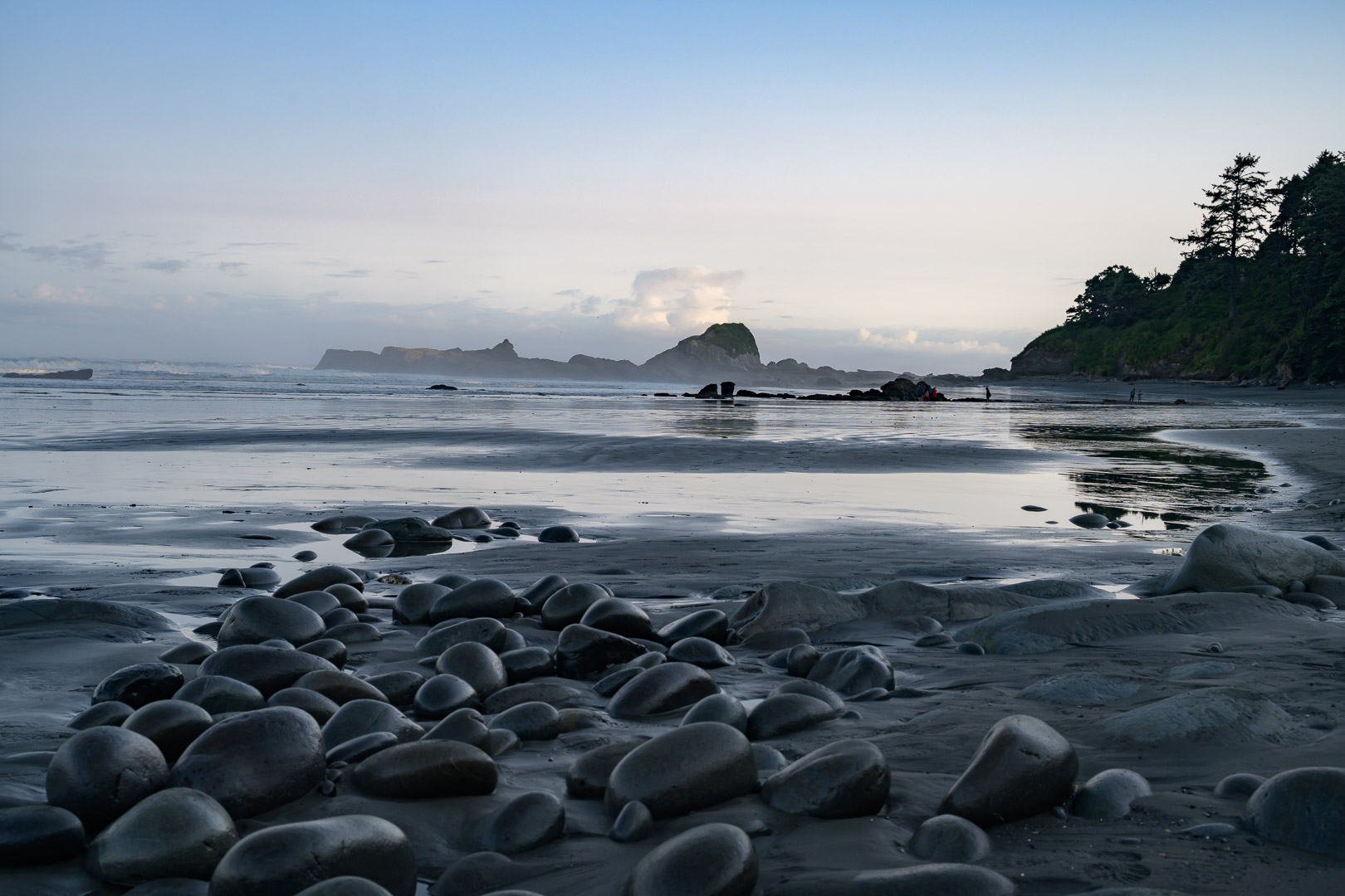
Original
About the Image(s)
1/160 sec at f/8.0 ISO 64 42 mm
This is from a recent camping trip to Olympic National Park and the beaches around Kalaloch. I was able to time it for low tide at sunrise. The exposed rocks and tidepools at Beach 4 offered lots of opportunities for exploration. This wasn’t a photo-oriented trip so I didn’t use a tripod or spend a lot of time on shots.
In this image I was trying to use them as an interesting foreground pattern to draw the viewer into the image. Rather than focusing on the sea stack itself, I became interested in the smaller discoveries the receding tide revealed across the beach. The bright clouds initially dominated my attention but I found myself lingering on the foreground and surprisingly, on the shapes and reflections in the mid-ground. The mist was heavy at first and slowly lifted and offers a subtle softening in the distance. I have cropped this in multiple ways and have ended up here. To me, this is about the ebb tide and what it reveals as well as the morning passing and ebbing away.
This isn’t an image that jumps out at you but offers its rewards more quietly on further review. The shapes of these rocks are like stepping stones that encourage the eye to explore the textures of the sand and water. The rocks in the mid distance give it another layer adding the sense of depth. The waves and the sky offer more texture and provide contrast to emphasize the sea stacks on the horizon. The wide horizon and blue hues are peaceful and calming.
I suspect the greatest weakness is the lack of a clear visual hierarchy. The clouds, sea stack, mid-ground rocks, and foreground all compete for attention. My intent was less to create a dramatic coastal landscape than to express the quiet discoveries revealed by the receding tide and lifting mist. Whether that comes across successfully is what I'd most like feedback on.
5 comments posted
I think your image and detailed discussion of it is wonderful.
A visual hierarchy is admirable, but it can also differ between beholders of your art.
I personally appreciate your edit along with all of the components you articulated.
Well done!
Posted: 08/03/2026 01:32:16
I like this composition better than the original. The flipped image and crop as well as removing the person improve the picture. The first thing that caught my attention was the different layers in your image. The subdued colors work well to enhance the morning mood. Very pleasing image to look at. Nicely done! One improvement that I see would be to remove the shoe prints in the sand. Posted: 08/06/2026 17:43:43
I do prefer the original from a compositional perspective. The crop looses the sweeping leading line which helps tie the foreground to the background. To me that helps unite the various elements you have going on in the image. But if I were to keep the final version you are showing I think I'd crop a little more from the left. There are some distracting elements near the edge - lone rock in the bottom left, small black rocks against a really bright background (which due to the contrast carry a lot more visual weight than their size would suggest), etc.
I have not photographed the Oregon/Washington coast much. But I've found that organizing an image there is almost as hard as in a forest where it's all about bringing order to chaos. There are just so many elements to love it is hard to simplify. Posted: 08/25/2026 10:51:18