Robert Atkins

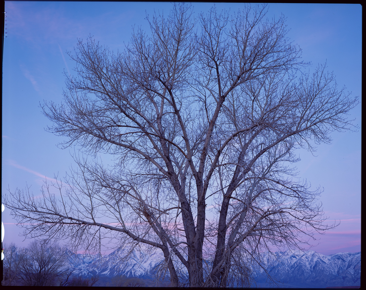
February 2025 - Tree, Sunrise in Eastern Sierra
Original
About the Image(s)
This image is from my winter / early spring trip a year ago to Death Valley and the Eastern Sierra in California, and was shot at a well known location, Farmer’s Pond, just outside Bishop. The whole trip was plagued by high wind, something pretty inconsistent with 4x5 photography (unless you are in to intentional movement sort of shots). The planned shots which I had scouted the afternoon before all involved grass and reeds, which was moving all over the place. So I regrouped and tried to make a go of this tree, with the level Sierra and morning light in the background. But I will admit before you all pixel peep that this image is probably still fatally flawed by movement of the smaller branches, despite all attempts for a still moment. Hard to get anything to hold still at 1 sec exposures.
The image was flawed in a couple of other ways too. First I had to decide between a 150mm (50mm equivalent in full frame) and a 75mm (24mm equivalent in full frame). The later would have made the tree and mountains quite small, so I went with the 150mm. But there was not quite room on the edges. So I had to do some cropping with generative expand to create some space. Also, since I was rushing, I did not consider the branch on the left side that stuck out asymmetrically. I decided to do some surgery here too, using fill to generate a slightly different looking branch which stuck out less.
In the end, I think I pushed through processing this more as an exercise of pointing out to myself everything that was wrong, or put differently, what I should have done differently. Frame differently (although I had no space to back up), pick a different tree (if I wasn’t so rushed), etc. I am not sure what I could have done about the wind other than to go with an even longer exposure that would have made the movement more deliberate. I do like the shot though. It is a bit of a different and simpler shot for me, and deliberately a lighter softer color pallet which was keeping with the feel of the morning. I think it gives the tree a majestic look, shot mainly against the sky and with the decorating mountains and color down low. So for me it was worth an afternoon processing it. Movement details (and the AI cheating) aside, I’d be interested in other comments. What else is off compositionally, etc? I’ve included the scanned film original for comparison.
Ebony RSW45, 150mm 5.6 Symmar-s, 1 sec, f22, Provia 4x5 film, no filters
2 comments posted
I most enjoy the upper 60% of your image. I think it is, in large part because of the semi-symmetrical placement of the groups of branches. Symmetry is something that most everyone enjoy in different ways. I also love the transitional forms and colours that emerge from the mountains through the sunrise light and general sky colours. . . especially in the right half of your image. Since you don't seem to mind making structural modification to images, how about taking the right half of your image and mirroring it to the left side, creating a truly symmetrical scene. Posted: 02/13/2025 23:45:37
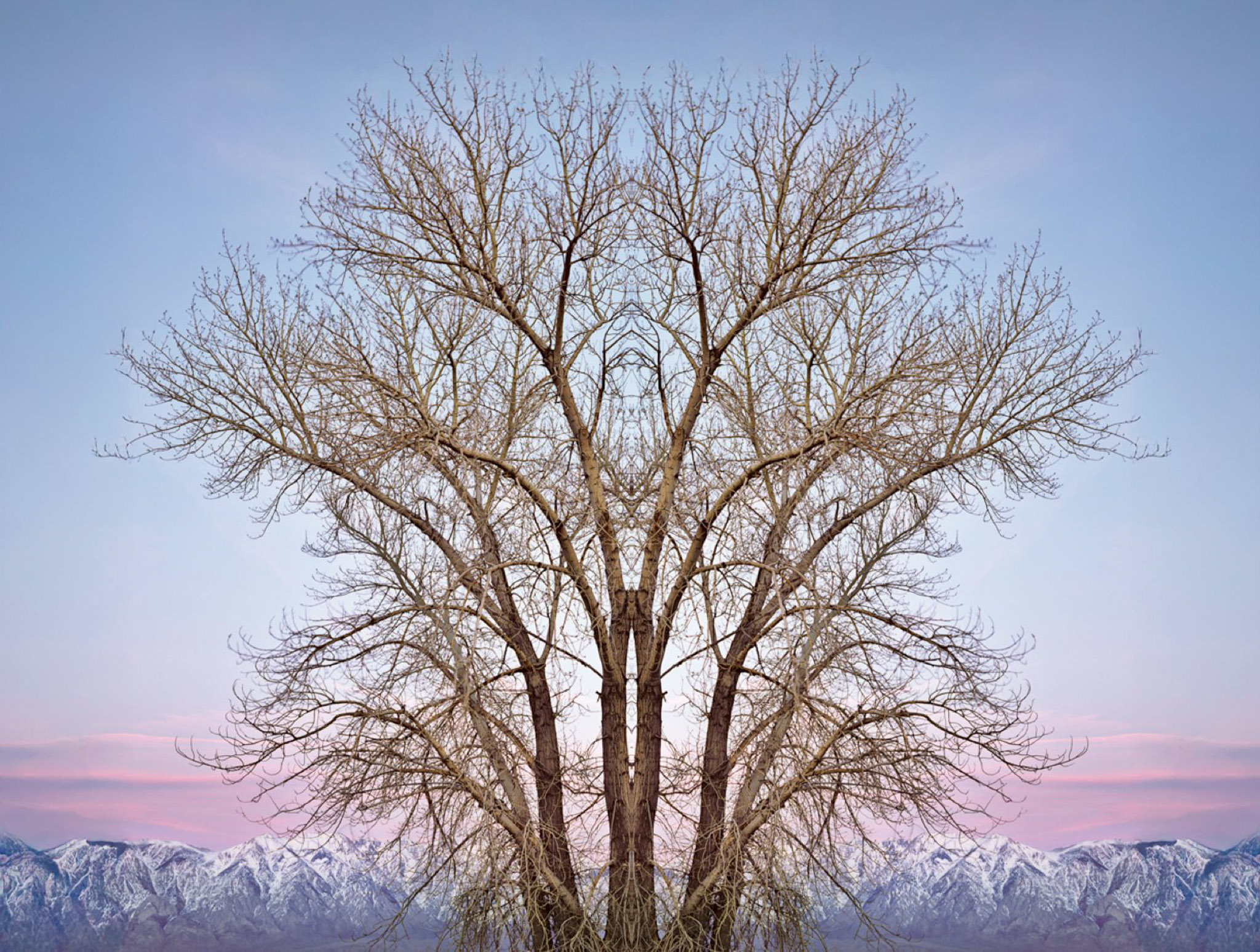
To me the question is how each of the elements in the image is contributing to the overall impact. He embraced the symmetry (which is the dominant theme of the image) forcefully in his rendition. Color palette is beautiful, but can we increase the sharpness of the tree in front? Don't know how, but I feel if that is possible maybe the image would become even better.
Great Work. Posted: 02/17/2025 02:27:00