Robert Atkins
About the Image(s)
This month's image is one that I unburied digging through my archive over the holidays. It is from a trip to the slot canyons of the southwest a few years ago - I think this particular one is from Willis Creek. It is shot on 4x5 film and has the distinction of being one of the few images where I used front swing to get critical focus along the canyon wall which is running away in distance across the image. Focus stacking in digital would achieve the same end, but here I used a view camera trick.
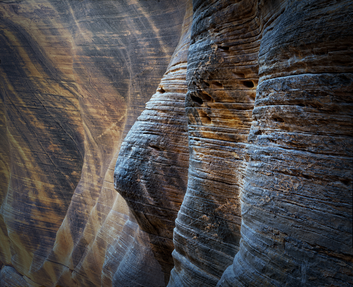
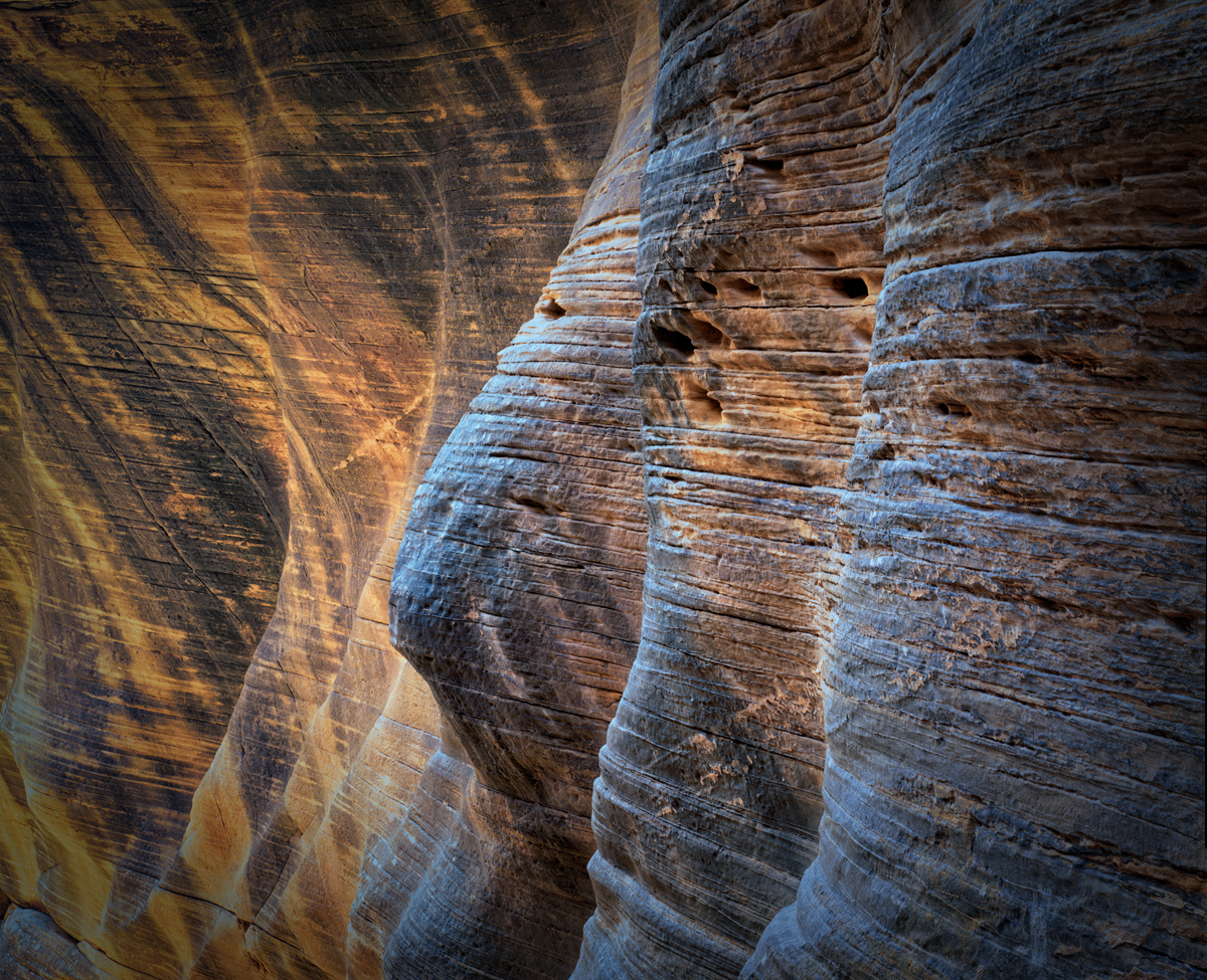
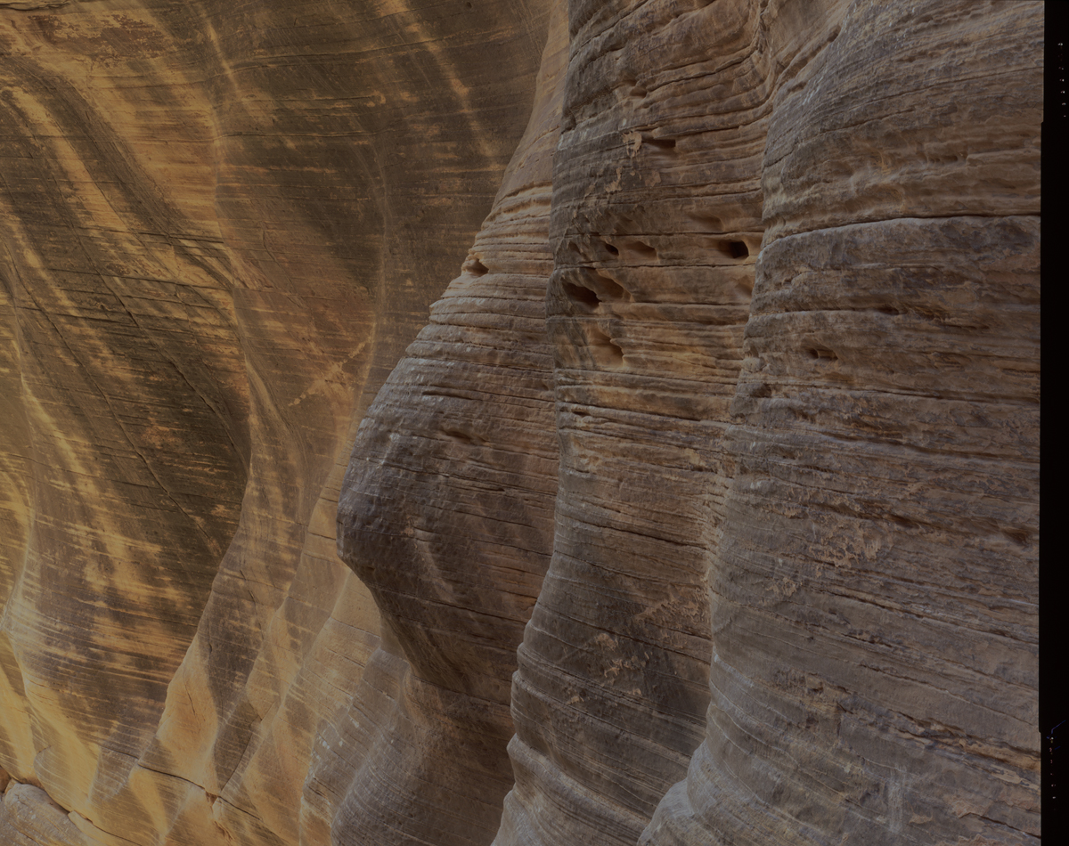
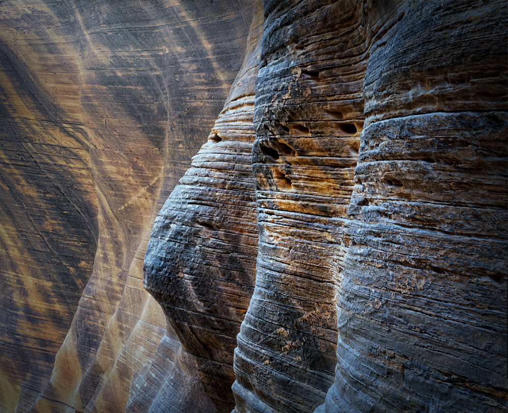
Several things attracted me to this image - the three shapely ridges in the canyon wall which are echoed my smaller ridges more distantly, the weather old look of the rock with the cracks and holes, the stripped coloration of the rock, and finally the beautiful light which combined the natural warmth of the walls with the cool direct light from that day’s blue sky. The later is not obvious in the original which I’ve included, but easily seen by removing the overall color cast and adding some color contrast.
In addition to the “original”, I’ve included the image as I processed it shortly after that trip. And then I am showing the reprocessed image. I’d say a few years can make a difference! In the previous try I was fascinated with the colors and textures, but did little to make the three main players stand out, and to give the image a 3D presence. I think I’ve improved that in the current version as well as brought out the lighting of the scene. I think the image is the better for it, but would appreciate your thoughts.
So, believing that you can always improve, I’d ask what is left to do? If I were to come back to this image in another three years, what do you think I should be changing further?
4 comments posted
Wow . . . very impressive scene. I also appreciate your description.
While it is true that there are no absolutely perfect images, I am liking it so much, I cannot immediately think of suggestions for improvement. I could see the potential of various cropping formats from square to vertical to an extended horizontal image.
The is the kind of seen where you could play with a distorted ratio and proportion.
OK . . . I just thought of what I would have personally done . . .
I would have titled your image "Three Wise Women"!
Cheers, Rick Posted: 01/11/2025 20:25:31
Thank you for sharing.
It is a good shot. I like the color palette and texture. I think your intempt of conbining 2 images turned out to be successful. It looks better from original in my opinion.
It is my personal opinion but the triangle shape rock in bottom left is distraction for me. It carries the tone and color from original and it looks stand out. And the beauty of the background is the layers of line of rocks and it stops the flow in my view. So my suggestion is crop a bit to eliminate the rock as attached. I added the light on 3 wise man a bit. Posted: 01/16/2025 09:10:13
Posted: 01/18/2025 12:11:48


