Haru Nagasaki
About the Image(s)
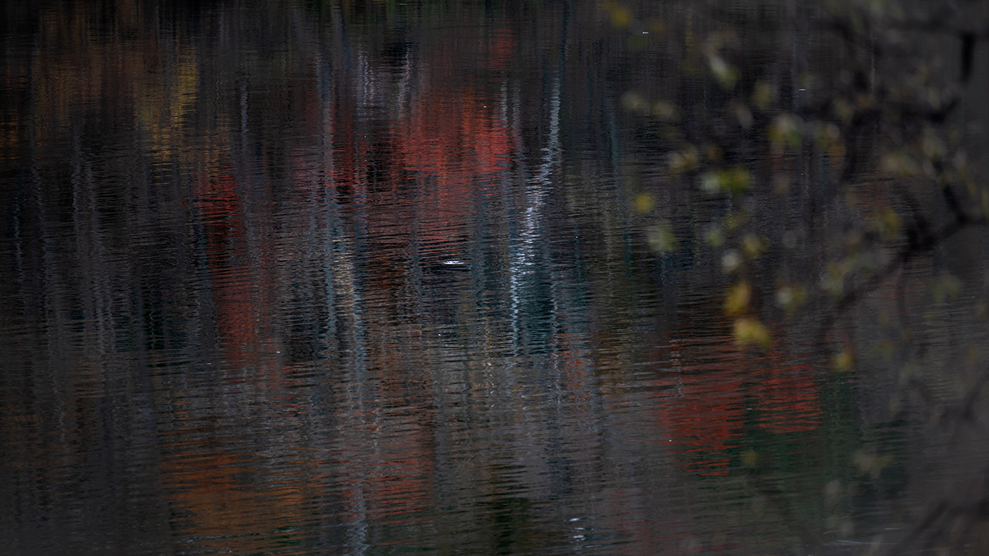
This is a reflection in autum captured in the lake.
The main subject is reflection of autumn colors (white tree and colored leaves) with foreground of yellow leaves tree in front in right side (which is blurred due to f5.6)
I wanted to make it impressionism art, i.e Claude Monet, So I chose the SS carefully.
I would appreciate your feedback on this image.
Nikon Z8 70-300mm @ 300 f5.6 1/13 ISO64 Tripod.
6 comments posted
Kenneth Taylor
It does look like a work of art. I think it could be a little lighter Posted: 11/16/2024 04:21:20
Thank you, Kenneth, for your comments. Appreciated. Posted: 11/20/2024 12:39:24
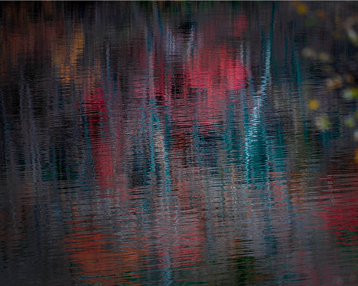
Hi Haru. I love the left 2/3 of this image. I think the biggest issue is the yellow leaves and tree on the right side. It is clearly "in front" of the rest, and to me at least, it competes too much for attention. It is beautiful by itself, but it feels like it is intruding on the other focus, namely the reflected reds and bright whites near the center. I'd suggest cropping and tried that below. I don't think you can completely remove the foreground tree because that puts the bright white reflection too close to the edge, so what I did is a compromise and I think enough to restore a single "center" of attention.
Your image did weird things in terms of color when brought into photoshop and I think that is because it is not tagged with a color space. So photoshop interpreted in a way that changed and brightened the colors. I think some of that helps but that is a matter of taste.
I think there are a few bright white "specks" (really they are just bright point like reflections). I think those should be cloned out - they are just distracting. There are some bigger ones that are part of the extension of the bright white reflected trunk, but they are right near the bottom edge and for that reason I think should be cloned too.
All of this is just some suggestions. I really like the Monet effect. You've created the sort of image that is more timeless and does well on the wall over many years without getting tiring. Would look nice printed on a matte paper with some texture.
Posted: 11/16/2024 13:23:05
Thank you, Robert, for your comments and your attempt.
My dilemma is that if I crop out the yellow tree, it lose the depth., I thought. It would become just a flat image. That's what I was afraid of.
I did not notice the color will become weird, thank you for mentioning.
And I would cleanup the bits and pieces as you pointed out. Posted: 11/20/2024 12:46:21
Hello Haru,
I also feel that the artistic merit of your image would be enhanced by deleting the foreground on the right side, resulting in a more square composition. Posted: 11/16/2024 17:12:15
I also feel that the artistic merit of your image would be enhanced by deleting the foreground on the right side, resulting in a more square composition. Posted: 11/16/2024 17:12:15
Hi Rick, thank you for your comments. Posted: 11/20/2024 12:46:42

