Robert Atkins
About the Image(s)
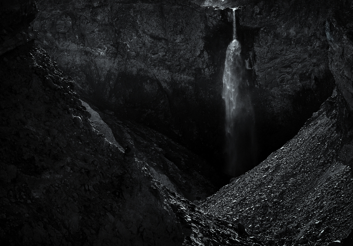
This image is of Loowit Falls in Mount St. Helens National Volcanic Monument. It is rather dramatic, seeming to flow out of the side of the volcano ??“ like something from a fantasy adventure movie ??“ but it is fed from the Crescent Glacier. I’m told this is one of the only glaciers on the planet which is growing not shrinking. The hike to the falls from the end of the Windy Ridge overlook takes one into the heart of the blast zone, which even now, years after the eruption, is in many places like an outer worldly moonscape. It is also nearly 10 miles round trip (at least with the wrong turn we managed to make at one trail junction) and it was a much warmer day than expected. I was in fall hiking gear and not so much outfitted for summer conditions ??“ so it was a bit of struggle, and I ran out of water on the way out.
Given that hardship, I was determined that I should get a worthy photo of the falls despite the harsh mid-afternoon lighting. That pretty much forced a B&W rendering ??“ something which is not really my thing. I framed things a range of different ways, but I like the simple composition of this capture, with the V-shaped foreground guiding us into the cavernous enclosure beyond into which the fall descends. Being far from expert in B&W, I hope I have adjusted tonalities to best bring out the mysterious feel ??“ a waterfall amid an arid volcanic moonscape, tucked into a dark, seemingly magical cavern. I always struggle a bit with the darkest tones ??“ just changing the surrounding border (from white to black for example) changes my thoughts on whether the image is too dark or not. So opinions on that are welcome in particular, as well as thoughts on how to generally deal with that across different lighting situations, monitor calibrations of different viewers, etc. Much harder it seems than making a print work for a particular lighting installation.
Sony a1, Loxia 85mm 2.4, f8, 1/200 sec (handheld), ISO 100.
3 comments posted
Science informs us that see depth though luminance alone, which is pure luminance. We do not see depth through color alone. (it is the luminance in color that is often difficult to perceive)
Your image conveys that sense of depth, so that is great.
Two thoughts . . .
1. I would consider eliminating the pure black left side of the image as it does not, for me, add to the image "story".
2. I admit to being curious as to what was cropped out at the top of your image.
The bright water at the top could, perhaps, benefit from a bit more "breathing room". Posted: 11/16/2024 17:23:38
Thank you for sharing.
Nice try for BW, which you do not normally do. I guess your attempt to make it mysterious is somewhat achieved, especailly around the fall. But the foreground is so bright that it reduce the effect of "mistery".
Before talking about tonarity in depth, I need to mention a couple of things.
1. For me, the top is too tightly cut and it looks unbalanced. I assume that you have some reason to cut.
2. I understand your attempt of framing V shape valley. However, lower left looks empty for me. It is processed dark, so there is a big space almost nothing to see, which caused the unblance.
3. The space below the V shape vs. The space above the fall - It is not equal which looks very unbalanced in entire composition.
I am for the direction you are heading in post-processing.
Do you have any other shot with a different composition?
Posted: 11/20/2024 07:04:07
