Bruce Flamenbaum
About the Image(s)
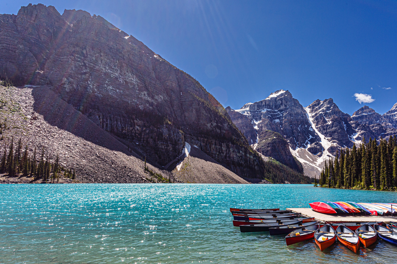
Shot at f14, 1/100 sec, ISO 125 17mm with a 17-40mm Canon F4L , Canon 5d MK III
5 comments posted
Kenneth Taylor
A beautiful scene. There seems to be a lot of sunflare in the upper left, and a circular
flare. I would have cloned that out. The shadows on the mountainside seem unnaturally bright, the water dominates the image. Posted: 11/10/2024 05:56:35
flare. I would have cloned that out. The shadows on the mountainside seem unnaturally bright, the water dominates the image. Posted: 11/10/2024 05:56:35
Hi Bruce. I love the Canadian mountains and lakes, and you've captured a nice example of that here with Lake Louise. The color of the water and the canoes is really grabbing.
I think there are a few things to that could be worked to make the image even stronger. As Kenneth points out, there is flare, and while in my experience it can be a lot of work to remove (better to use a good hood or shield the lens some other way), it can be removed. Before doing that though, I'd think about a crop. To me the interesting stuff is in the lower right corner, and I'm not sure the broad expanse of cliff at the left adds much, particularly given how the canoes scream to be the focal point. While there are some great colors, there are a lot of different colors and I don't know that they are all harmonizing. Finally the lighting is pretty harsh.
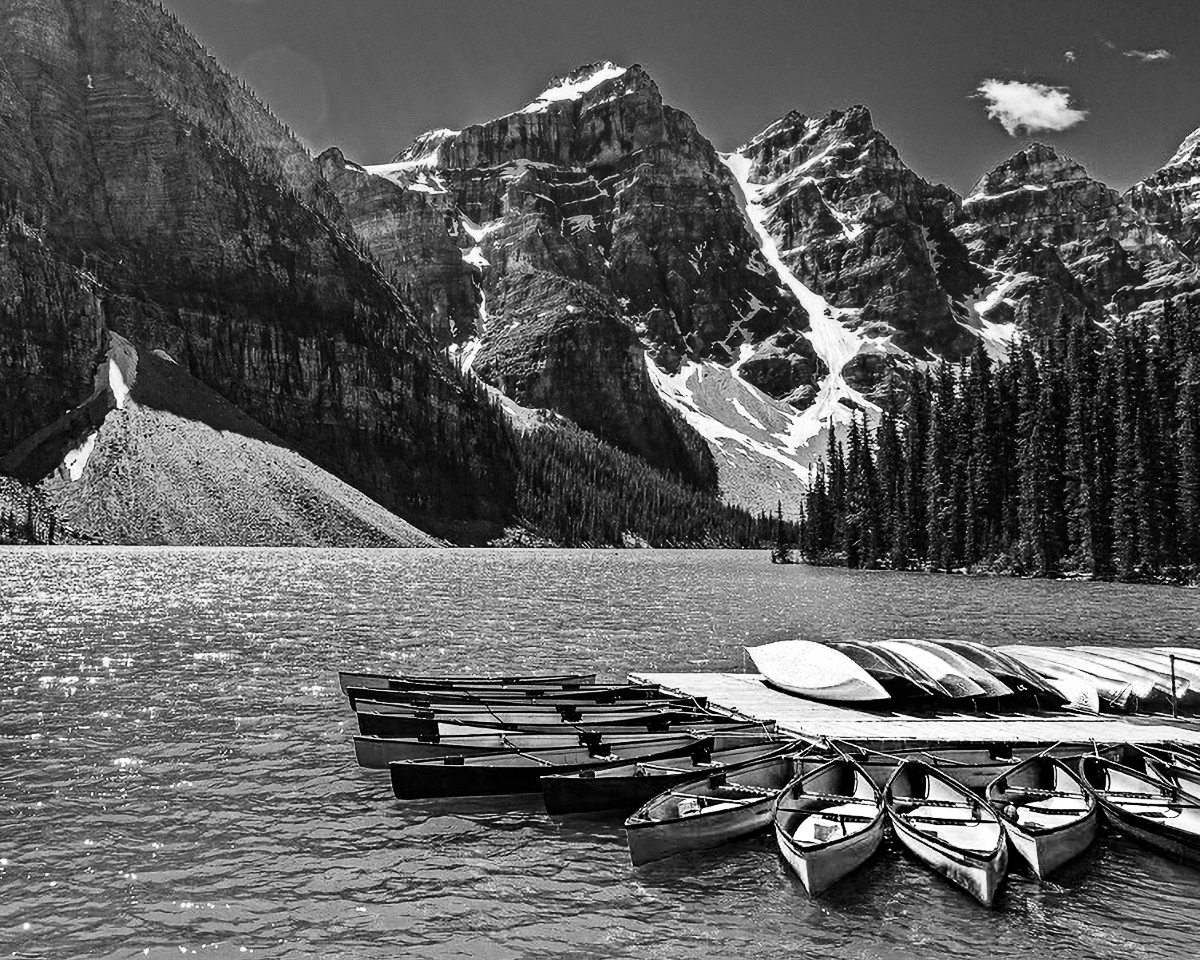
Given all that I'd think about surrendering the color and going B&W, cropping a lot off the upper left, and then fixing whatever portion of the sun flare you need to. I took a cut at the first two (but did not have the patience to work on the flare).
If you really want to keep the color (and again the water is amazing), then one approach could be to try to mute some of the other colors (like the yellow green of the trees, the sky blue which clashes with the water, the purplish tones in the mountains). Then you are left with fewer colors and ones that harmonize better.
Just some thoughts. You've captured a very beautiful image in any case.
Posted: 11/16/2024 16:37:24
Hi Bruce,
I agree with Robert's suggest composition . . . either in color or B&W.
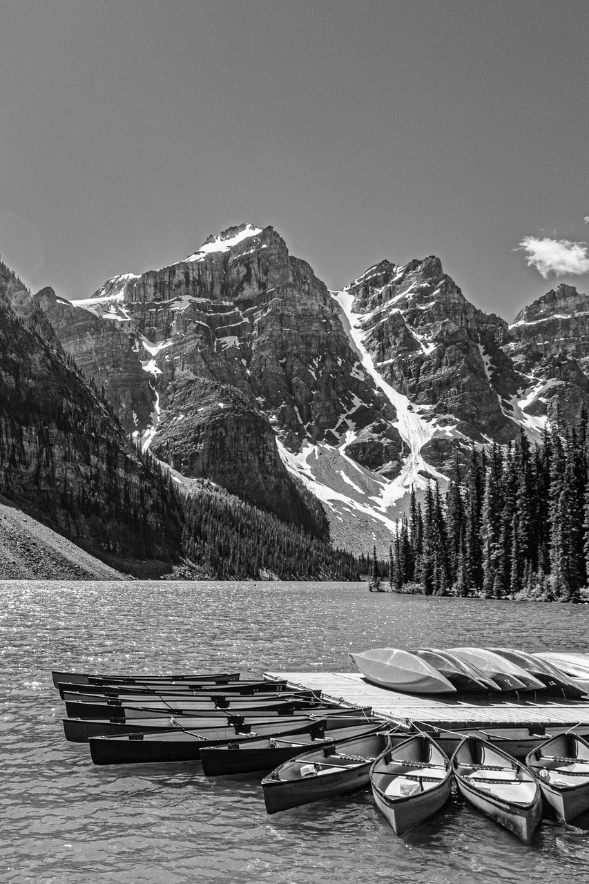
Another thought would be to have maintained a sky above the tallest mountain and to enhance the flare even more. . . perhaps trying a vertical format image with either a wider angled lens or stepping back further. I appreciate that my suggestions might have been difficult to achieve. Posted: 11/16/2024 18:33:35
Thank you for your comments. In places such as this lake, I see sun flare as kind of a divine inspiration shining down on such beauty. While cropping would focus on the boats, etc. in this case I wanted to focus on the majesty and vastness of the Canadian Rockies. I did very little editing. The color of the water, combined with the sparkling surface is almost ethereal. In addition, the boats conveyed a peacefulness that is to be found in the Rockies.
I did crop the image using a virtual copy and removed the solar flare and made it a B/W, But it seemed to lack any vitality.
I appreciate your input. Attached, (I hope) is a B/W cropped version. It does nothing for me. Posted: 11/16/2024 19:15:56
I did crop the image using a virtual copy and removed the solar flare and made it a B/W, But it seemed to lack any vitality.
I appreciate your input. Attached, (I hope) is a B/W cropped version. It does nothing for me. Posted: 11/16/2024 19:15:56
Hi Bruce,
Thank you for sharing.
In my understanding, sun flare become now well accepted these days in the landscape photography world, especially if it is intended and add value to the image. So I do not mind that so much.
But I am with Robert to crop left. It is because lower left does not look add value to the image for me. The highlight is heavy weighted in right side.
Your edit looks better than the original.
2 inputs.
1. I feel the sky is too wide without any cloud action.
2. I am not sure that BW conversion is the right solution in this image. I like the color palette, the color of the boats, the blue of the lake, and the blue of the sky, all different colors. That's what I like about this image. Posted: 11/19/2024 12:28:52


