Rick Hulbert
About the Image(s)
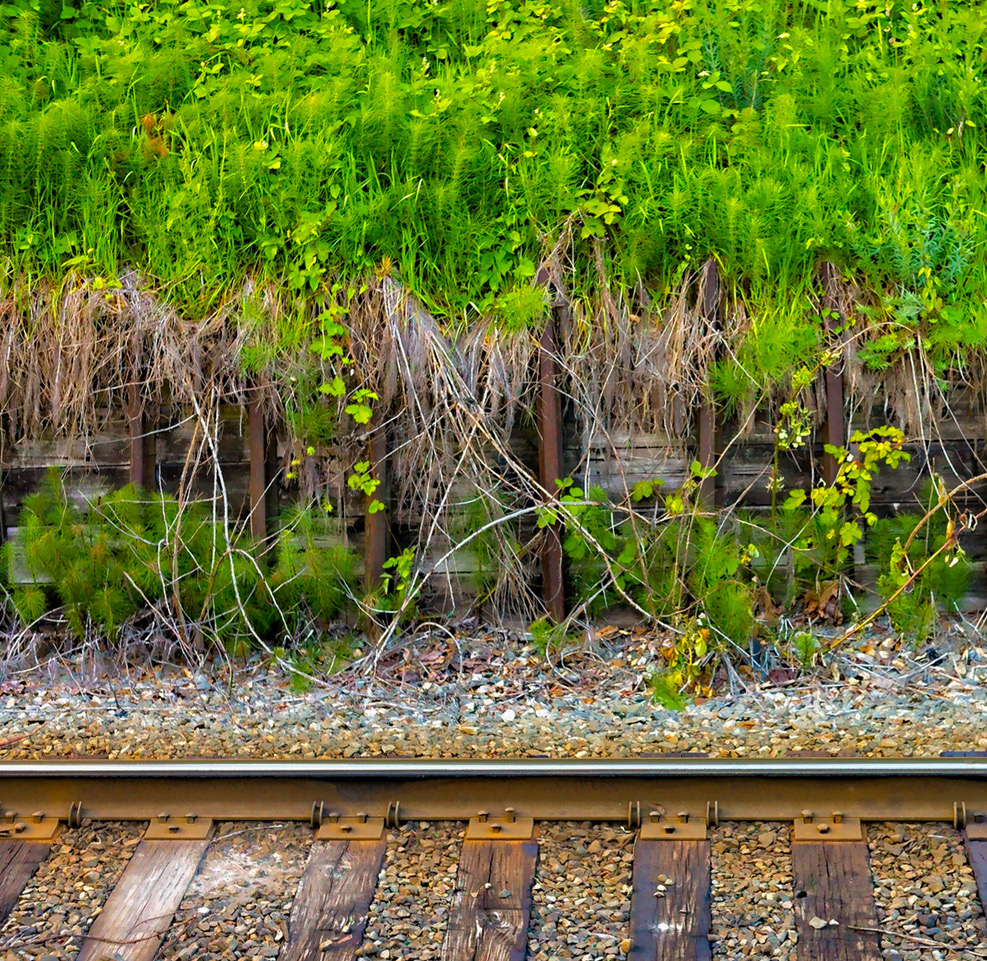
I used to live along an active Railway Right of Way in British Columbia, Canada.
On one of my walks, I decided to record the natural garden that borders the train tracks, admittedly a fair distance from my home.
I was hand holding a Nikon DSLR Camera with a 35-70mm zoom lens set to an aperture of f/8 and a shutter speed of 1/60th off a second.
I spot focused between the tracks and vegetation.
What drew me to the subject was the relative simplicity of the scene.
For me, the image symbolizes a symbiotic relationship between humans and nature.
The fact that it was a cloudy day with no direct sunlight is often a bonus when photographing vegetation.
4 comments posted
My only suggestion is that I find the green at the top a little overwhelming. It is very strong and there is a lot of it. So for me it tends to grab attention and not want to let go. Also it is not as sharp as the stuff at the bottom - it looks like it is pushing depth of field at f8.
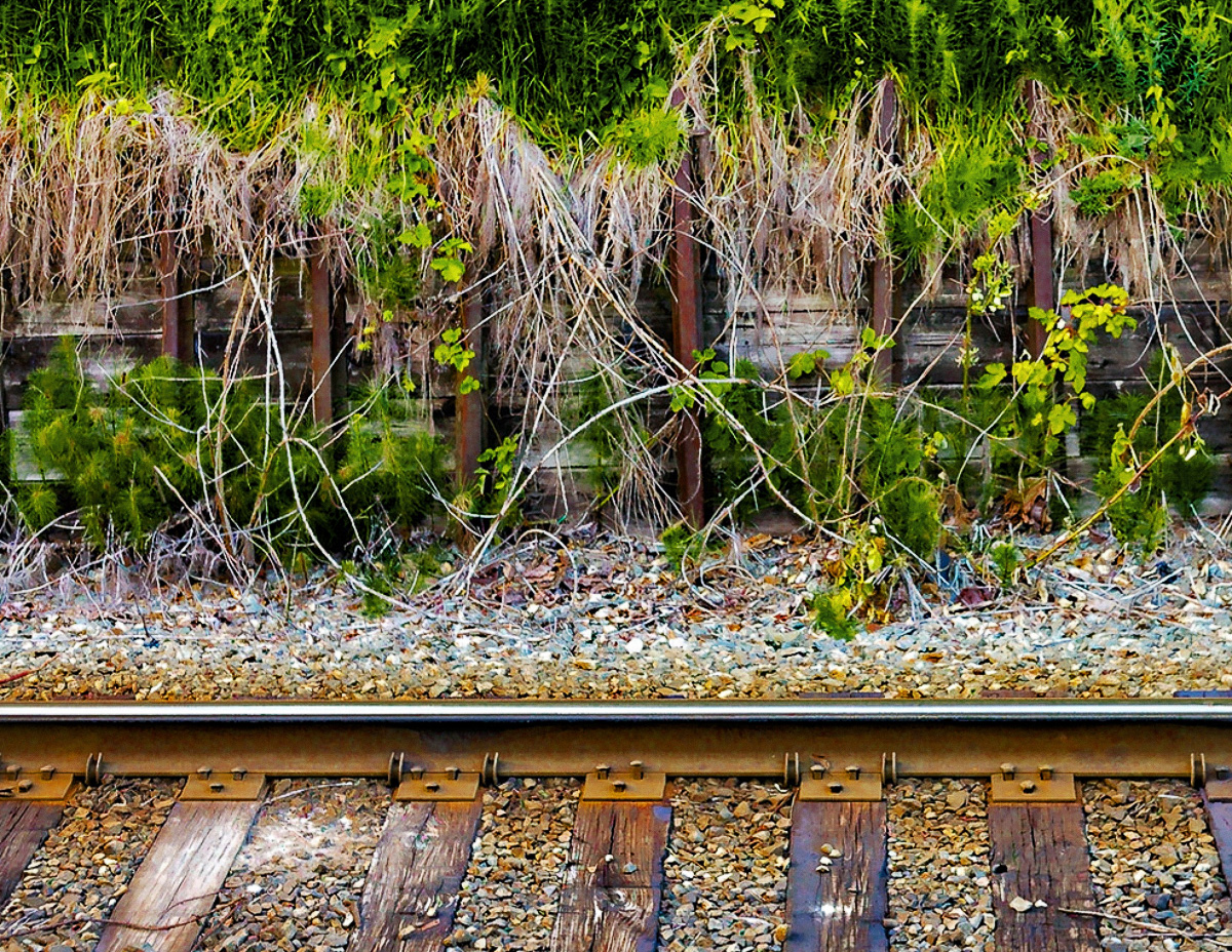
So I tried a couple of things to maybe help with this. First I dialed the green back a bit both by dropping the saturation and by adding a b&w layer in photoshop set to luminosity blending and adjusting the greens and yellows. This breaks up the solid green with more shadows and highlights. But then I didn't think that was enough, so I decided to crop. I pretty aggressively came down from the top, because I really love the bottom part of the image. But you've expressed that the image speaks to the symbiotic relationship between nature and humans, so you might want to keep more but play with not keeping "all of it".
It's easy to make great images of the famous locations and epic overlooks. But it is always impressive to me when someone takes a more everyday scene and turns it into compelling art. Very nice!
Posted: 11/16/2024 13:52:08
It is so great to get opinions and suggestions from other photographers.
I really appreciate your thoughts. My initial reaction is to meet you half way, by reducing the intensity of the green (although the intensity of the green was actually present due to the atmosphere resulting from the time of day and recent rainfall), and by cropping a smaller amount from the top of the image.
Posted: 11/16/2024 16:52:41
Thank you for sharing.
Interesting theme - "relationship between humans and nature"
I think the volume of greens at top is good enough. I do not feel to crop down.
It shows the vitality of the plants. It looks powerful for me compared with the man made object.
And 1x1 format fits well in this scene for my eye. Good try! Posted: 11/19/2024 12:16:08

