Kenneth Taylor
About the Image(s)
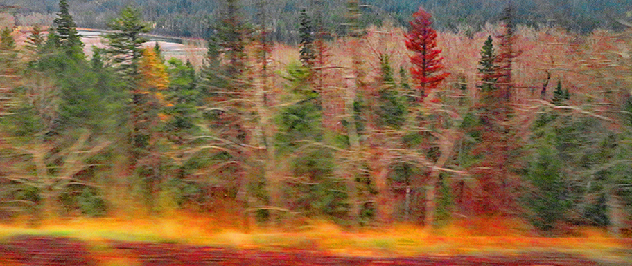
The image was captured enroute from Portland Oregon to Chicago during the fall from a moving train. I chose this image because of the variety of colors. I tried to bracket the shutter speed to reduce the blur, but hadn’t reached an acceptable shutter speed when this image came into view and was taken. It was tightly cropped for the purpose of focusing on the forestry, and minimum color adjustments made.
3 comments posted
Hi Kenneth. This is a lovely shot which to me is all about the colors and textures. I particularly like the lighter colored (sort of white) branches which sweep in a horizontal direction and add to the feeling of motion.
There are a couple of things though which detract from the "abstract" sort of intentional movement feel. First is the bright water in the upper left - it is both not blurred (because it is further away and the angle changed less) and bright. The second is to a lesser extent the whole background nearer the top of the image. The eye tends to go to sharper areas, and so for me, my eye wants to go up near the top edge and stay there too much. Finally while the colors are beautiful, for me again, they are a bit overpoweringly saturated.
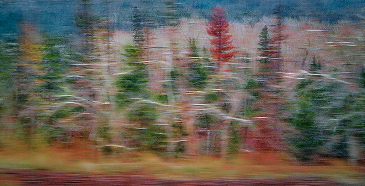
This is the kind of image that you could take in many different directions. But as one possible direction, I decided to commit to the intentional movement and an even more abstract approach. I eliminated the water at the top by cropping some from the left (the brighter branches at the left end are less horizontal so they don't flow with the rest of the image), and then using generative fill in photoshop to replace the water remaining. I decided to emphasize the branches I like so much by lightening them individually (that took a little brush work). Then I desaturated things and added a vignette. Finally I copied the image, did a motion blur horizontally of about 50 pixels, and then layered that on top with about 50% opacity. This "commits" to the abstract look, and fixes what might be a problem in that some stuff is in blurred and some not - enough so that someone might question whether the blur is intentional.
Again this is just one possible look. There are a lot of different ways to develop this particular image, but I very much like the "dancing" theme you've captured.
Posted: 11/16/2024 15:50:58
Hi Kenneth,
Your image conveys a great sense of motion!
I am guessing you may have cropped the original file from both the top and bottom.
If that was the case, I would suggest an alternative approach to focusing on the trees and colours.
Consider, as an option, maintaining the original file and use linear gradient masks or a vignette to darken and perhaps desaturate the top and bottom of your scene. Posted: 11/16/2024 18:19:42
Hi Kenneth,
Thank you for sharing.
I am attracted by the motion blur. The colors are one of good feature of this image, but what makes this image unique is the motion blur.
I prefer to see the back ground more. It is not blurred, and the contrast of motion vs sitting still looks interesting to me. Posted: 11/19/2024 12:03:39

