Ed O’Rourke

August 2026 - The Other Oregon
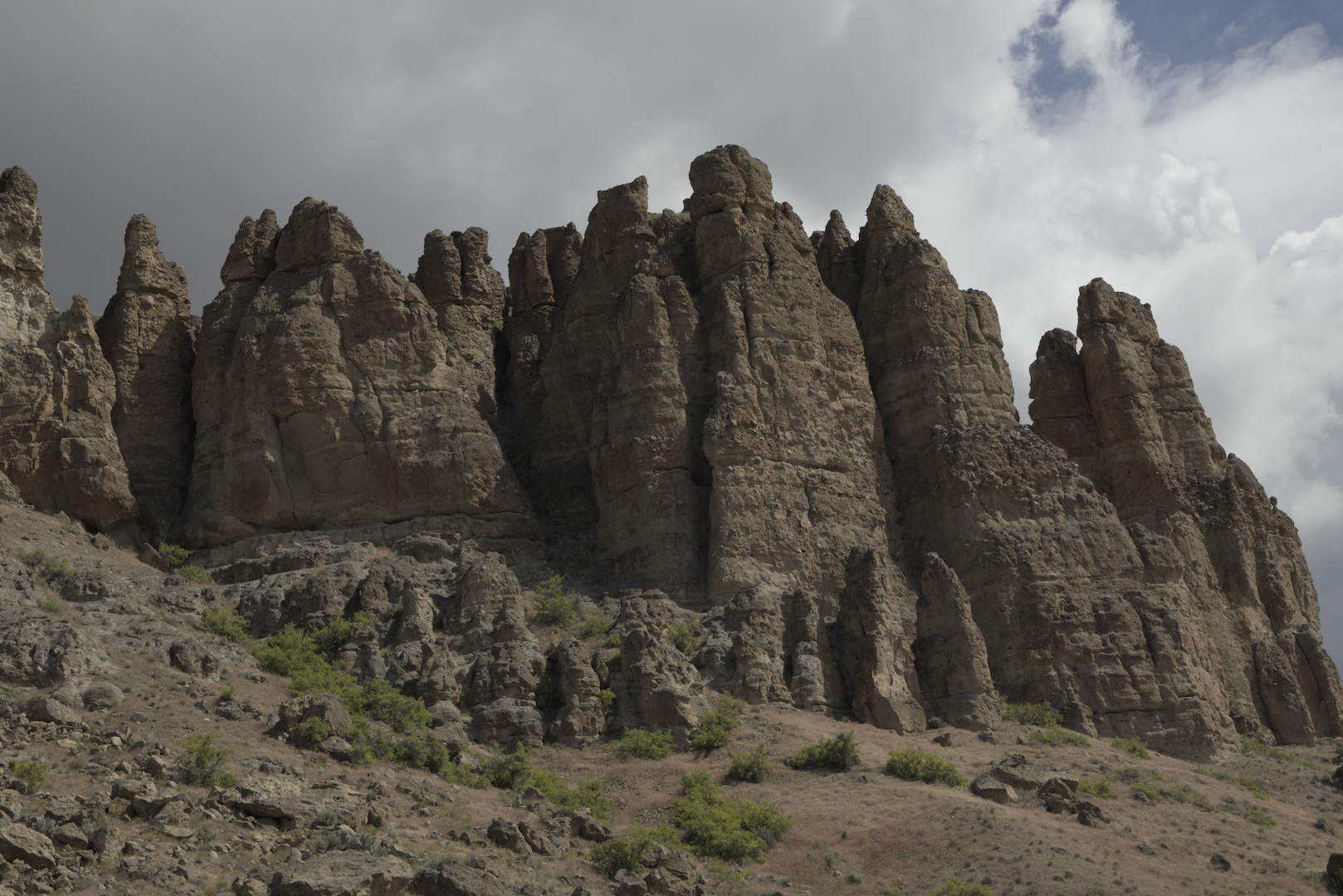
Original
About the Image(s)
I first shared this image in June 2024. This time I chose to go with a vertical crop so I could bring attention to the formation in the center and, hopefully, bring attention to the imposing height of the rock formation. I adjusted the exposure, specifically with the shadows and highlights. I then worked on the color balance and saturation to bring out more of the colors. Do you think I over saturated? After that I worked on the color contrast, hoping to make the image "pop" a little bit more.
I took the shot with my Canon R; RF 24-105 mm lens at 56 mm; aperture f/16; shutter at 1/200 and ISO 160.
5 comments posted
Carol Dunn-Martinez
I like the crop brings out the texture and does show the imposing height. The saturation makes it look like the sun is peeking out of storm clouds. It might be a tad bit yellow. Posted: 08/05/2026 10:19:48
Bob Gray
I like it as is, I don't think it's oversaturated. If it were in B&W, I would think it was a frame from a 50's Sci-Fi movie. Ha, ha. Posted: 08/10/2026 20:59:01
Hi Ed. I have not seen the previous horizontal image, but i think this works better in a vertical crop since your main focal points are vertical. It makes for a stronger composition like it is. Weel done. I also see the picture of a 50's Scifi movie that bob mentioned :). Posted: 08/11/2026 19:13:25
I love this crop better. I would suggest you isolated the greens and take some of the yellows out of them. Yes I see the team from star trek energizing at the bottom of the rocks. Posted: 08/12/2026 18:05:02
Dawn Gulino
Hi Ed, I like the crop as well! To me, it's a bit too saturated, but that's my thought and seems others like it, so totally personal preference as always! I think I'd darken the clouds a bit more and add some contrast to see if it adds more details and they look ominous!
Posted: 08/21/2026 21:09:28
Posted: 08/21/2026 21:09:28