Darcy Quimby
July 2025 - Standing Alone
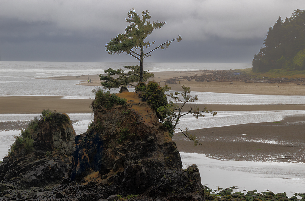
Original
About the Image(s)
Camera: R7 f10 1/125 ISO 200 Lens Canon RF 24-240mm
BackStory: This was my first time heading north of Port Orford on the Oregon Coast. Spent the weekend in Lincoln and dealt with some rain. This tree was near Taft Waterfront Park at low tide. I took this from my chair at low tide looking across at the tree.
In Post Opened in ACR upped the exposure,contrast, shadows and whites. lowered the highlights, and blacks. Brought it into PS where I added a curves layer and brightened the midtones. I used selective color to adjust the reds in the image. I added another curve layer and masked the tree to bring out the personality of the tree.
I selected the sky and brought out the clouds.
5 comments posted
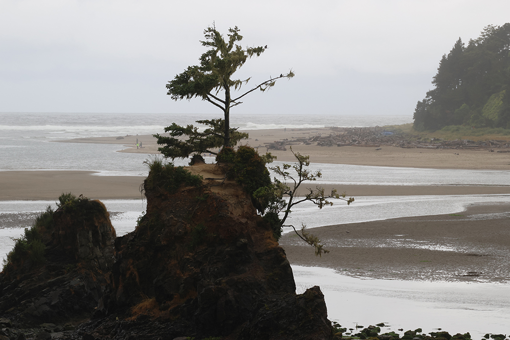
One of those images where the elements did not want to cooperate. Therefore a very mono chromatic image. The scheme itself is pretty but not sure what happened to the tree on the top of the little hill. There see a bit of selection artifactics and maybe shadows that have been lifted too far Posted: 07/13/2025 15:24:13
Francois
I think it might have been either a compression issue or I did not have a great mask going on. You mentioned mono chromatic. I might try this in BW. Posted: 07/13/2025 19:39:27
I think it might have been either a compression issue or I did not have a great mask going on. You mentioned mono chromatic. I might try this in BW. Posted: 07/13/2025 19:39:27
Dawn Gulino
Darcy, I like the balance of the tree in the foreground with the right side background balancing it out a bit. I agree with Francois, perhaps in B&W and the tree does look a bit funky in your processed image. Posted: 07/24/2025 01:54:17
I'm comfortable with this photo, but that's perhaps because it shows the conditions whenever I go out to take photos. The daily marine layer mist that we always get does make for flat lighting which can be a problem but I think you've been successful in bringing out a nice level of softness.
I think you have two photos here: the tree on the rock in the foreground; and the beach scene in the background. The foreground image tends, in my opinion, to screen out the background image and I'm not sure they work well together.
I picked up on Francois and Dawn's comment of B&W so I gave it a try. I think it looks better in B&W, what do you think? Posted: 07/24/2025 16:59:53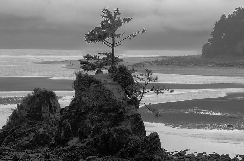
I agree thanks Ed for doing that for me. I also think the two 'scenes' are less obvious in B/W Posted: 07/24/2025 18:48:03