Jennifer Marano
About the Image(s)
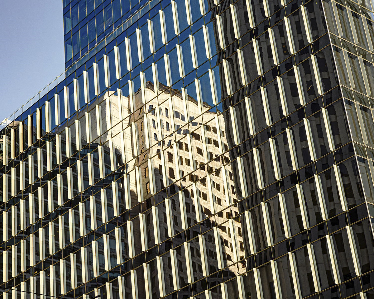
I used my Olympus camera and a 12 to 100 mm lens to photograph an interesting mix of shadows, light and reflections on a building in the downtown area.
Technical: f/4 at 29 mm, 1/4000 sec, ISO 400.
7 comments posted
A very interesting image. I don't mind that the building is leaning. You have added enough lean to assure the viewer that it is a purposeful effect. Posted: 11/10/2024 20:46:32
Thanks Chan! Posted: 11/10/2024 22:00:43
I like this image - consider a tighter crop and perhaps monochrome. We know it a building (the sky adds little to the image). The detail and different glass/textures add interest. Please see a similar image I shared with Group 86 in September. Reflections in skyscrapers are a great subject! Posted: 11/10/2024 23:08:09
Thanks Steven. I will experiment with a tighter crop and also try monochrome, though I really like the blue color. Can't know until I try! Posted: 11/10/2024 23:22:02
Very interesting photo! To my eyes, the reflection seems to create a "building" within a building effect. Very interesting! The composition and details are excellent as is your handling of the light and reflection. Thanks for sharing this photo with us! Posted: 11/12/2024 00:46:34
Thank you for your comments, Dale! I found it very interesting how much the shadows affected the reflections. Big cities are like kaleidoscopes in a way! Posted: 11/12/2024 01:50:22
Though I appreciate the idea, concept and visuality of the what this composition is trying to present, the overall visual effect in creating an engaging image is not accomplished: why?
As Steve suggests, the sky adds nothing, but more so, the sky "distracts" and seems very out of place ... the slant of the building, too, does nothing but add a component one would deem as not "constructive" towards a creative goal.
To salvage the scene, one might try a very tight Square format crop and then convert to B&W.
Posted: 11/20/2024 11:10:20
