Michael Hrankowski

December 2023 - Photo-Op at the High
About the Image(s)
On a recent trip to Georgia, we had an opportunity to visit the High Art Museum. The architecture of the High has some interesting features and I found myself taking several shots with my iPhone.
I had stepped out of one of the Galleries to wait for my friends to catch up when I spotted these two people across the way and one level up.
The woman was posing while the man took her picture and I took theirs. Image was converted to monochrome and edited in Lightroom with a 2x up-res in Gigapixel.
This round’s discussion is now closed!
17 comments posted
(Group 32)
Talk about telling a story in a photo! This is a great capture and a great story image.
You might experiment with cutting off a bit from the top or even the bottom to simplify the composition. I am not sure. Might be worth trying. Posted: 12/02/2023 17:54:14
You might experiment with cutting off a bit from the top or even the bottom to simplify the composition. I am not sure. Might be worth trying. Posted: 12/02/2023 17:54:14
Thanks, Stephen. Appreciate the comments. And yes, as I look at it again I think I ought to have eliminated entirely the soffit at the top of the frame. Initially I chose to simply darken it with a gradient, but it didn't serve to completely eliminate the distraction. As to the bottom, I cropped it so the ramp would emerge from exactly the corner of the frame, but the wedge below the ramp I see now doesn't add much of anything to the composition. Based on your recommendations, I'm going to have another go at it. Thanks again. Posted: 12/03/2023 09:49:26
Stephen, I think cropping from the top did improve the composition. Regarding the bottom, my original had a negative linear (diagonal) gradient to darken the wedge. In this image I did the reverse, and I like it better. Posted: 12/04/2023 18:47:27
(Group 32)
Michael, thanks for showing this. I am happy to participate in the conversation. Posted: 12/04/2023 19:23:42
Micheal this is a great conversation!
Off the bat, I suggest, maintaining a certain amount of continuity is important for an image like this, and the featured work does this best ...simply, the featured work is balanced, including the dark rectangular shadows across the bottom that balance the two people, and as important, the upper diagonal balances the diagonal of the steps, all forming "continuity".
The featured image really does represent visual cues associated with, what I like to call, "true" street photography compositions. (See the work of Gary Winogrand for a prime example of narrative-ambiguities ... he is known for). Posted: 12/10/2023 08:07:27
I like the idea of the 2 bodies of in the 2 frames. i do agree that a closer crop keeps the attention more on the subject as Michael suggested.
Posted: 12/08/2023 05:18:10
Posted: 12/08/2023 05:18:10
I again find myself in the minority, it just doesn't work for me. The lines are crystal clear and the contrast of the bodies with the walls and surrounding area is great.
I think what I enjoy most about your photos is your courage to try something I would not think of. It is not that during the course of my life I haven't gone off on a lot of deep ends trying stuff, just not with photography. I'm sure I don't have to say this, but keep it up, because viewing your work helps expand mine. Posted: 12/08/2023 08:46:30
I think what I enjoy most about your photos is your courage to try something I would not think of. It is not that during the course of my life I haven't gone off on a lot of deep ends trying stuff, just not with photography. I'm sure I don't have to say this, but keep it up, because viewing your work helps expand mine. Posted: 12/08/2023 08:46:30
Hi Mark. No worries. I appreciate your honesty.
Since this forum is about getting feedback about how others view our work, more helpful would be for you to expound a bit more with your comments. What about it doesn't work for you? Is it the genre? Subject matter? Style? Composition? If you had been there with camera in-hand, is the scene something you would photograph? If not, why not?
Equally important would be for me to understand what it DOES take for an image to resonate with you? Mind you, I'm not asking these questions to challenge you because I'm offended by your comment - I'm most certainly not. But rather knowing the answers will help me better understand your thought processes as they pertain to YOUR work. I look forward to your additional commentary. Posted: 12/08/2023 09:12:24
I get it! Posted: 12/08/2023 09:19:49
Thanks! Posted: 12/08/2023 10:11:42
I like it Michael! I feel the suspense, way better than showing the whole thing. I actually don't mind to have the top diagonal line at all, seems to me it serves as a continuation of the story. Posted: 12/08/2023 13:48:20
Don, for an alternative critique, see my comments above. Posted: 12/10/2023 08:11:06
Hi Michael, I like the concept-leading staircase to the subjects-leaving viewer to imagine about the subjects. I thought the light is too even throughout the photo. I would most likely use a linear gradient to lower the intensity a bit for the bottom half. That way it is not drawing same amount of attention as the top half. Posted: 12/09/2023 08:56:20
Hello there Michael
I have the benefit of coming into the conversation (very interesting) late and I can say straightaway that the reworked image with the straight line appeals to me more than the original because it brings the focus more clearly onto the two people - or what you can see of them. But apart from that, it's voyeuristic in a sense because you are observing a moment between two people. Because it's street photography you don't have a lot of time for composition but you achieved it anyway and you captured a good story. Posted: 12/12/2023 05:46:38
I have the benefit of coming into the conversation (very interesting) late and I can say straightaway that the reworked image with the straight line appeals to me more than the original because it brings the focus more clearly onto the two people - or what you can see of them. But apart from that, it's voyeuristic in a sense because you are observing a moment between two people. Because it's street photography you don't have a lot of time for composition but you achieved it anyway and you captured a good story. Posted: 12/12/2023 05:46:38
(Groups 7 & 67 & 73 & 97)
Michael - a terrific opportunity shot - your image again has a good degree of impact, a lot of visual interest and best of all it tells a fun story due to its obvious uniqueness, i.e., you just don't see shots like this every day. On the downside, the image has a ton of distractions which really draws the viewer's eye - see my VF and LMK your thoughts.
Best, Posted: 12/19/2023 10:08:20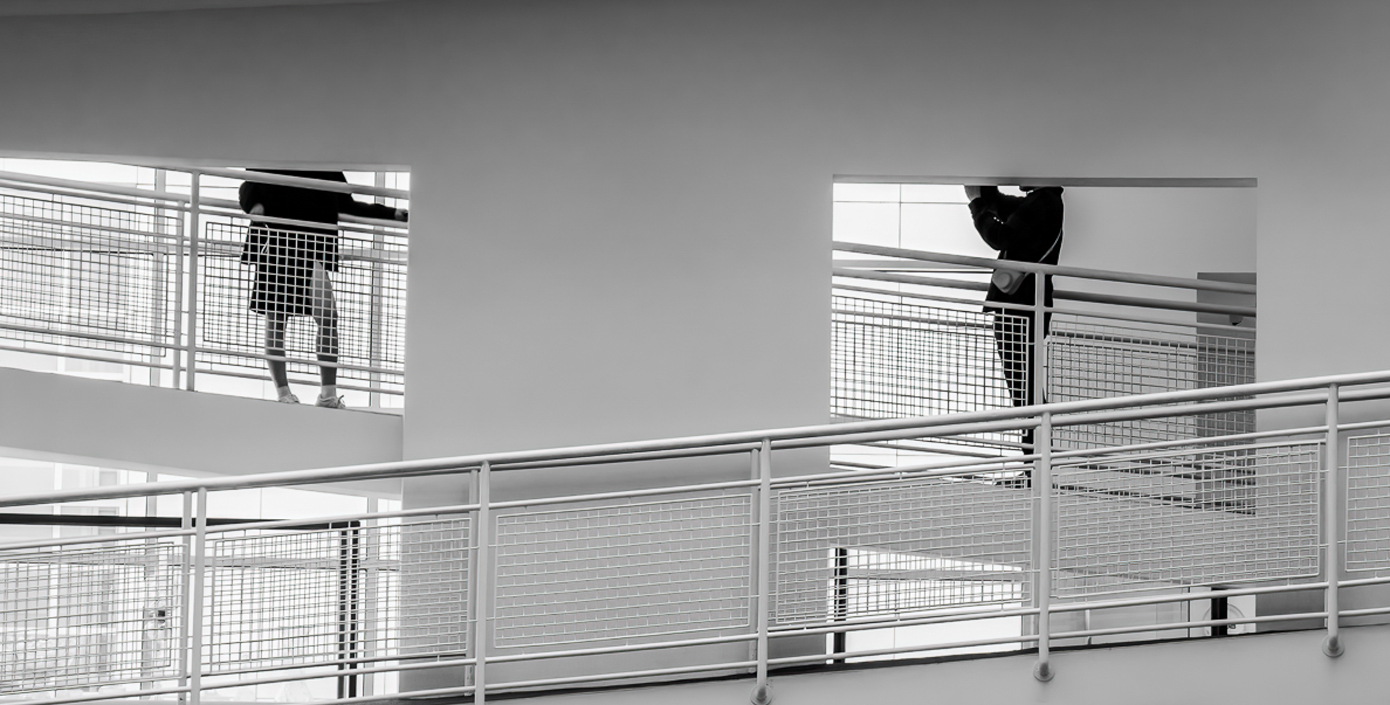
Best, Posted: 12/19/2023 10:08:20
Butch, thanks for your perspective on my image. Any and all feedback totally welcome! I often struggle with how much context to include. In my professional career I shot macro daily for thirty some odd years and I've gotten feedback that I ought consider including more context in my images when doing so would enhance the story.
Your version certainly works - and I had considered a tighter crop while editing. In the tight crop version, the story is focused entirely on the two people. In the wider version, the story becomes not only about the two people but also about their relationship to the larger, empty space as a whole - which is the story I ultimately wanted to tell. Thanks again for your commentary and visual feedback. Posted: 12/19/2023 10:29:50
Your version certainly works - and I had considered a tighter crop while editing. In the tight crop version, the story is focused entirely on the two people. In the wider version, the story becomes not only about the two people but also about their relationship to the larger, empty space as a whole - which is the story I ultimately wanted to tell. Thanks again for your commentary and visual feedback. Posted: 12/19/2023 10:29:50
Micheal this is a great conversation!
Off the bat, I suggest, maintaining a certain amount of continuity is important for an image like this, and the featured work does this best ...simply, the featured work is balanced, including the dark rectangular shadows across the bottom that balance the two people, and as important, the upper diagonal balances the diagonal of the steps, all forming "continuity".
"Street Photography"
The featured image really does represent visual cues associated with, what we may refer to as "true" street photography compositions. (See the work of Gary Winogrand for a prime example of narrative-ambiguities ... he is known for). Whether or not a Winogrand scene is ambiguous or not, the use of space to define a sense of "place" helps establish where/how (Winogrand) and spectators did/may interpret the scene.
Posted: 12/20/2023 05:41:14