Mark Holbrook
September 2023 - Dinosaur National Park and Walden, CO.
Original
About the Image(s)
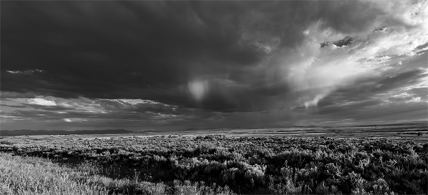
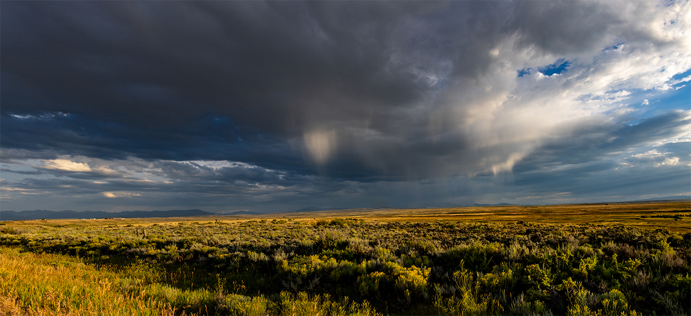
This landscape was taken during the golden hour, and was as dramatic as I’ve seen in a long time. We were traveling from Dinosaur National Park and Walden, CO. The scene was brilliant. I think the only thing done to the photo was conversion to B&W and resizing for the web.
This round’s discussion is now closed!
4 comments posted
Hi Mark, I like your B&W interpretation but I think the original looks better.I think the sky in this landscape photo looks great in B&W but the foreground does not translate in B&W well. The light at golden hour beautifully highlighted the field and separation of yellow and green gave more granularity. Posted: 09/10/2023 13:29:30
Hello Mark,
I'm often caught on the horns of a dilemma when viewing a given scene in color along side the monochrome counterpart. As Lance so often points out, we ought not be comparing one to the other as to which is "better", because they are two separate animals, each with their own merits. That said, I still find it difficult to refrain from making the comparison. So, I confess that I prefer the original color version.
In your monochrome version, the beautiful golden hour light on the plain seems to get lost. While I see and appreciate lots of texture, the impact of that golden light doesn't translate for me. In the absence of the foreground color, my eye is drawn immediately instead to the brightest portion of the sky in the upper right. The monochrome version then becomes for me more about the sky than the land.
In my visual feedback, I cropped such that the sky becomes the subject and the land plays the supporting role. It must have been amazing to witness the scene in person.
Posted: 09/10/2023 16:13:57
Posted: 09/10/2023 16:19:12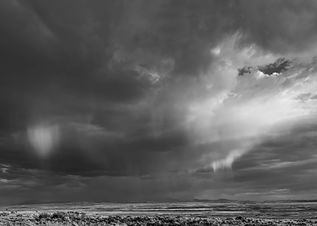
Good morning, Mark!
Well, the actual scene is worthy as subject in both a painting and photographic print, but I must suggest fundamental issues detract from the featured work:
1. The focus is not clear. I do not believe this is a resolution issue. One of the main reasons, and in my opinion, the B&W is not working, is in fact, the color version, too, imbues a sense of conflict between the foreground hay, weeds, and associated grass. This can be a factor of i. blowing wind swaying the foreground grassland, and ii. simply poor focus. In either case, in this particular instance, this is causing a visual conflict or what I term, "visual overload".
2. The B&W treatment, though bold, and indeed, a valid choice in the tonal gamut for this scene, is also increasing the foreground "visual overload" I speak of.
One remedy for this particular image is to redo the B&W treatment, choosing a slightly (less) contrast aesthetic.
We can discuss additional ideas, concepts and general thoughts on photographing this scene (and others like it) if you all want to. We can continue here or on the Bulletin Board. Thanks, guys! Posted: 09/23/2023 06:46:59