Michel Biedermann
About the Image(s)
TECHNICAL: 1/80 @ F/11, ISO 1000, 142mm (EF70-200mm f/2.8L IS II USM)
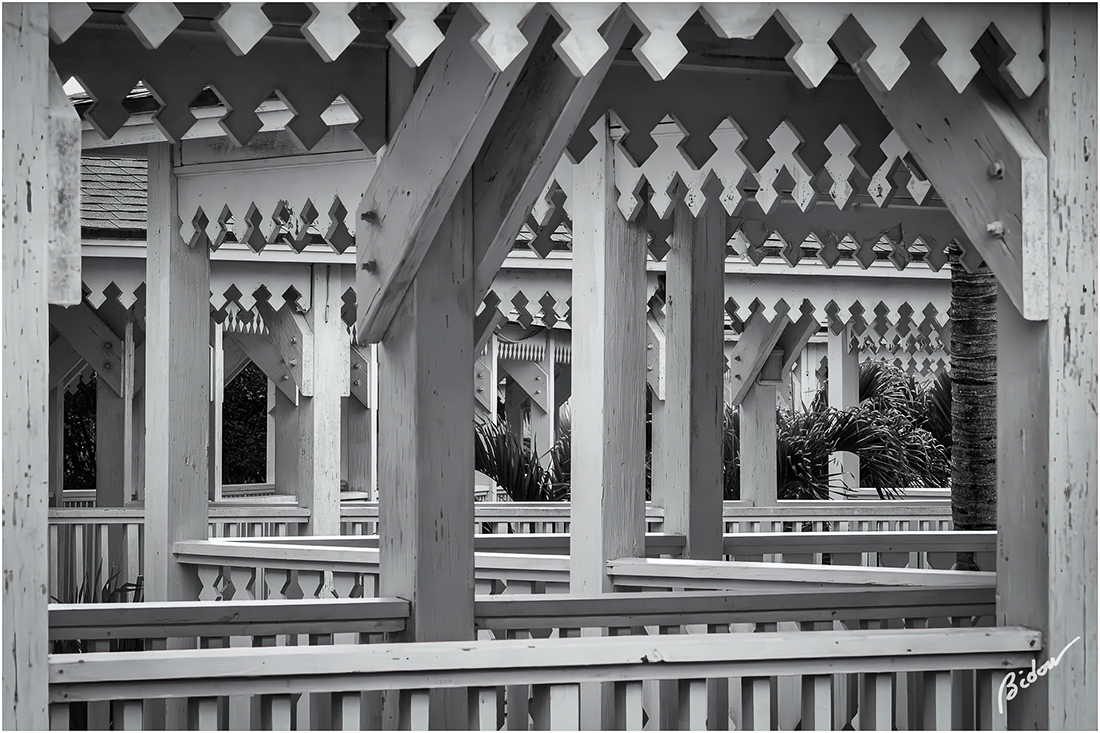
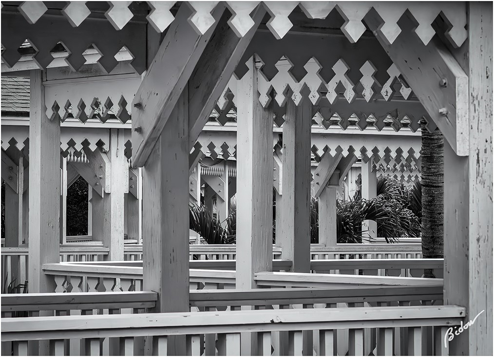
BACKGROUND: I took this picture at my favorite scuba diving resort in the Caribbean. I like the zig-zagging patterns but struggled with how best to straighten in.
PROCESSING: Minimal processing in Lightroom Classic. Used Nik Silver Efex to render monochrome and On1 NoNoise to remove noise and sharpen. No generative AI was used. The hardest decision was how best to straighten the picture. It's debatable which straight lines would look best
3 comments posted
Hi Michel. What a confusing maze! ...but it makes for an interesting composition. Leading lines galore as well as zig zags, shapes and patterns. Your post-processing gives the image a lot of depth. As to your question, I think your choice of perpendicular verticals to be the correct choice. A fun image that lets my eye linger and enjoy. Posted: 11/06/2024 23:14:11
Elsie Allen
This is a very neat looking!
We have vertical, horizontal and then, a pattern added into the mix to make this a very engaging image. Good eye in seeing, composing and successfully registering these intricate patterns and shapes. I would change nothing. Posted: 11/20/2024 11:17:24
We have vertical, horizontal and then, a pattern added into the mix to make this a very engaging image. Good eye in seeing, composing and successfully registering these intricate patterns and shapes. I would change nothing. Posted: 11/20/2024 11:17:24

