Clark Anderson
About the Image(s)
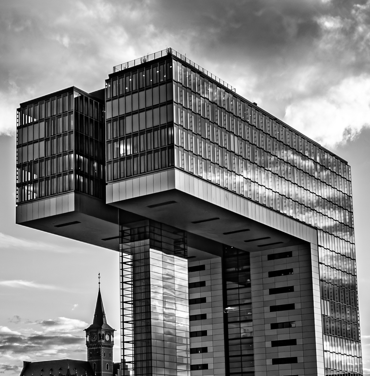
This photo from the river in Cologne contrasts the very modern building with the much smaller and older church. I see the church spire trying to point to the sky but being overshadowed by the building.
4 comments posted
Clark - I love the 200 (?) year contrast, or is it conflict, between the buildings. Would it have been possible to show less of the sky and more of the lower parts of the buildings and church? Either way, I very much enjoy modern architecture so this picture really resonates with me. Thank you! Posted: 11/06/2024 23:55:13
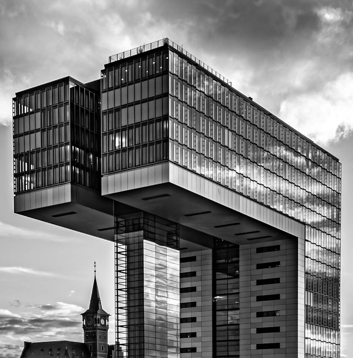
Hi Clark. I really like this sort of architectural image. The modern building is interesting in and of itself and the addition of the old church gives a really nice contrast both in tonality and architectural era. I like your post-processing, but the skewed angle of the modern building is distracting from an otherwise pleasing composition. In my visual feedback I used the Transform tools from within Adobe Camera Raw to straighten the perspective. Posted: 11/07/2024 00:06:47
Elsie Allen
Hi Clark,
I really appreciate the concept you have presented.
The clouds' reflections on the mirrored panels are beautiful!
I agree, the modern budling is swallowing the church. But a bit more of the lower portion of the buildings (especially the church) might improve the viewers perception of the relationship between these buildings. Posted: 11/07/2024 23:34:34
Good day, Clark!
I very much like what is going on here ... my thinking echos Michel's and I do like very much the straightening accomplished by Michael.
Overall, very engaging and narrative-provoking statement! Posted: 11/20/2024 11:29:17
I very much like what is going on here ... my thinking echos Michel's and I do like very much the straightening accomplished by Michael.
Overall, very engaging and narrative-provoking statement! Posted: 11/20/2024 11:29:17

