Keith Francis
About the Image(s)
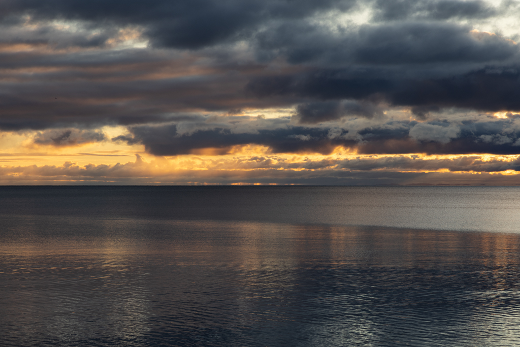
Rather simple image this month. I was visiting Duluth Mn last week and took this shot just before sunrise, facing east. The sky and clouds were so lovely to see while having a morning cup of coffee. It was cold that week but so enjoyable. I was there for 3 days and each morning the sunrise was spectacular.
Canon R5, f/11, ISO = 100, shutter speed = 1/80 sec, minor tweaking to light and colour in ACR and PS
5 comments posted
Laurie McShane
Keith, it's wonderful to see your shot as I live in Duluth. That big lake can be very moody, and you've captured it beautifully. I wonder if you might want to consider cropping the sky enough to eliminate the white gaps in the upper clouds, which would put the focus more on the wonderful glow above the horizon. Just an idea as it's a great shot as is. Hope you had a good time in our fair city! Posted: 11/01/2024 20:08:29
Hi Laurie, I tried a few different croppings to see how the image would look. I think it's an interesting idea but the few I tried made the sky a smaller portion of the image thus giving more prominence to the lake. I like the lake but the sky is the best part of the image in my mind. I like your idea though and will play some more, maybe cropping some of the sky and some of the lake.
FYI - love the Canal District and also the view from Enger Tower. Best lasagne this side of Italy is at Luce Pizza! Posted: 11/01/2024 23:45:54
FYI - love the Canal District and also the view from Enger Tower. Best lasagne this side of Italy is at Luce Pizza! Posted: 11/01/2024 23:45:54
beautifully captured, nice vibrant colors, though the composition is not typically 1/3rd the horizon is in middle of the image, but it kind of balances the frame. as Both sky and water have lot of character. Posted: 11/07/2024 12:32:16
I could ge lost in this image...for quite some time. Lovely. Not to be too much of a heretic, the white spots could have darker shades cloned in so the visual distraction is reduced. Another radical thought, the bottom third cropped off eliminates the water pattern, but emphasizes the sky and strongest reflection. Posted: 11/07/2024 14:50:11
Four levels of texture. A simple image but complex. Nicely seen. Posted: 11/09/2024 15:24:43
