Kurt Reinhard
July 2024 - White Tower under the clouds
Original
About the Image(s)
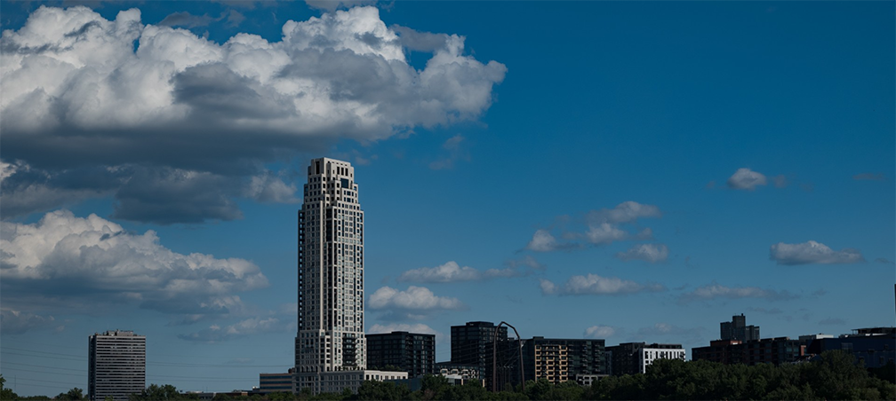
I took this picture using my Nikon Z5. F/7.1, 1/640 second, ISO 100, 52mm, at 5:58 PM on June 23, 2024. I took this shot near the Mississippi river in Minneapolis. I used a CPL (Circular Polarized Lens) filter on the lens of the camera. I thought I would try the filter to improve contrast on bright sunny days. The sun does not go down here until about 9:00 PM, so there was plenty of sunshine. I was struggling to get good contrast in this condition using the options on the camera and thought I would try a simpler approach. The only editing I did in Photo Shop Express was to crop, straighten, and a slight dehaze. So, I think the filter worked well. The photo is just east of downtown Minneapolis, so the tower is isolated from the rest of downtown. I believe the building is a newer condominium. I removed the fence because it looks terrible, and I thought leaving only half of the stone arch bridge would be a distraction. I have shots with less clouds, but I thought the large clouds crossing over an isolated tower gave the photo a bit of a foreboding feel."
This round’s discussion is now closed!
6 comments posted
Glad you cropped in enough to get rid of the fence and other distracting elements. Lovely lot of detail in the clouds.
I felt the base was a bit too dark and I had a play. I cropped in quite a bit on the left side to put the tower on the thirds. Using levels I moved the mid tone slider to lift the shadows a bit at the base.
See what you think? Posted: 07/09/2024 14:46:19
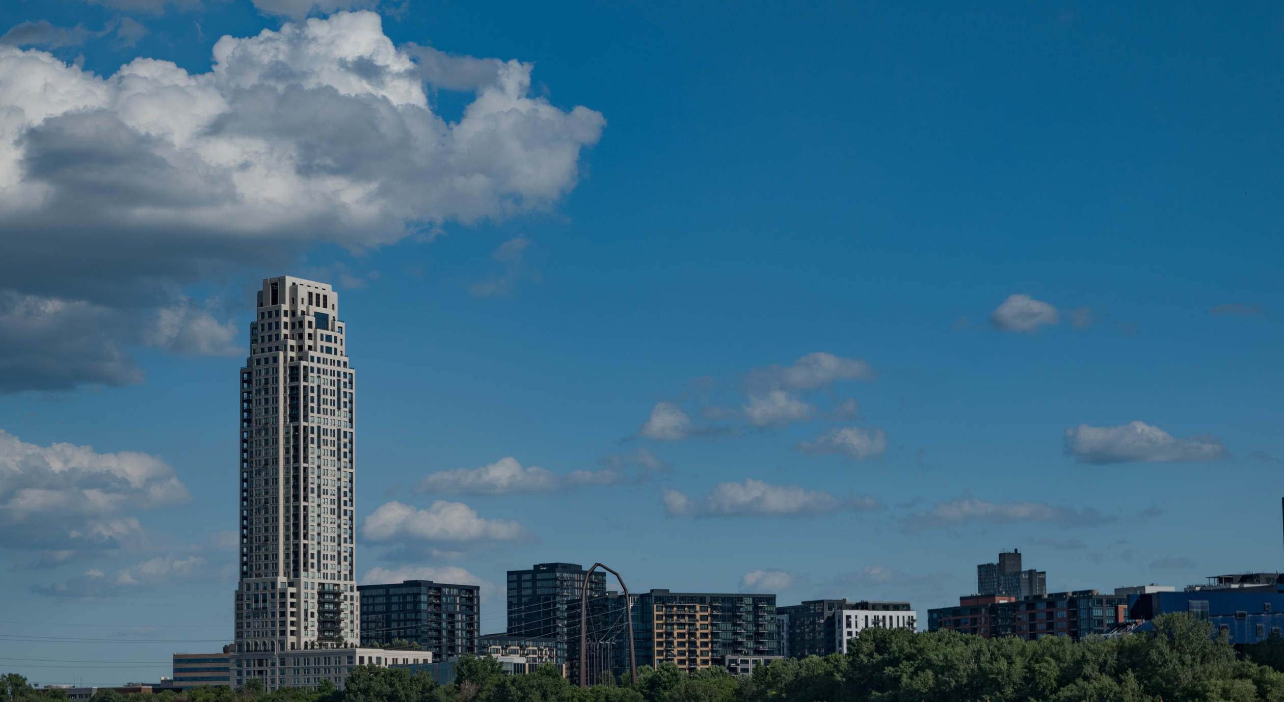
In either the original or the revised version you could experiment with bluring the other buildings in the composition for more impact and focus on the main subject in the image.
Great job and great storytelling! Posted: 07/29/2024 15:15:11