Randall Gusdorf
About the Image(s)
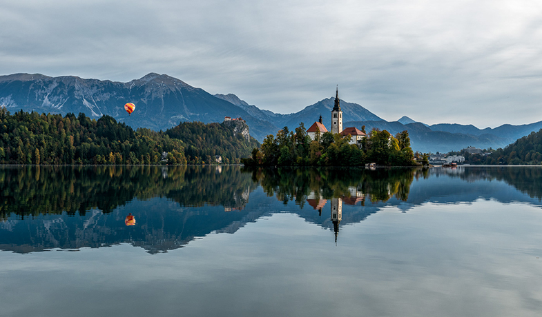
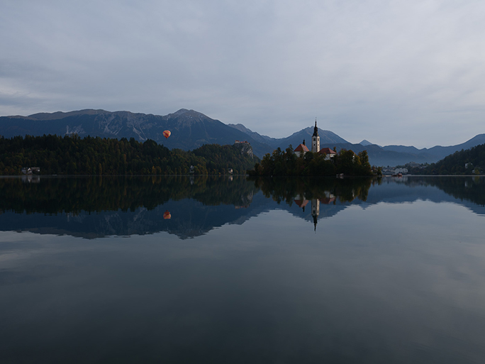
I took this shot in Slovenia a few weeks ago. Fujifilm 1/160s, 35mm, f9, iso 125. I used Lightroom and brightened it, added contrast and vibrance and saturation, clarity, decreased highlights and added shadows. Some other tweaks, and then took it to Color Efex Pro 4, and used Contrast filter and used Standard, as it deepened the colors and brought out the clouds and reflections. I also warmed it up too. It still seems too blue to me, but warming it more seemed to make it kind of ugly. I wonder if it is too saturated, but taking it down it seemed to lose its luster and effect.
6 comments posted
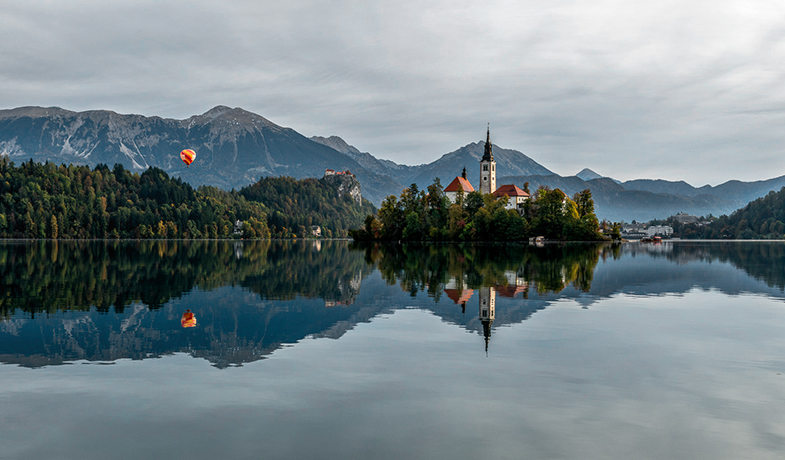
Angela, you are great. You modified the picture as I wish I had it. Now it looks like I vision it, and as I want it. Great suggestions!!!! Thank you. Posted: 11/04/2024 16:42:55
Kurt Reinhard
Randall. I really like the reflections. That is something that I do a lot, so I am glad to see someone else do this. The still water really keeps the detail in the reflection. I agree that the photo is a little blue. Reducing that gives a more natural look to the background. Good photograph. Posted: 11/05/2024 23:55:58
Very nice image. The symmetry works well. Your changes made a big difference as it no longer looks flat. I do like Angela's added changes. It would make a great photo to frame and hang on the wall. Posted: 11/06/2024 16:37:20
Love this image! I'm always thrilled to get a reflection in water with a beautiful landscape like this! Your edits were wonderful! I don't think it is too saturated at all. Well done! Posted: 11/08/2024 23:44:36
Randall, this is a stunning shot! The reflections and contrast bring so much depth to the scene, and the balloon adds a whimsical touch. Angela's tweaks with the reds and blue tones really complement your vision-an inspiring image! Posted: 11/11/2024 16:54:08


