Rose Norman
About the Image(s)
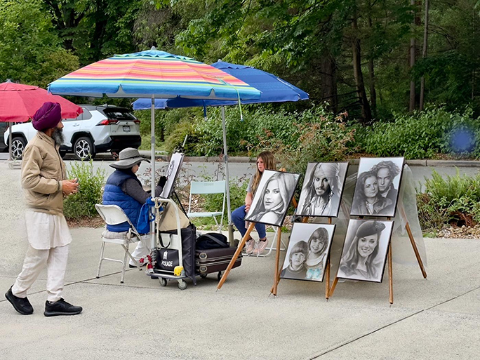
I took the photo in Vancouver of a Street Artist with my iPhone 14 Pro as that is what I had with me at the time.
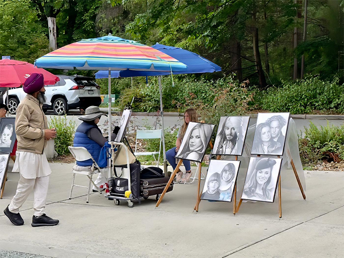
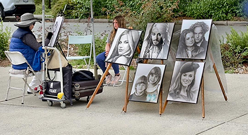
From the original I removed the part of another artist beside them, a light tree trunk, green box and the bottom left of the sidewalk. I also darkened the paintings that were on display.
7 comments posted
Some people are so clever and talented. Always have wished that I could draw!!
You did well to take out the other drawings from the left side. Darkening the drawings really has brought out all their details. Two of the people I recognise!!
I have tried an even closer crop to really concentrate on the artist and her drawings. See what you think?
Well done. Posted: 11/03/2024 16:25:47
I did like the crop. I had taken another photo that was similar to your crop. I wanted to include the person walking by as he was looking at the artist and her work which I felt added to the story. Posted: 11/06/2024 16:47:51
Kurt Reinhard
Hi Rose. Good street shot. I think it is a good story shot, with the concentration of the artist, the interested third party, and what appears to be a young person who is a little bored. I really like the darkening of the paintings. That really brought out the detail. Just a 'proof reading' note: There is a blue blob on the right side of final photo that is not in the original. I find it a little distracting. Good Shot! Posted: 11/03/2024 23:26:55
Rose, these shots are not as easy as they look. Good for you to see this. I would have liked you to move to the left and doing that you would not have the car in the background, the bottom right of her face not cut into by the print and would see the artist's rendering of her picture in progress. That the artist's back would be showing without her face would not bother me, as it would add to the story, the drawing and the person being drawn. I do like having the other drawings in the pic, and would keep that moving left, as it adds context and supports the story. Posted: 11/08/2024 19:04:26
Rose this is a great capture! The edits really focus attention on the artist, creating a clean, impactful composition. Darkening the paintings adds depth, and removing distractions keeps the viewer's eye right where it should be-on the artist's work. I agree that cropping the left would focus more attention on the artist and the work. However the passerby does add to the storytelling of interest in the work. Posted: 11/11/2024 16:52:06
Great shot of this talented artist. I like how you darkened the images to make them stand out. I would love to see the work in progress, but sometimes that's just not possible and it also adds to the mystique of the photo…It leaves you wondering! Your photo tells a great story! Posted: 11/19/2024 19:51:26


