Kurt Reinhard
About the Image(s)
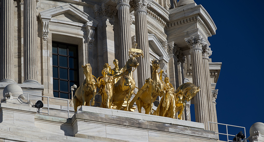
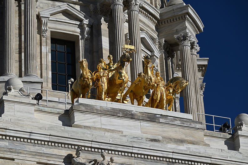
"The name of this sculpture is 'Progress of the State'. The sculpture is located on the portico of the Minnesota State Capital Building. I shot this using my Nikon Z5. F/9.0, 1/800s, ISO 100. I used my Tamron 70-300mm zoom lens, at 164 mm. The sculpture was created by Daniel Chester French and Edward Clark Potter and was added to the portico about 1906. It is steel with a copper sheeting covered in gold leaf. The two women represent agriculture and industry, and together they represent civilization. The four horses represent earth, air, fire and water. Together they represent nature and are carrying the man, who represents Minnesota, forward.
The state capital building was designed by Cass Gilbert who was living in St. Paul Minnesota at the time. The capital building was Cass Gilbert's first government building design, but it led to him also designing the state capital buildings of Arkansas and West Virginia, as well as the US Supreme Court building. The sculpture is meant to be the featured attribute of the capital building, so I thought it was appropriate to zoom in on this. My intention was to show the detail, but also give a sense that the sculpture is very elevated from the ground.
For edits I cropped from the bottom and the left. I also reduced the exposure of the horses by about 15% in Photoshop Express. I did that to bring out the detail on the sculpture as it was reflecting a lot of sunlight in the original. I was fortunate in that I was able to capture the details of the marble without any edits, and you can see that some of the marble blocks are darker than others. That is due to a recent restoration to replace the most worn of the nearly 120 year old blocks."
6 comments posted
You have done well to get so much detail in the horses etc. and the marble. Lot of detail in the shadows as well.
I did wonder about cropping off the right hand side a little to get rid of the top part of another building but it didn't look right!! I think it is because the image has been taken at an angle instead of straight on. I have not been there so do not know if that would have been possible?
Well done. Posted: 11/03/2024 16:14:58
I have attached a straight on shot of the state capital building with text of about where I was standing when I took the shot. As you can see, the capital building is a very large building, and I was standing at an extreme angle. What you were trying to crop is actually part of the same building. If you were trying to crop out the sphere on top of the column, you can see there is a something that matches on the left.
Thanks Posted: 11/03/2024 23:11:17
The crop at the bottom eliminates part of another statue which was distracting.
Perhaps eliminating the two black lights would allow more focus on the building and statues. Very nice Posted: 11/06/2024 16:42:53
You are correct, this is a photograph of art, not architecture. I need to do better at distinguishing. I have not heard the term documentary shot before, and I can look into that. Attached is an updated version with a tighter crop, and it does show much more detail. Thanks for the feedback, I do appreciate it. Posted: 11/10/2024 23:06:15

