Doug Wolters

August 2026 - Leafscape 42
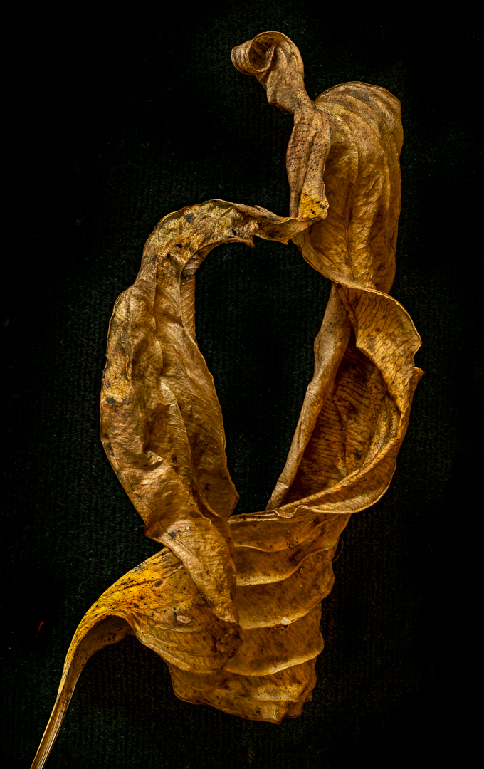
Original
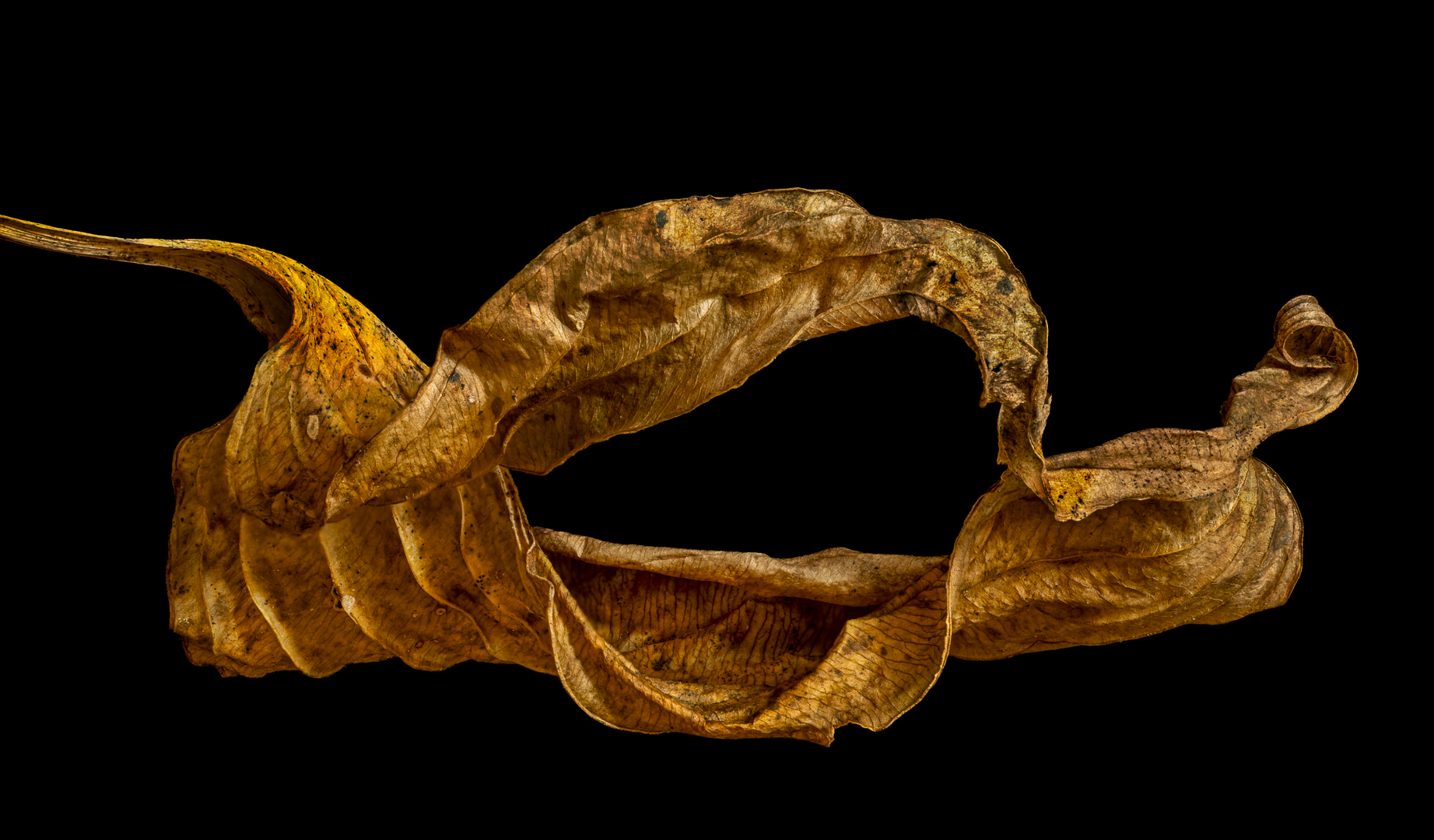
Original 2
Original 3
About the Image(s)
Shot with a Canon R6 M2, Canon RF 100 macro lens, 2.0sec. at f/ 9.0, stacked in Helicon from 23 images shot in camera. I've tried different orientations. Which do you like best? My wife does not like the orangey color. What do you think? Is the image worth all this trouble?
5 comments posted
Doug, hopefully I've placed the multiple versions as you requested. They all have great focus and toning (if one always loves the brown/tan tones). Since you asked, Orig 3 is the weakest and most of that is the weaker color. Composition is fine and in fact is better than Orig 2. Original is my least favorite orientation. Leafscape 42 is just right with orientation and color and no need to go 3 or 4 versions. Going forward it would be great for you to use your creativity and change up your color pallet and or subjects. Just my opinion. Posted: 08/10/2026 01:56:33
I like your final. Until I read Bob's comments I didn't stop to see the image was the same with different orientations. So without a stroke (border) I thought it looked like one image. I agree with Bob in seeing some different subjects. Posted: 08/10/2026 02:45:35
Hi Doug. I like both the orientation of your final and the original. Your sharpness and texture makes the leaf look very crispy and touchable. The black background makes it stand out well, and the I was encouraged to spend time exploring all of the shapes and textures. It might be interesting as a black and white image as well. Posted: 08/12/2026 18:55:38
Hi Doug
Greetings my friend.
I love the sharpness, the color tones and the appropriate background you have provided for this image and project.
This is a specialised genre. Nothing more to add.
Thank you for sharing.
Cheers.
Kamal. Posted: 08/22/2026 12:52:52
Greetings my friend.
I love the sharpness, the color tones and the appropriate background you have provided for this image and project.
This is a specialised genre. Nothing more to add.
Thank you for sharing.
Cheers.
Kamal. Posted: 08/22/2026 12:52:52
Hi Doug, you do these images so well, they look so large that you could almost touch it. I do agree with Ingrid, that it would look just as good in a monochrome, there's so much texture to work with. Well done.
Posted: 08/24/2026 10:36:32
Posted: 08/24/2026 10:36:32