Ingrid Lockhart

July 2025 - Columbine
About the Image(s)
This image was taken with my IPhone 14Pro while on a bike ride around our neighborhood in Michigan. I used the portrait mode. I was attracted to this bloom because of its pristine condition and the way the light was reflecting off of it. In post-processing, I cropped the image, replaced the background with black, and increased vibrance and clarity, Then I finished it with a stroke and my signature stamp. I'm always amazed by the fact that some of my favorite images require very little adjustment in post-processing.
10 comments posted
Stunning! To be very picky, I'm not sure I like your initials in the bottom corner. To me, it draws my eye away from the flower. Maybe fade it out some? Also I feel the stroke could be a little thinner or perhaps the blue from the flower? It seems a little heavy and sort of takes my eye away from the flower. Very nice though overall.
My attempt. Posted: 07/06/2025 05:25:58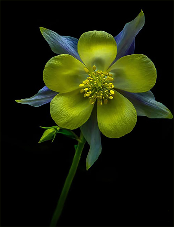
My attempt. Posted: 07/06/2025 05:25:58
Thanks, Marti. It's nice when a critique only talks about the stroke and signature! Posted: 07/19/2025 23:25:37
Ingrid, this is a very powerful color combination. I like your composition and would keep your logo in the corner but tone down to match a toned down stroke to match the yellow in the flower. I'm not sure if this was intentionally soft, but the center parts appear more soft than the petals. Posted: 07/08/2025 01:15:42
Thanks, Bob. I didn't even notice the softness of the center and it was easily remedied with the tools available in PS. I appreciate your comments. Posted: 07/19/2025 23:26:30
Ingrid, a real beauty. Composition is perfect with the slight tilt to the flower and the colors are so unusual and eye catching. Amazing what our phone cameras can do. I do agree with the others about toning down your logo and stroke, but its a keeper in my book. Posted: 07/09/2025 17:27:58
Thanks, Rich! Your comments make me happy! Posted: 07/19/2025 23:27:21
A striking image, great composition, nice stem treatment, very nicely cut out & put on black. One does need some stroke for DDG since the image is on black, but as the others said, not so much. It would be better if all of it, especially the center, were more in focus. Posted: 07/13/2025 00:36:42
Thanks, Doug. I agree about the brightness of the stroke. I also was able to add to the sharpness in the center and appreciate your noticing it's softness. Posted: 07/19/2025 23:29:09
Ingrid, this is just stunning. On first viewing, I didn't notice your signature at the bottom right side and my attention was drawn to it by reading the comments. Also, I don't mind the "heavier" stroke as it keeps my eyes dead focused on the flower. Love the unusual colours. Just love it. Well done. Posted: 07/21/2025 11:13:28
Hi Ingrid,
Greetings my friend.
A lovely image with an appropriate background.. Loved the composition and nothing more to add.
Thanks for sharing.
Cheers.
Kamal.
Posted: 07/29/2025 10:48:40
Greetings my friend.
A lovely image with an appropriate background.. Loved the composition and nothing more to add.
Thanks for sharing.
Cheers.
Kamal.
Posted: 07/29/2025 10:48:40