Mary Hinsen, BPSA  


New Sister by Mary Hinsen, BPSA

September 2023 - New Sister
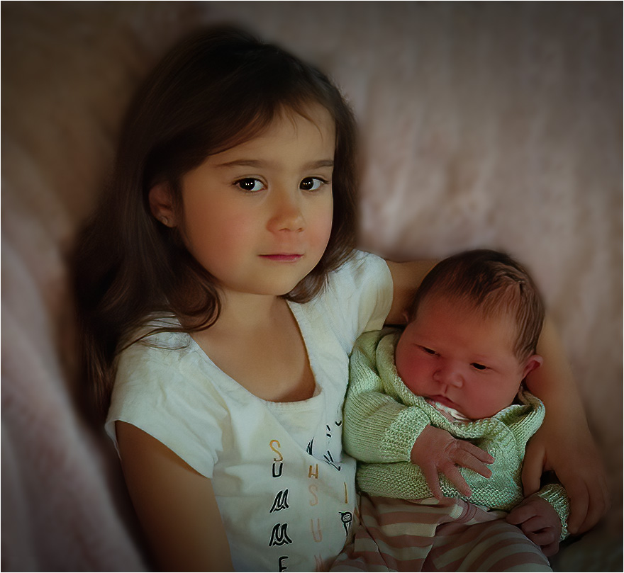
September 2023 - Mary Hinsen, BPSA

Original

September 2023 - Mary Hinsen, BPSA

Original 2

About the Image(s)

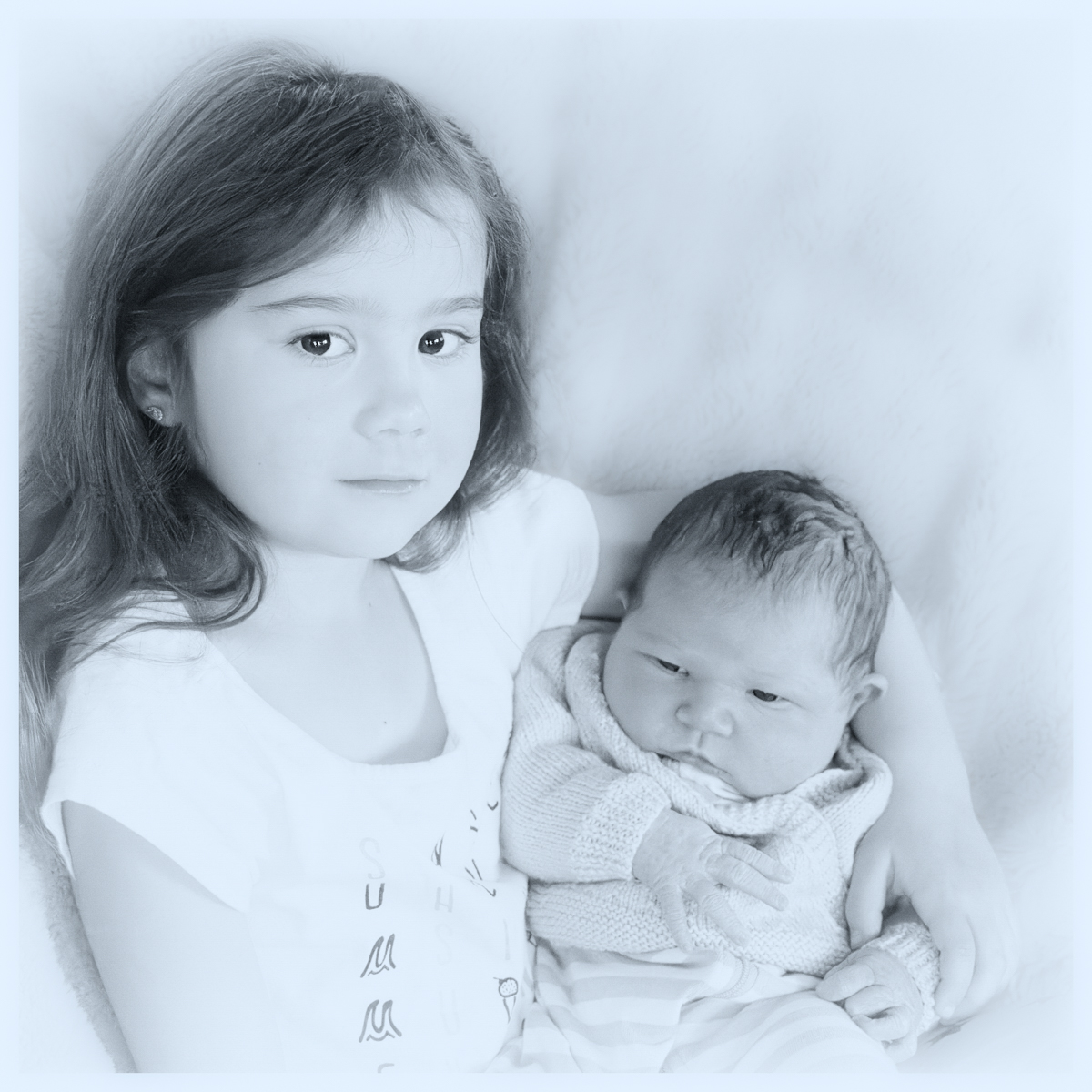
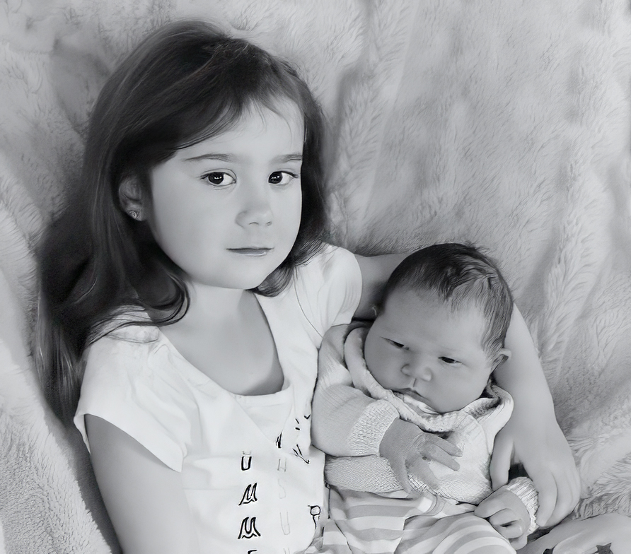
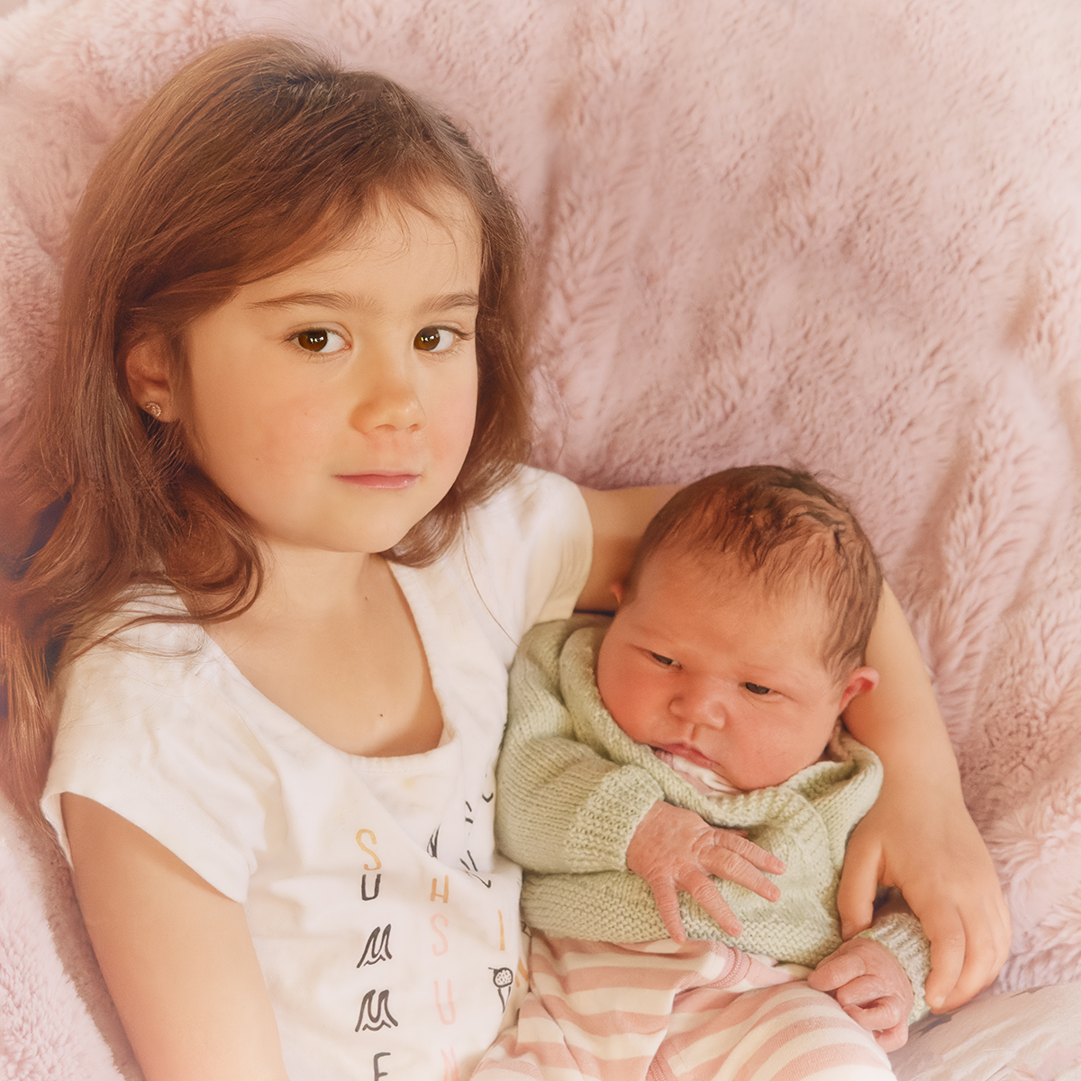
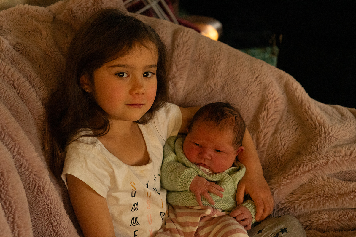
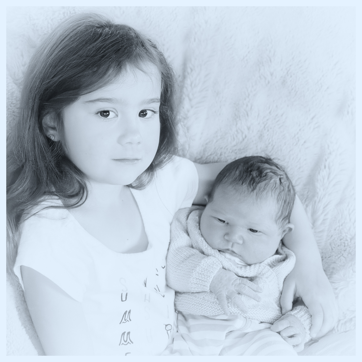
I am working on images to print. I want to do a series of portraits to hang in our home, so I am experimenting with different styles, and different papers. I have been using my family as subjects, so I can make plenty of mistakes and just re-shoot. This image is my granddaughter Lily when she first met her new sister.

Some of the curtains were closed in the room; I never use flash with babies, so I had ISO on auto. Settings were 1/200sec, f/5.6 and ISO went to 6400.

With this image I thought I would try two different styles - so I have submitted both for you to comment on. I prefer to finish images of children in colour, but I am also experimenting with black and white with washed out tones at the moment. I decided to process both with a high key approach.

I opened in DXO PhotoLab as I find its noise reduction really good. I saved as a tiff and re-opened in Photoshop. I cropped to square to get rid of as much of the background as possible and cloned more of the blanket around the girls. I lightened, and added a white vignette. For the colour image I added a LUT with pink tonings, then with a light brush took it away from the skin.

For the black and white, I converted to black and white, played with the colour channels until I got a lighter effect, then overlayed a blue-toned LUT at low opacity. I added a border in white.

Thanks for your thoughts and advice on this. I am thinking a textured paper could work for the mono image; I'm not sure yet about the colour one. I'm just learning about printing, so it might take a few trials - both with processing styles and papers.


This round’s discussion is now closed!
6 comments posted


Jan Handman   Jan Handman
What a precious moment to remember with a photograph. Your high key approach with both images is quite nice. The software you used for noise reduction worked really well. Just as personal preference, the B/W version is more apt for a Fine Arts application. But the color version is maybe best for a family gallery wall. I don't do a lot of printing, so I'm no help there, except that I think matte paper looks nicer than glossy. I wish you well with your project.   Posted: 09/16/2023 16:34:10


WOW, Beautiful Children. I started working on this beautiful image before I read your description. I hope you don't mine. I took the original image and put the children more in the center. I used Gaussian Blur in the background to soften the background. I put a dark vignetting.   Posted: 09/17/2023 18:09:27
Comment Image


I also trying in Black and White. I love Metallic Paper on Black and White.   Posted: 09/17/2023 18:10:39
Comment Image


Connie Reinhart   Connie Reinhart
Wow, you got a beautiful final image from that original. I like both versions. But I find the blue tone on the B&W is a bit cold for children. I added a photo filter #85 at about 20% to neutralize the blue. As to printing, I would try something like a fine art water color paper that has a nice matte finish for either version. The color version would look very nice as a canvas wrap. We put most of our prints on a semi-gloss or luster. But truthfully, once a picture is behind glass, the paper makes little difference.   Posted: 09/18/2023 14:54:22


Denise McKay   Denise McKay
Lovely portrait Mary. Such an angelic expression on the child holding her baby sister. I prefer the black and white portrait as a fine art example. But I'm sure the parents would appreciate either one, as they are both gorgeous in their own ways.

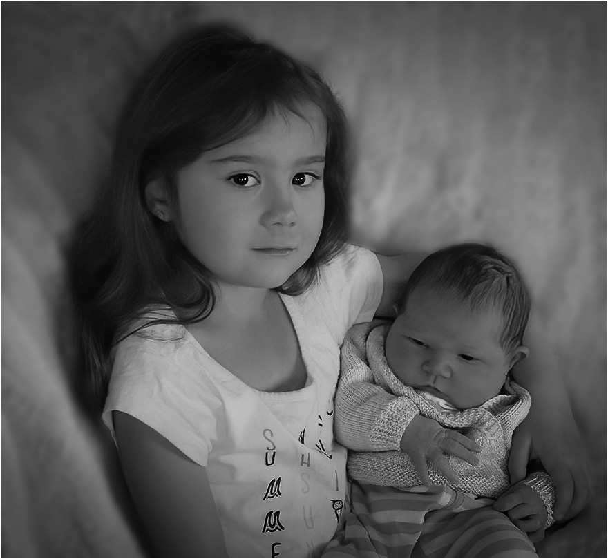
My only suggestion is to blur the background some more, as Linda mentioned as well. For another example I took your image into Lightroom, added a mask on just the background, then reduced the clarity and texture. I also increased the black points just a smidge to make the hair and eyes pop a little more. I like your high-key effect which makes the image a little more ethereal.

I agree that a lightly textured, matte paper could work well for the black and white. Great capture of these beautiful children!

  Posted: 09/19/2023 17:28:01
Comment Image


Carol Watson   Carol Watson
Hi Mary you did a great job given how dark the original was. In terms of the crop I would prefer to keep all your older granddaughter's hair in the frame. I do prefer the BW version but for my taste it is a bit too high key and the colour toning does give it a cold feel. Attached is my take, using NIK Silver Efex for the conversion and the Full Spectrum Inverse mode. Permajet Portrait White is a good paper for portraits, it is a light textured matt paper.   Posted: 09/24/2023 05:28:37
Comment Image