Witta Priester

May 2022 - Red-orange Iris
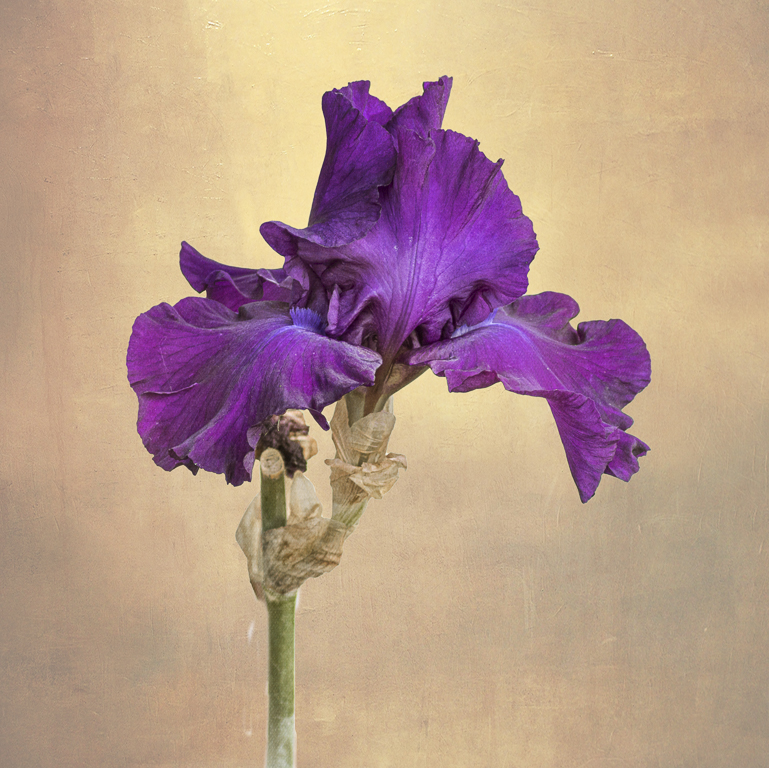
Original
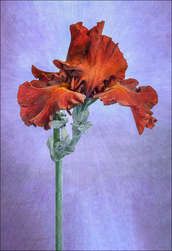
Original 2
About the Image(s)
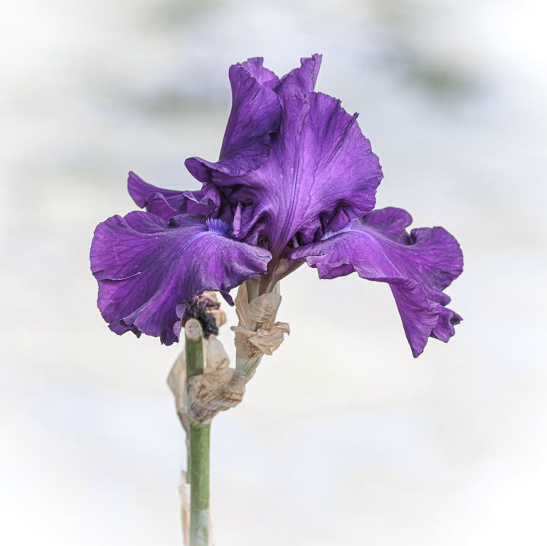
I took this iris photo with my 100-400 mm lens last June, thinking the white background, which is a local pond, would work well for adding a texture. Indeed, a mix of textures was added to the background in Photoshop, thus creating the intermediate image.
Still, I wanted more interest, so I tried a variety of other and additional textures, but nothing grabbed me. So, the image got a time out.
This past fall I learned about LAB ââ¬Å“inversionâ⬠techniques from a free, on-line class from Harold Davis. (YouTube: Photographing Flowers for Transparency 4*) For this case, I took the flattened, textured, RGB image and converted it to the LAB color space (via image/mode/LAB). Then (in the channels pallet) I took the "b" channel and inverted it (using the shortcut Cmd I). Then I converted this LAB color space back to RGBâ⬦
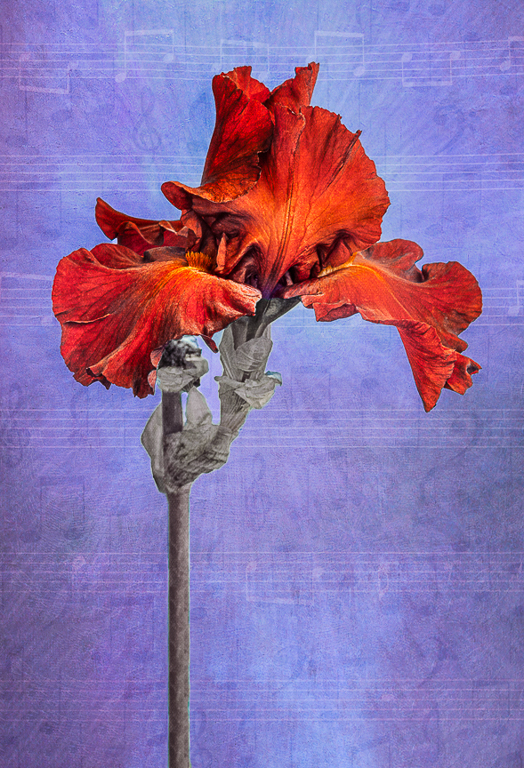
I loved the resulting blue-red color combination from the b-channel inversion. I then worked to add ââ¬Å“depthâ⬠to the flower, by enhancing the orange in the most-forward petals of the iris. I also elongated the stem and bottom of the image using content-aware fill, and selectively added some green to the stem to make it look more realistic. This was followed by a bit of cloning, cleanup and sharpening. Finally, one of my radial textures was added at 10% opacity, masking the iris.
I'm wondering: do you think this image would do well in a PID color competition? Also...Fine art photography?
https://www.youtube.com/watch?v=5GjWrbfVSqo
This round’s discussion is now closed!
6 comments posted
My only suggestion for both your final image and Original 2 would be to darken your texture. I think this might make the flower pop a bit more but also help with a more dramatic presentation. Posted: 05/14/2022 07:24:41
I've attached an example of an edit with a texture that has more movement to it and that included colors that picked up on the natural colors of the stem and the purple petals. I LOVE the original color of the Iris, so left that as is. I cropped in a little from the left. Using a rule of thirds grid, I lined up the stem with the vertical line you'd see in the left third. I feel that accentuated the far right petal flourishing into the right third of the frame.
This isn't the be all, end all for editing your image, LOL. But you captured a really beautiful, curvy flower so well, I feel the background needs to have some movement to it too. Posted: 05/15/2022 12:35:32
Posted: 05/15/2022 12:54:12