Witta Priester

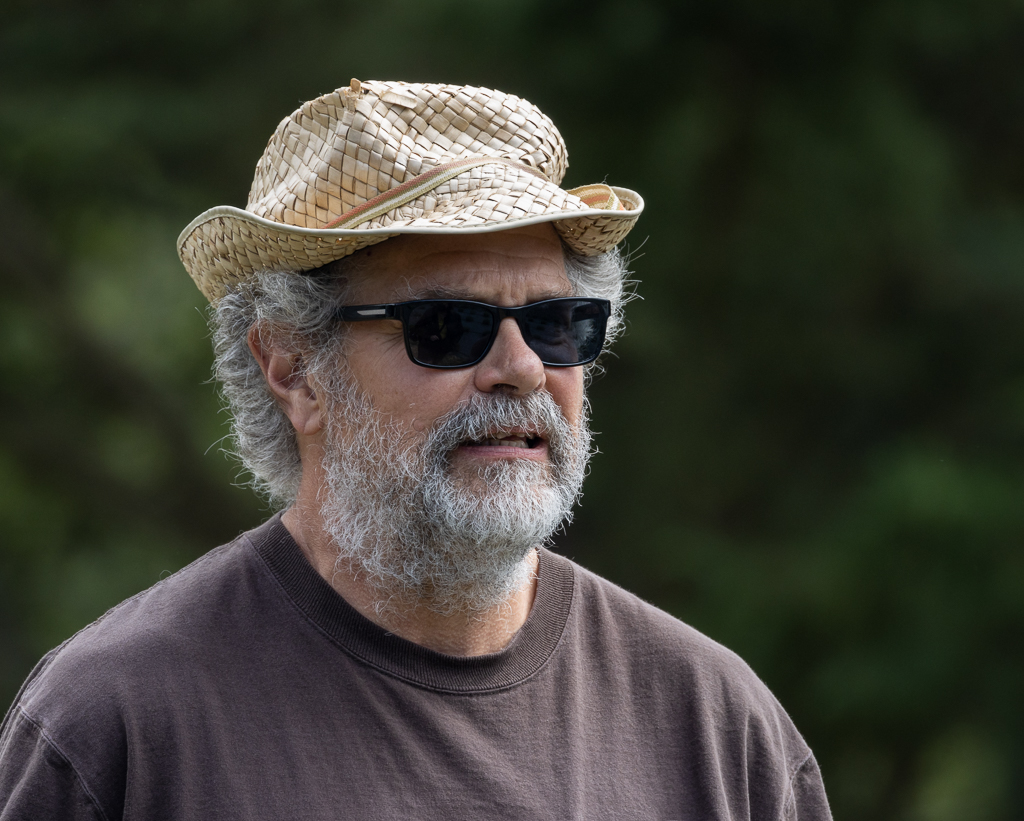
September 2021 - Man in the Straw Hat
Original

Original 2
About the Image(s)
The start photo was taken (surreptitiously) at a lavender farm last month -- 400 mm on a Canon 90D, f/5.6, ISO 320. After some minor adjustments in LR, it was opened in PS.
I have been learning Topaz Studio 2 (TS2) and in the process creating some ââ¬Å“looksââ¬, which are personalized combinations of several filters that can be saves. Some of these filters are not traditional filters, in particular I like Topaz’s ââ¬Å“AI Remixâ⬠filter. (The recent version of PS has an attempt to copy AI Remix. If you want to try it, take a photo and stamp up. Then use filter / neural filters; turn on the ââ¬Å“style transfer ââ¬Å“button ; apply one of the style options and say OK. Then you can lower the opacity of this filtered layer and/or change its blend mode.)
For this image, I applied one of my saved looks (which includes 3 AI remix filters at various opacities) and then I partially masked his face. That resulted in the interesting background. Back in PS I did a bit of cloning, and applied a levels adjustment layer to just the funky hat (using a mask). This resulted in 2A. It seemed to still need a bit more to make it pop, so I stamped up and on that layer in TS2 applied another of my ââ¬Å“looksââ¬. Back in PS, that second topaz layer was applied at 60% opacity, again partially masking the face, resulting in 2B.
Now back in LRâ⬦ I scrolled through my 60+ ââ¬Å“develop presetsââ¬, most of which were created by others; I had downloaded them over time (for free) from various sources. This quick scroll through my develop presets helped me choose an effect from Doug Landreth that he named ââ¬Å“Hidden Potential V1 01. Applying that preset as a starting point, I made a bunch of develop changes and selective adjustments to create this month’s image.
I think some might label the image "creative", but I wonder: do YOU think it is fine art photography? Also, any ideas for improvement would be appreciated.
This round’s discussion is now closed!
7 comments posted
The background is terrific, though I could do with many fewer dots. The hat is well done. Though the background is appealing to me, I like the way the man really stands out from it. The coloring of this portrait is also appealing to me.
Yes, to me this is fi e art. I would hang it on my wall! Posted: 09/03/2021 04:41:50
As it stands, it's an interesting portrait and I like how your post-processing brought out the details in his hat, hair, and skin tones. But I don't think the background adds to this image. I'm curious to hear more about your objective for this photo. Posted: 09/06/2021 08:01:27

Georgianne, thanks for your comment on the background dots; I agree they are distracting.
Denise -- it's hard to know why I take a photo (it is mostly because I enjoy being out there doing it.) In this instance it was because he looked like an interesting "Character", he had a uniqueness about him. Also, he was in a location where I could easily blur the background with my camera settings. So, that was step 1. Now for the why of the processing... for me it usually starts with a "play-around", letting my tools and skills try things, almost unconsciously. In the end, I wanted to emphasize a grittiness that I associated with his distinct look, the scruffiness of his hat and hair and coarse beard.
I have worked on this image some more, given your helpful comments. I'm thinking about putting this revised version into the NWCCC competition late next week. Posted: 09/17/2021 12:35:19
