About the Image(s)
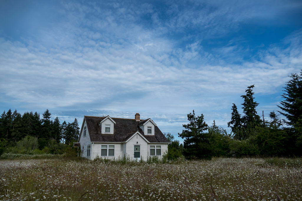
I expect that we each have a number of places that we photograph AGAIN AND AGAIN. This Sears house is on my way into town and it is one of my favorite subjects. It’s been abandoned for at least 12 years, though thankfully the grass does get mown once a year. I’m especially enamored of the scene in June, when the wild daisies are blooming. This photo was taken this week when, like the house itself, the daisies were past their prime. It’s intended as being a bit forlorn, left alone to decline with the elements and weather.
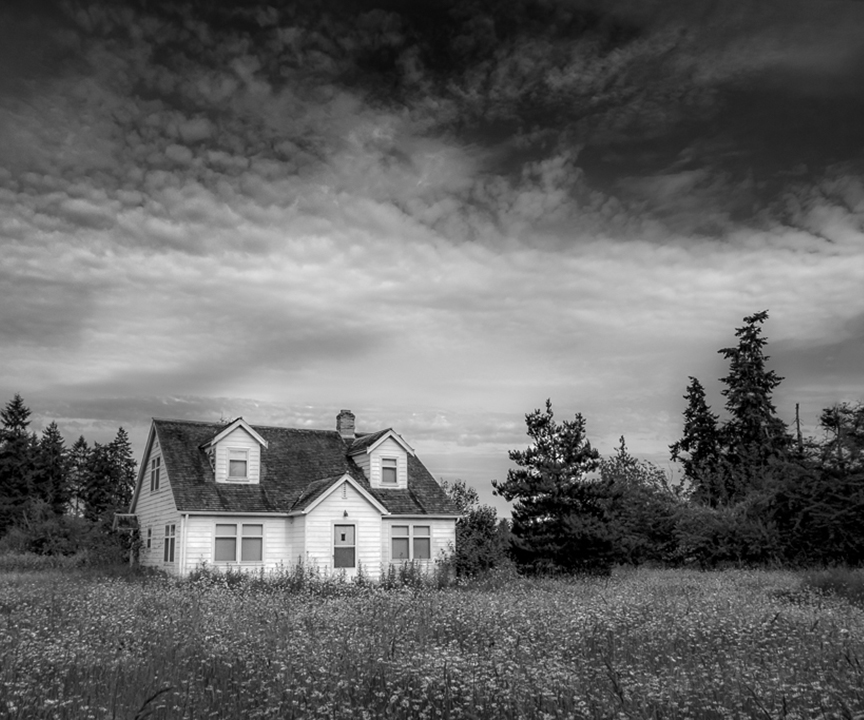
Most of the processing was done in Lightroom. I used PS to ⬓transform / distort⬠the house a bit so it had less keystone-ing. Also, there was the conversion to B&W, curves, and a few levels adjustments using a gradient mask to apply to the either the top portion or the bottom portion of the photo. In LR there were quite a few selective adjustments used to add or subtract contrast and exposure in various areas. Then a vignette was added.
After a few days, I looked at the photo again and decided a sharp image just wasn’t right, so I reduced the clarity everywhere except for the roof, the door and the weeds right in front,.
Looking closely I noticed that I have blocked up the blacks in some of the tree areas, so this will NOT print well. Aside from that, any ideas for improvement? Or ideas on how to make it feel more abandoned, sad, or alone?

Larry Treadwell
(Groups 36 & 67)
First I was quite struck with the requirements for submission for this group. The requirements lend themselves to photographers who think about their images and do not just take snapshots. This is something I try to bring to my images and thus I am particularly drawn to this image and some of the others in this group.
After reading your comments I feel that everything you did had a positive impact on the image. I think your technique on the roof was inspired. Normally I would suggest cropping the tree on the far right but due to its size I feel it adds to the feel of the building being taken over by time. A possible suggestion would be to shoot from a lower angle. My idea is to raise the position of the flowers so they will look like they are taking over more of the building. Other than that, I think you effectively reach your goal.
A second thought just occurred to me. Old time photos are often faded. The fading removes texture from the buildings. I do not know if it would work but it crossed my mind.
I really applaud your creative thought.
After reading your thought process may I shamelessly request that you read my description explaining my thoughts on capturing my image After the Storm. I think it may fit in with the goals of this creative group   Posted: 07/02/2020 15:38:11

Georgianne Giese
this is a heartwarming reminder of times in our history. As an image, it is beautiful to me. The monochrome version appeals to me more than the color original. I also like the sky you inserted in the BW version better than the original sky.
I have two suggestions. First, I found the bright squiggles in the center clouds to be quite distracting. Secondly, it seems to me that the wide landscape of trees detracts from the central subject.
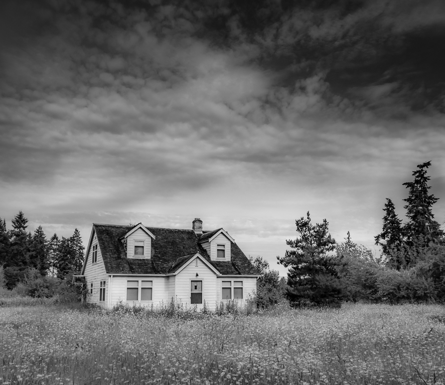
I tried two different crops and took out the bright squiggles with the healing tool. What do you think?  
Posted: 07/02/2020 20:49:59

Georgianne Giese
 
Posted: 07/02/2020 20:50:29
Georgianne, I like your crop. Thanks!
BTW, the sky was not changed, but the processing does emphasis some parts.
I've gone back and reprocessed the image to get rid of the blocked up darks and the squiggles... Here's the current version.  
Posted: 07/03/2020 18:20:50

Denise McKay
I have a similar decaying house that I photographed over and over and still never seemed to get the result I wanted. But, that was also when I had less knowledge about post-processing, and you've inspired me to dig out some old images and start working on them again. The house is no longer there, so I can't go back and take another shot!
I think your strategy to have a wide-angle to include more landscape helps to tell the story of this house being "alone". Also, converting the image to black and white and the edits on the sky are improvements over the color original in my opinion.
I also wonder if the suggestion made by Larry, trying a lower angle would make a difference to achieving your vision.
I like your subject matter, composition, and the edits you made.
  Posted: 07/03/2020 11:04:31

Georgianne Giese
Witta, you have also inspired me to go back and rework some old images of mine. I have lots of old houses and barns, but there is one, taken on one of the islands in Puget Sound, that reminds me a lot of your image. I always loved that image, but didn't know quite how to treat it. If I can find it again, your inspiration is urging me to see what can be done with it!   Posted: 07/03/2020 18:32:35

Connie Reinhart
Ah, the eye of the beholder. To my husband and I, the house doesn't look abandoned. The siding, roof, and windows are in decent shape. Rather it looks like it is waiting patiently for the right family; one who's children will play in the field of daisies, read in the cool shade of the trees, plant flowers under the front windows. B&W makes this more than just a capture, it sets the mood. Your final version is so much better than the original (even though I think the original is quite good). I tried to put a glow on just the house to give it a ghostly effect, but it really didn't improve anything. Very nice.   Posted: 07/05/2020 15:50:35
Witta, your final image has such a lovely feel to it. I like Connie's poetic description of what she saw in the photograph. It doesn't look abandoned to me. It is so peaceful sitting in the surrounding landscape. I like the original image dimensions which allow the house to be almost dwarfed by the overgrown landscape. The monochrome treatment gives it a timelessness and brings out all the cloud features that were not apparent in the color version.   Posted: 07/06/2020 16:12:59

Guy Davies
(Group 4)
Hi Witta. Great subject and lots of interesting interpretations! I wouldn't crop the image as I think the house needs the space around it to help with the lonely abandoned feel. Have you considered a light sepia tone to give the impression of an old photogrpah? Also, maybe you could add a random white vignette to create a faded look so common with old prints. Just a thought.   Posted: 07/13/2020 04:01:06
Thanks Guy. Both of your ideas are good ideas. I'm currently experimenting with B&W toning, and with split toning on a bunch of photos. Trying to understand how these options could enhance the mood and story of a photo.
 
Posted: 07/16/2020 09:08:03

Georgianne Giese
Witta, I really love the toning in this alternate version of your image! After considering what you did, what I previously said, and what Guy Davies mentioned about not cropping, I take back my previous crop suggestions. The wide, uncropped view does add to the feeling of isolation, and I do like that in your image!
  Posted: 07/17/2020 12:17:13
Thanks Georgianne for continuing to engage and comment. I appreciate it!
  Posted: 07/17/2020 23:42:32

Diana Magor
(Group 32)
Just visiting from group 32. I saw your dancing forks on the showcase and loved it. I have been doing macro work since lockdown and I was about to start on forks and reflections next. I promise not to plagarise but how did you get the ing patterns and various colours_
Anyway, very impressive!   Posted: 07/16/2020 05:14:08
Diana, Thanks for visiting. I'm pleased you like the image. Forks are fun! A mirror makes for even more fun.
I use Topaz Restyle for modifying colors, but photoshop's Color Lookup and Gradient map (at low opacity) adjustment layers are other good options. As for the play, it was done with the polar coordinates filter and the liquify filters. I'm sure, even given the beginning photo, I could not recreate this image...   Posted: 07/16/2020 09:18:52
Witta, your dancing forks image is so fun and creative. Congratulations and well done. What are your plans for it?   Posted: 07/17/2020 08:36:35
Plans for Dancing Forks???
I created it about 6 weeks ago as part of my Camera Club's daily challenge (the dining room) where I photographed the original forks. Then I had a creative play, as mentioned in my previous comment.
I will likely enter the image into the NorthWest Council of Camera Club's annual open competition, which I enter most years; they have a "creative" medal, which I have won in the past. I've already entered it into a local juried city art show, "Fluidity". It just happen to fit the thene. It was accepted and is currently part of a 3-month Sequim City on-line exhibition (
https://www.sequimwa.gov/705/Current-Exhibit, as well as running on monitors facing the street in city hall.
Cecilia, please let me know if you have any suggestions of what to do with it.  
Posted: 07/17/2020 10:55:24
Witta, I took a look at the Fluidity show. You're in very good company there. Your piece fits perfectly. I know you intended this, but every time I look at your Dancing Forks, I do see graceful dancers. My suggestion is to keep entering it because what you've created is so unusual. You might try working on companion pieces with knives, spoons, or other utensils. Congratulations on your acceptance into the show and best wishes for further acceptances.   Posted: 07/17/2020 19:54:27

Bunny Laden
(Groups 12 & 43)
Witta, I like what you've done with the image, especially the selective clarity and the monochrome treatment. I agree with Connie about the eye of the beholder. From my perspective, this looks like prime property looking for the right owner. Perhaps a new title "Looking for the Right Owner." Regardless of what you call the image, it is wonderful.   Posted: 07/25/2020 16:57:03