Mary Hinsen, BPSA

October 2026 - Burnouts

Original
About the Image(s)
This month's image was taken at our local annual burnout competition. I had a spot in the bunker - so got up close to the action. My camera settings were 30.00mm, 1/320sec, f/8 and ISO800. The action is pretty fast, so I shot hand held.
Since this photo was to be published by a magazine, my processing had to keep the final image reasonably true to reality. I did remove the top of the light pole because it was cut off at the top of the image - but I left most of the pole and the lights there. I also removed an aerial that was next to the light pole. I then selectively dodged and burned the smoke using two masked curves layers. I used a high pass filter at 2px and overlay blend mode. I masked it out, then painted back the gesturing hand and the car.
7 comments posted
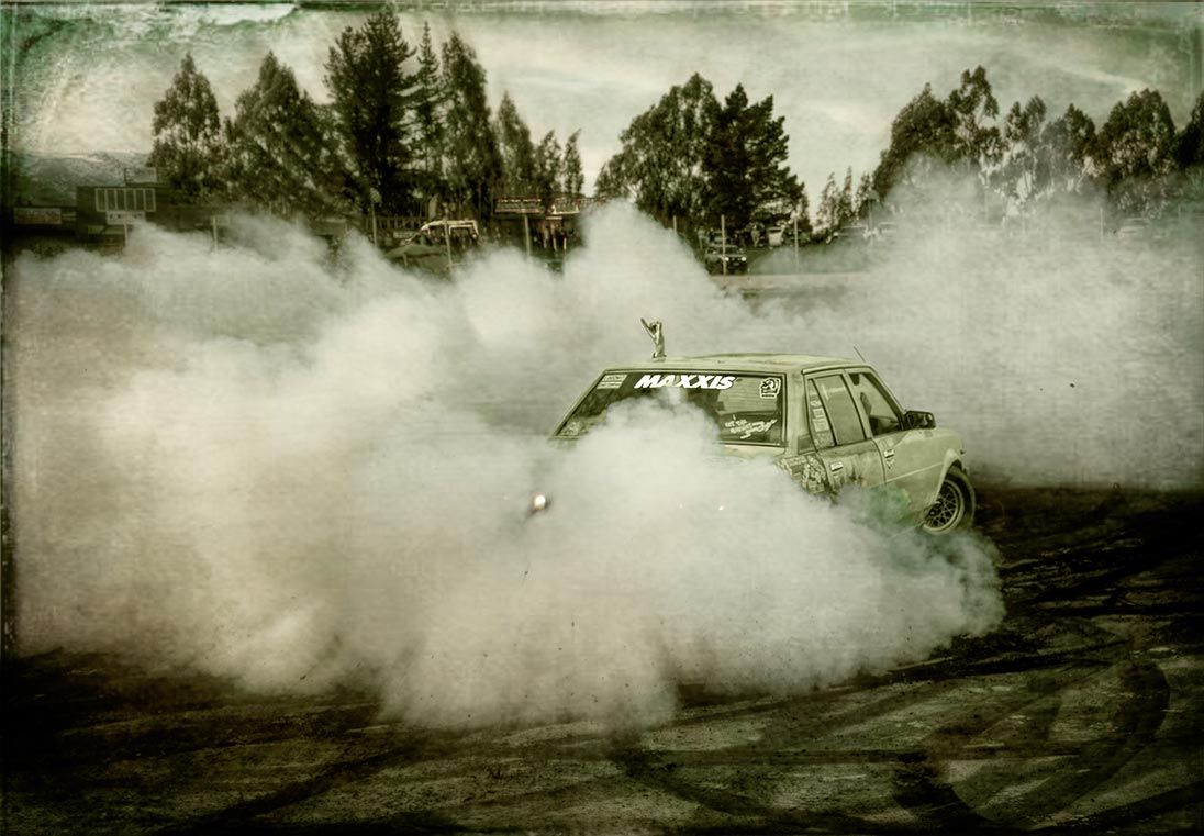
I played with it for a while, to make it something I would put on a home wall. Basically, I gave it a vintage look:
1. Removed the tall light pole, which really detracts from the fine art look, in my opinion.
2. I played a lot with PS hue/saturation and Selective Color adjustment layers.
3. In PS, I went into Topaz Studio 2 and applied a Vintage grunge look.
4. The colors weren't "vintage" enough for me, so I added a Solid Color fill layer in a grayish yellow green.
5. To bring back some of the green in the car, I used PS Object Selection Tool to draw a box around the car in the original layer. I used that selection on the solid color layer mask and painted a low opacity black brush over the selection.
6. I stamped up and used another Selective Color adjustment layer to bring out more green on the car.
Hope you don't mind my playing with this so much. Posted: 10/02/2026 03:36:52
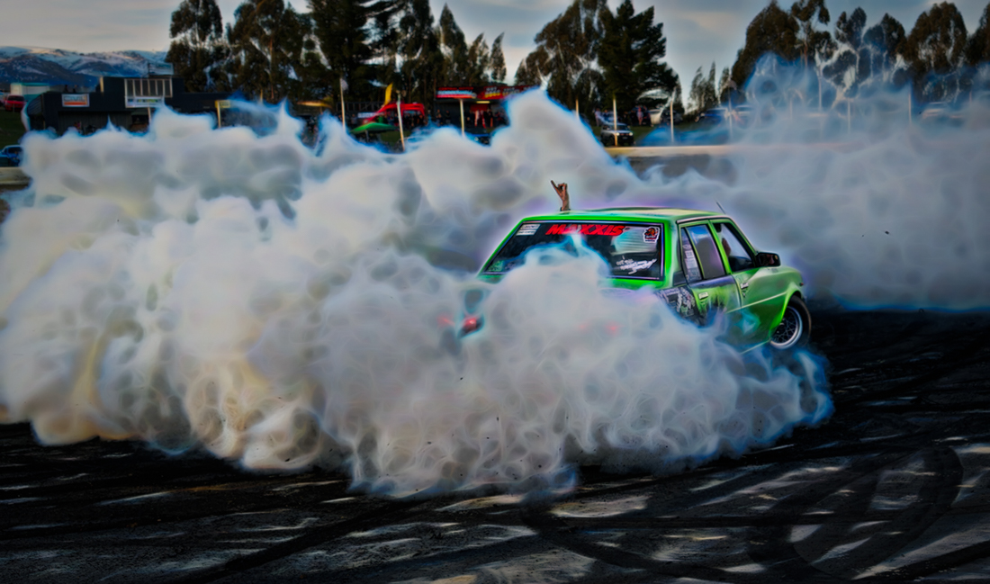
My take on it was to add some abstraction to the image through some filters in Topaz Studio 2. So the background gave the essence of lights, signs, trees, etc. without being so literal, and the smoke was enhanced as well. I also cropped it down a little from the top.
Just some food for thought.
Posted: 10/05/2026 15:31:50
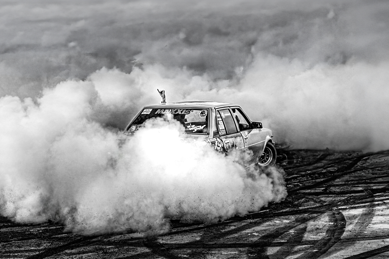
I decided to reduce the image to its bare essence and see what the result was. I lightened the hand just a touch to bring the viewer's attention to it, since it tells a story.
It's very enlightening to see everyone's creative vision on this one. Posted: 10/08/2026 18:03:17