Rita Johnston

August 2026 - Hold On Tight
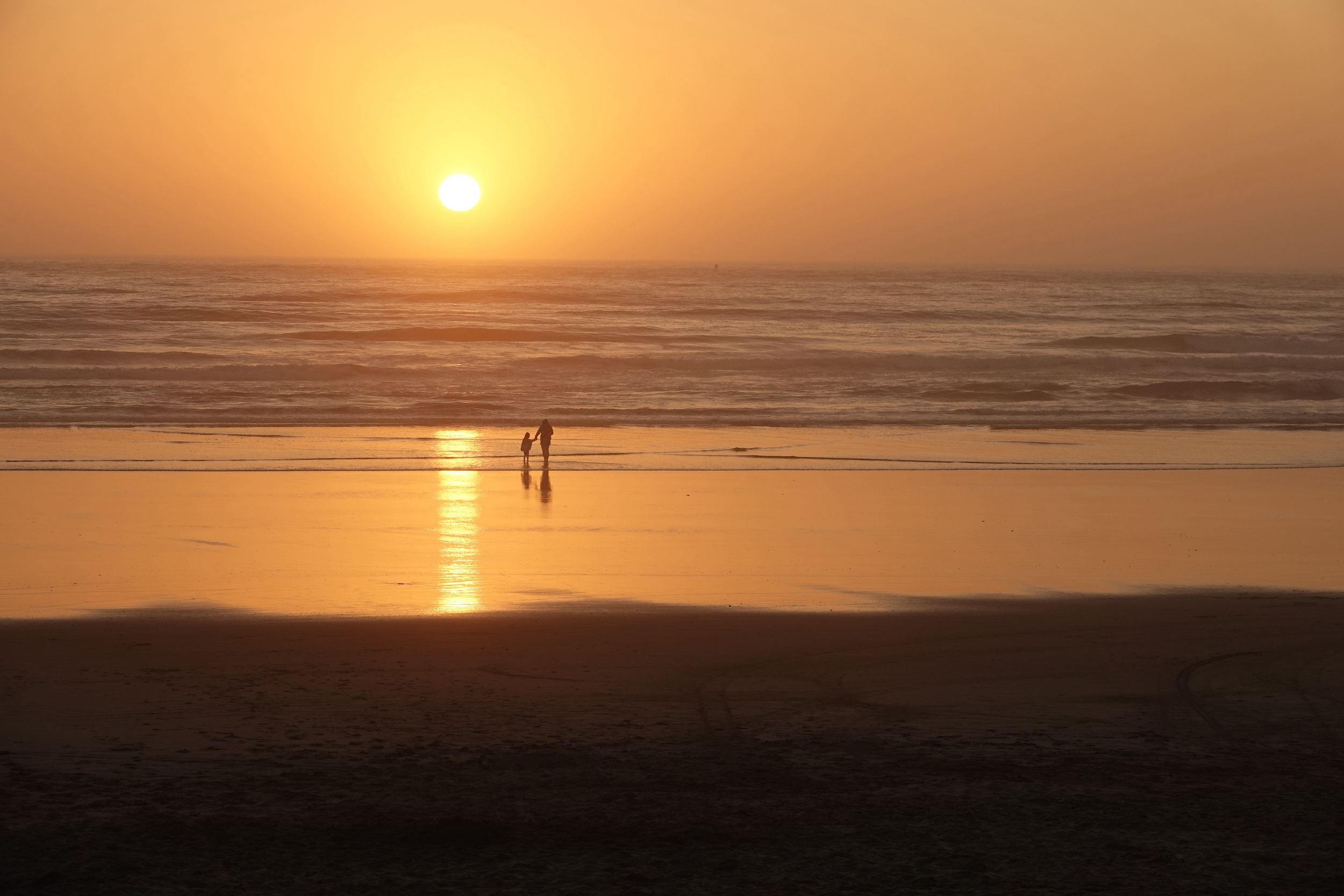
Original
About the Image(s)
When I took this photo it was golden hour on the beach, and this child and mother were there. With the title "Hold on Tight," I want to emphasize the connection of the two people on the vast beach.
In processing it, I used ACR to adjust light and colors, added a pro contrast layer, and denoised it in Topaz. The original seemed a little too light in color to have contest impact, and the final has impact - but too much orange? It is not perfect so help me make it perfect.
9 comments posted
I don't enter contests Rita, so I can't comment on that. I can only tell you the impact this has on me as a viewer who is also a photographer, LOL.
I love the composition and the strong story this tells. The colors are appropriately warm to my eye, and this has a peaceful feeling of a quiet moment shared with parent and child enjoying nature and time together. I like the simplicity. However, I also felt this was a little bright, so I took it into Lightroom Classic and reduced the exposure somewhat. I also removed a small shadow on the far left that was catching my eye for some reason.
I've attached the edit so you could see if you felt it made a positive difference. It could just be my monitor, so take it with a grain of salt! Posted: 08/04/2026 15:18:01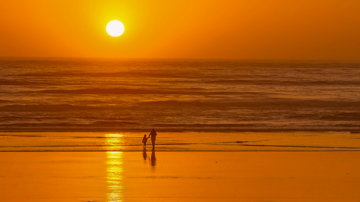
I love the composition and the strong story this tells. The colors are appropriately warm to my eye, and this has a peaceful feeling of a quiet moment shared with parent and child enjoying nature and time together. I like the simplicity. However, I also felt this was a little bright, so I took it into Lightroom Classic and reduced the exposure somewhat. I also removed a small shadow on the far left that was catching my eye for some reason.
I've attached the edit so you could see if you felt it made a positive difference. It could just be my monitor, so take it with a grain of salt! Posted: 08/04/2026 15:18:01
Thanks Denise. I will give that a try. Posted: 08/05/2026 16:24:13
Rita... I felt the two silhouettes didn't stand out from the background enough. I put a long, radial gradient with an 80% feather from the sun down past the people and lightened it so it looks like a shaft of light. I put a smaller radial gradient around the people and darkened them back down so they're more visible. I also removed the distracting line on the left. Posted: 08/13/2026 14:44:26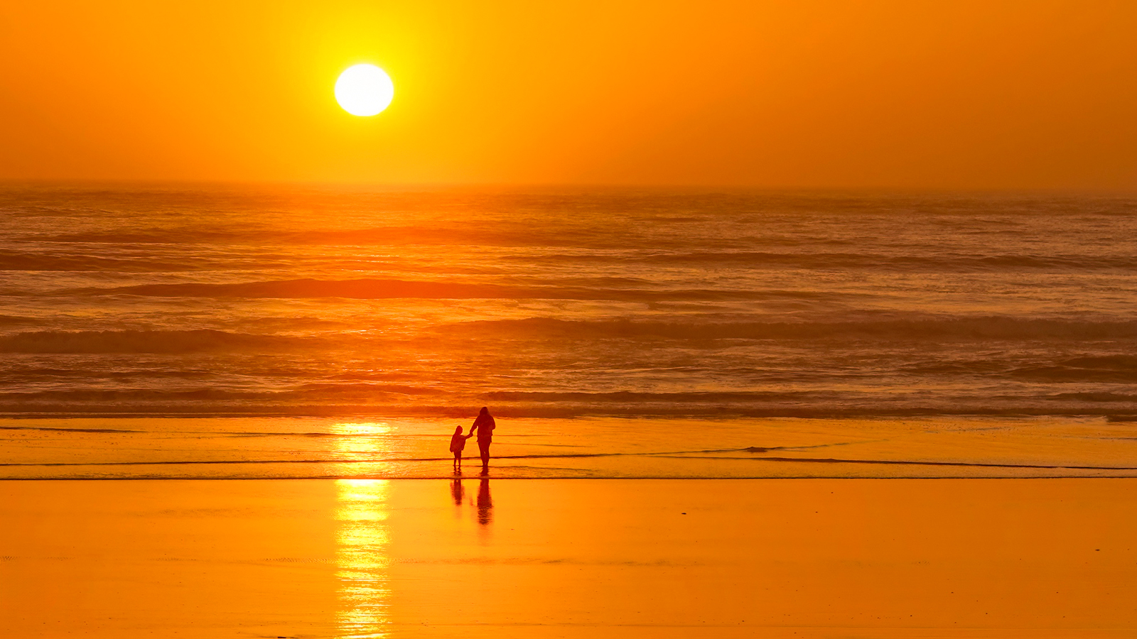
This is a beautifully simple and serene image Rita. I like your edits to increase the drama and details. The only area that seems too orange to my eye is the reflection of the sun on the shallow water and sand to the left of the people. The softer color in the original seems to compete less with the people. I agree that the dark line on the left edge should be removed. Good luck with your entry!
Posted: 08/13/2026 19:45:07
Posted: 08/13/2026 19:45:07
I made the suggested edits above, and the image is better. Thanks for the input. Posted: 08/16/2026 16:59:17
What an enchanting evening that must haave been. It is almost a classic shot of silouetts against a sunset.
One thing bothered me. It was the placements of the people. I moved them over to a power point and cropped the image a little. What do you think? Posted: 08/18/2026 01:26:27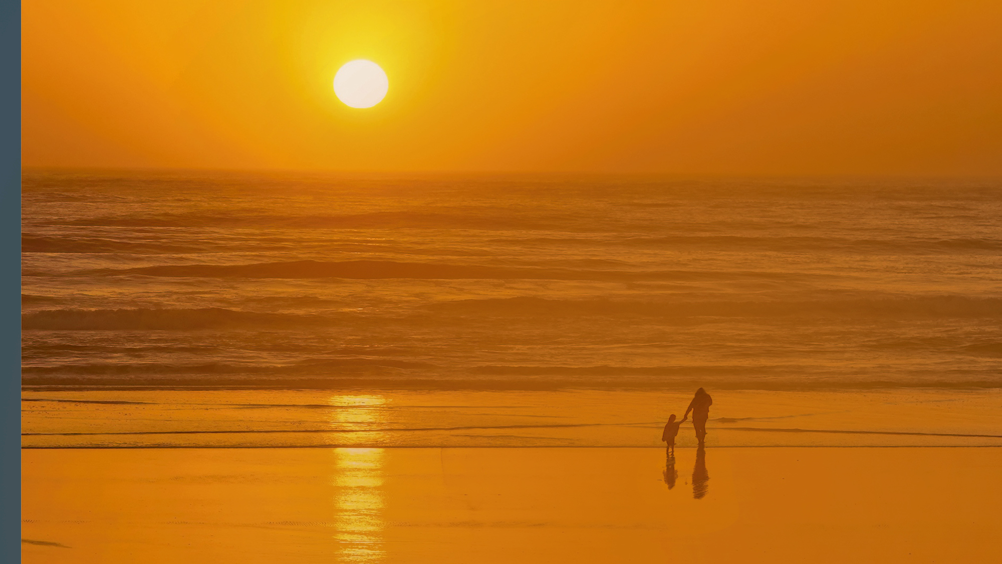
One thing bothered me. It was the placements of the people. I moved them over to a power point and cropped the image a little. What do you think? Posted: 08/18/2026 01:26:27
Posted: 08/18/2026 01:26:28
That's a possibility I had not thought of. Thanks. Posted: 08/18/2026 21:37:00
A great sunset shot and the figures give the much needed human interest and sense of scale. I like the connection between the mother and child. I feel the figures don't stand out enough but moving them as Georgianne has suggested helps them stand out more. Posted: 08/19/2026 10:15:32