Connie Reinhart
July 2025 - Faded Beauty
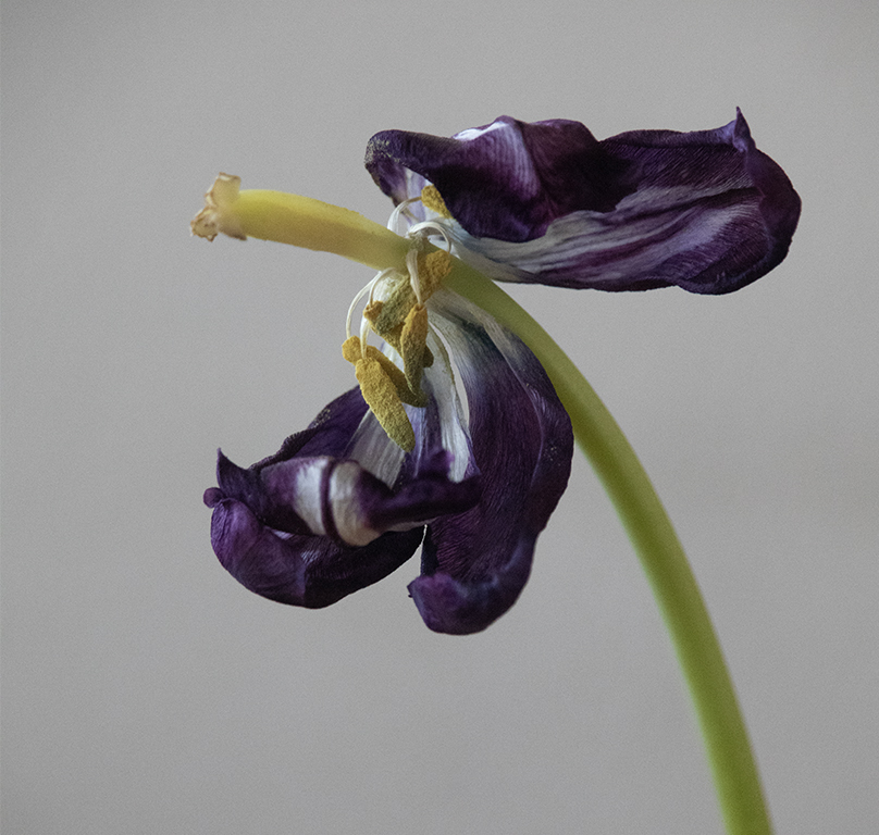
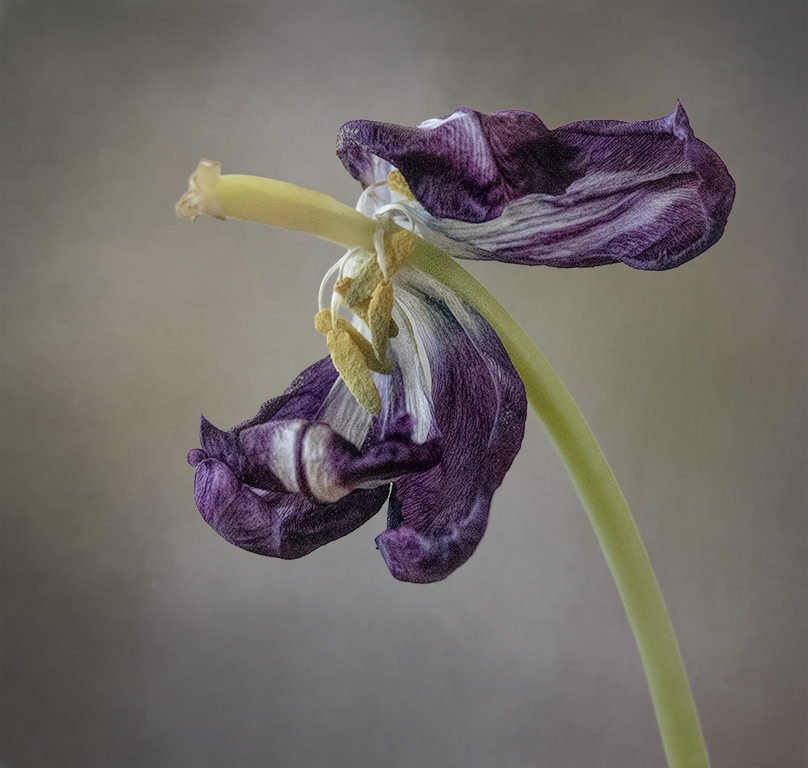
Original
About the Image(s)
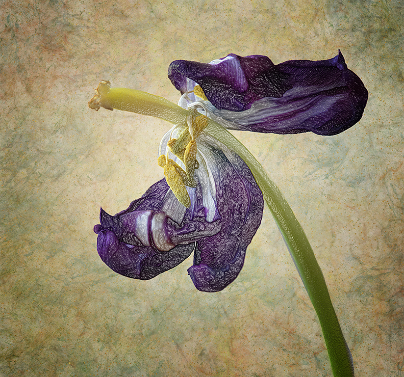
This was one of a pot of purple tulips we got for Easter. In fact, it is one of those in the image from the May round. It was originally taken for the category of ‘overlooked things’ for our annual scavenger hunt. Only basic editing is allowed for that contest. But this just pleaded for more work. I always start with a duplicate layer and put each adjustment on its own layer. First was levels to brighten it up a bit. Then Hue/Saturation on the yellows and greens. Then a high pass filter to sharpen. Curiosity lad me to the filter gallery, and Plastic Wrap spoke to me. Plastic Wrap set at Highlights 15, Detail 6, Smoothness 2. Then I selected subject and copied it to its own layer. I added several of my own textures under the subject and settled on this yellowish one. In choosing these textures, that was the one I liked least, but became the one that worked best. Just proves that we should always be open to possibilities. This texture was set to 68% opacity. Then I did more Hue/Sat on all colors individually. Lastly I used NIK Color Effects to darken the edges.
6 comments posted
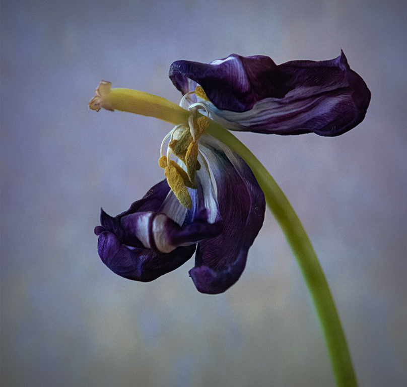
I've attached two edits just as food for thought if you want to see this image in a different way. The first, in Lightroom, I just masked the background and reduced the texture, clarity, and sharpness to smooth it out and blend the colors so you could see what the background might look like. Just a quick edit, not perfect. Again, I wouldn't leave the flower with all of that texture when using this background either.
The second, I took your original image into Topaz Studio 2 and layered two textures in Soft Light mode, added a layer with a painterly "look" at very low opacity, then added a color vignette choosing a color from the petals. This gave it a completely different, softer look overall. I have to add the image in a second comment.
I appreciate that you still found beauty in this overlooked object! Posted: 07/12/2025 16:57:34
Like others, my suggestion would be to tone down the texture over the flower. It is too distracting from the beauty of this treasure, in my opinion.
All in all, I find this a beautiful image. Posted: 07/19/2025 00:39:40