Jan Handman

May 2025 - Lily of the Nile

Original
Original 2
About the Image(s)
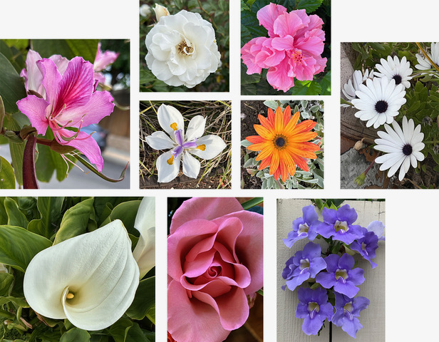
I take a lot of flower photos with my phone when I take neighborhood walks, so I decided to give my daughter-in-law a face full of spring flowers. The portrait photo
is several years old. I placed the two main flowers (white rose and orange daisy) directly over her eyes and then just added in others to get a grouping I liked. Next I added shadows under the flowers so they didn’t look so pasted on. Then into PS Filters-Conte Crayon to get a drawing look, but ended up reducing the opacity of that layer down to 30%. Then into On1 for a Glow and Vignette, and finally into Nik ColorEffex for a Vintage filter to make it look less like a photo. After all was done, I decided to crop up to leave only her face, so that the flowers were more dominant in the composition.
2 comments posted
In my opinion, the intensity of your daughter-in-laws face should be different than that of the flowers. Perhaps the vibrance of the flowers could be increased and the face a bit darker. In my opinion, that would emphasize the story.
I find that the flowers are too large relative to the face. In my opinion, they should be reduced in size.
Posted: 05/07/2025 14:47:26
Maybe if the entire background included very defocused flowers, with some stretching across her eyes as if her face was emerging, would make a more compelling image. With everything being more soft and abstract and the background color lighter and a different tone? The background color doesn't exude softness as it appears you would want this image. Posted: 05/12/2025 15:01:24