Denise McKay

April 2025 - Layers
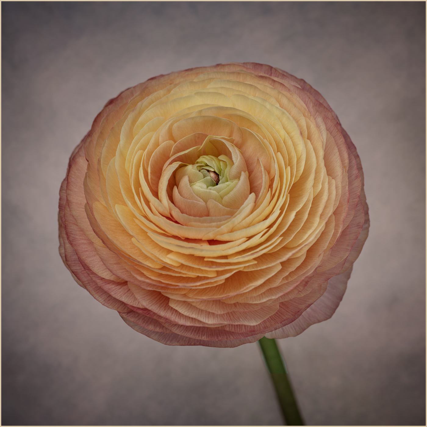
Original
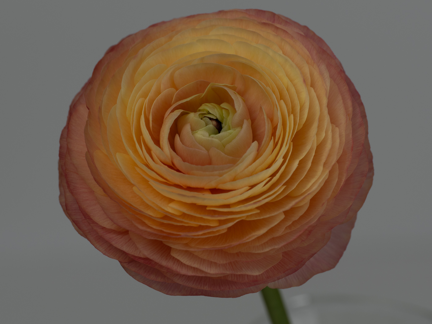
Original 2
About the Image(s)
I took this photo indoors during February's very cold days. Used my OM 1 mark II and 90 mm macro lens. Settings were ISO 100, f 8, 1/30 second under natural sunny light on one side and a diffused LED light on the other. Camera was on a tripod.
I first did edits in LR to increase overall exposure, then opened up the shadows on the center of the flower. I also had to remove the edge of the glass vase it was sitting in. I decided to just add a slight dark vignette to see if I liked it as is as I was really happy with the level of detail I was able to get (Original 2). Then I decided to play a little more "artistically" and took it into Topaz Studio 2.
I added a background texture, then used filters from the Line and Ink look and manipulated them quite a bit. Then I returned to Lightroom and decided to increase vibrance and saturation. I also masked the background and changed the color temperature to arrive at what you see. It was more yellowish which I felt didn't make the flower pop as well. I also cropped in from both sides a bit more.
8 comments posted