Connie Reinhart
April 2025 - Sweet Blues
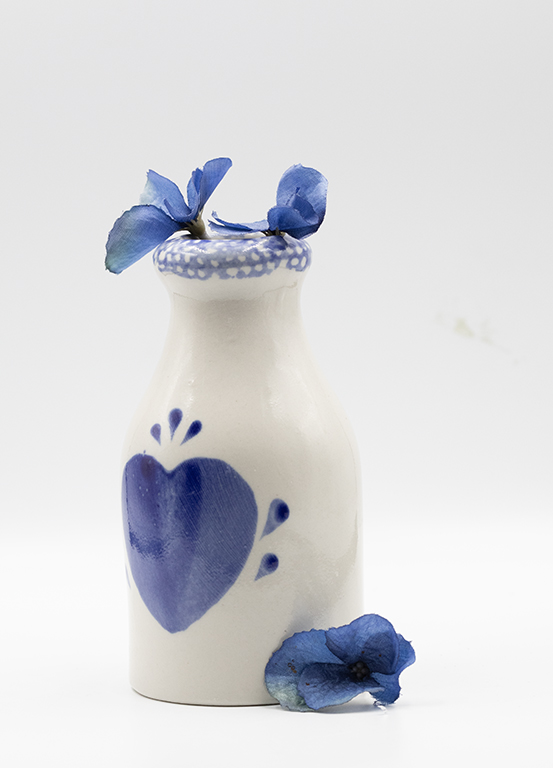
Original
About the Image(s)
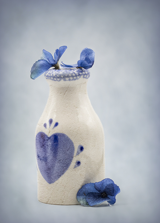
This was taken for a tabletop assignment. The vase was in a light box, thus minimizing the hot spots on the reflective surface. I’ve always liked this image even though it was a little blah. It was processed in PS> I always make a duplicate layer of the original. Then I played with filters. Plastic wrap gave a nice touch. In Topaz Studio 2 I added a blue vignette; just pale enough to be unobtrusive. Next was a levels adjustment layer. The image still seemed to run off the edges, so I added a blue stroke.
6 comments posted
I like the simplicity of your original image and how well you managed any reflections. I'm not sure that the scratchy texture lines behind the vase added anything to the image. I wondered if a smoother edit to the background might compliment the container and soft flower petals a little better. So taking a cue from your title "Sweet Blues" I tried the following:
In Lightroom I selected the background and changed the color temperature to achieve a pale blue.
In NIK Color Efex I selected a color vignette, again pale blue, and manipulated the size and opacity to keep it light, but more intentional.
Back in Lightroom I used a Linear gradient to darken the lower part a little for a bit more weight at the bottom.
This just takes it in a different direction rather than adding the thicker textures to add interest. Maybe a little too blue, LOL. But I just felt like playing.
Posted: 04/17/2025 20:47:38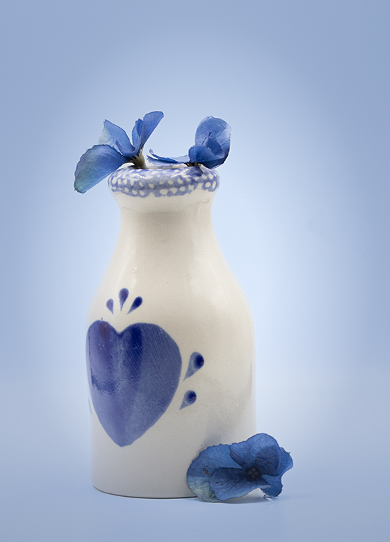
Thank you. This version is better than mine. Those scratchy lines in the background are a result of the plastic wrap filter. They should have been masked off/ Posted: 04/19/2025 11:29:42
What a marvelous transformation of the original. I agree that the original was a very nice take, though it could use something to make it go from ordinary to spectacular. That Plastic Wrap filter did that. The light blue vignette helped to spotlight the subject. Great job! Posted: 04/19/2025 03:28:17
Thank you for your nice comments. I did think that the plastic wrap gave it a surreal feeling. But the blue vignette could be darker, as Denise suggested. Posted: 04/19/2025 11:32:05
I agree that the plastic wrap filter on the bottle worked well to give it more depth and character. I kind of liked the flowers as they were in the original though; the filter seemed to make them look a bit battered. Denise's version is very nice too. I like the simplicity in composition and color ways; blue and white always appeal to me. Nice Springtime image! Posted: 04/19/2025 22:59:57
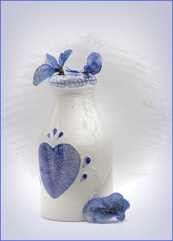
A lovely simple still life well captured. I think that the plastic wrap filter did a good job of adding texture to the vase. An alternative would be to use something like a stone texture over the vase in soft blend mode, which I have done in the version attached. I think a subtle texture or colour in the background helps to separate the vase from the background. I have used a simple painted texture and adjusted the hue to match the blue in the vase. I have also added a radial gradient to give a vignette. Posted: 04/21/2025 10:05:19