Rita Johnston
About the Image(s)
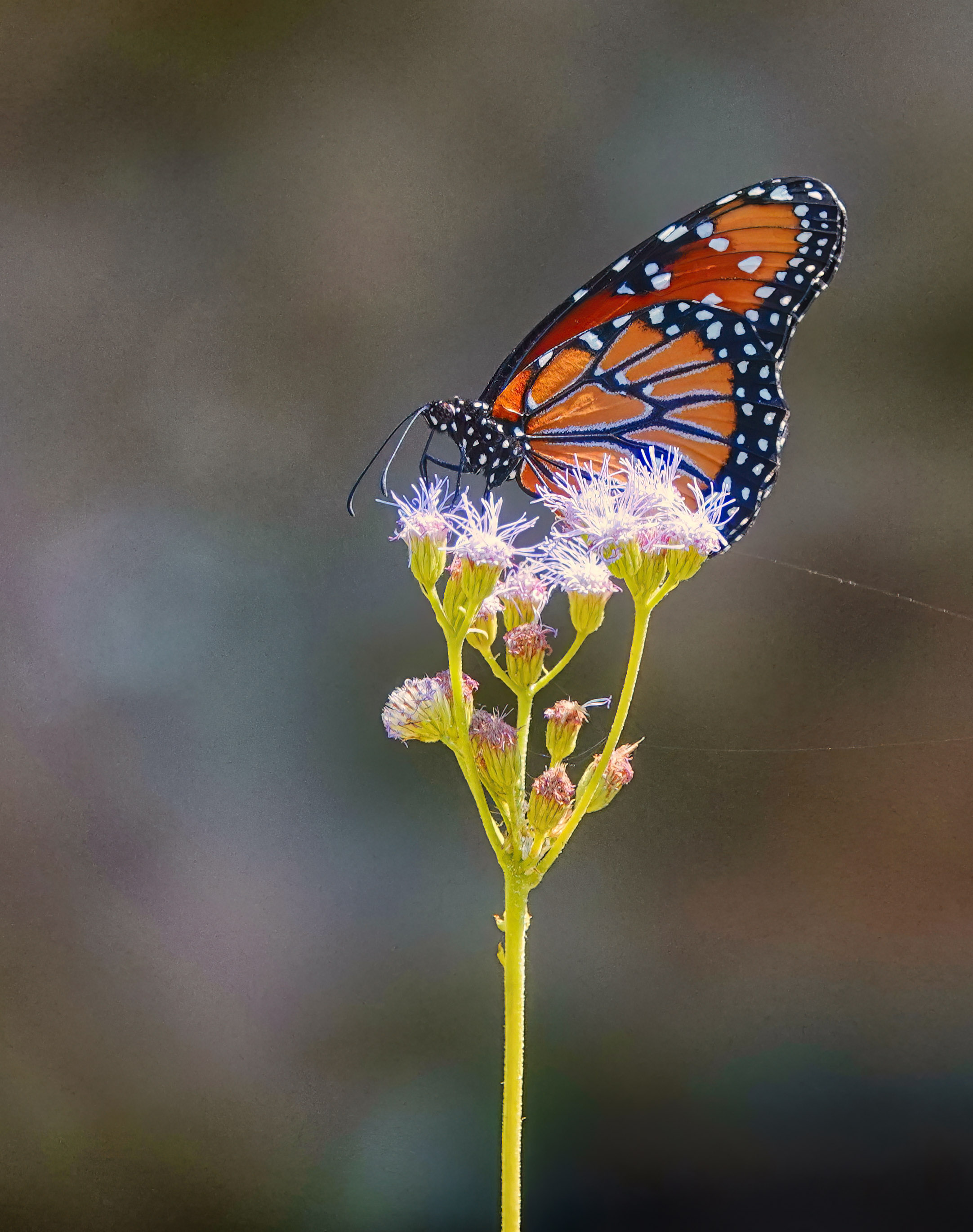
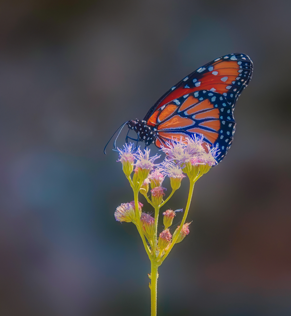
I took this photo in September, when the butterflies were very active on the flowers. I was hoping there would be enough detail to make it into a print. Any comments on how to make it better, or even to process with a filter, will be appreciated.
I processed it in Photoshop, Adobe camera raw, and then used a nix saturation filter on it.
This round’s discussion is now closed!
9 comments posted
This is an excellent photo. It is hard to get such a clear image of a Monarch. They seem to take flight whenever a camera gets near!
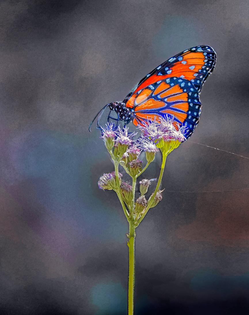
I like the subtle color of the Monarch replicated in the background. However, to me, the subject looks pasted, especially with the darker interior background layers of the subject. I attempted to play with this to replace those areas. To me, the image would be enhanced with a slanted stem rather than a straight down stem, but I didn't want to play with that.
In my opinion, there needs to be more contrast between the background and the subject. Also, that bright yellow-green seems too bright to me So I attempted to remediate those issues.
I played a lot with this, adding and deleting layers until I got the result I wanted. Here is a summary of the major steps.
1 I selected the subject as well as the stem, and saved those selections. I used them a lot later.
2 The background needed to have more of a blue tone to contrast with the brilliant butterfly. So I used NIK Color Efex 6 with Darken/Lighten Center and Tonal Contrast plus Nik 6 Viveza. Near the end, I also added a light blue Solid Color adjustment layer to enhance those blues.
3 I loaded the stem selection and painted a darker green over the stem.
4 I loaded the subject selection and removed the dark interior of of the subject from the selection, left from the original's missed selection.
5 I selected the subject from the original, as I wanted to emphasize that sans any tweaking of the background which affected the subject. Using a mask, and the stem selection, I removed the stem from the original, so the painted stem would show through.
6 I stamped up and using the adjusted subject selection inverse, I masked out the dark remnant spots.
7 I also tweaked the image with Hue/Saturation and Brightness/Contrast adjustment layers, along the way.
Posted: 11/09/2024 16:30:34
I am so glad you liked this image and you had such interest in working on it! Do you have the larger jpg that you could send me? The size limitation on this stie makes it had to see the see the detail you talked about. If not I can try to follow what you did. You have my email. Thank you so much for all the detail of what you did and why; I'm learning from you and this group. Posted: 11/16/2024 19:00:26
Rita, I no longer have your email, thought Denise, as facilitator has it. I did work on your finished JPG image, so I don't believe that another would be much larger. I do really like the crop that Denise did, as it mitigates the long verticle stem. I find strickly verticle and horizontal stems to detract from images. My preference is to place them at an angle, often just by rotating the camera. But, with some work, one can also move them in PS. Posted: 11/16/2024 21:50:49
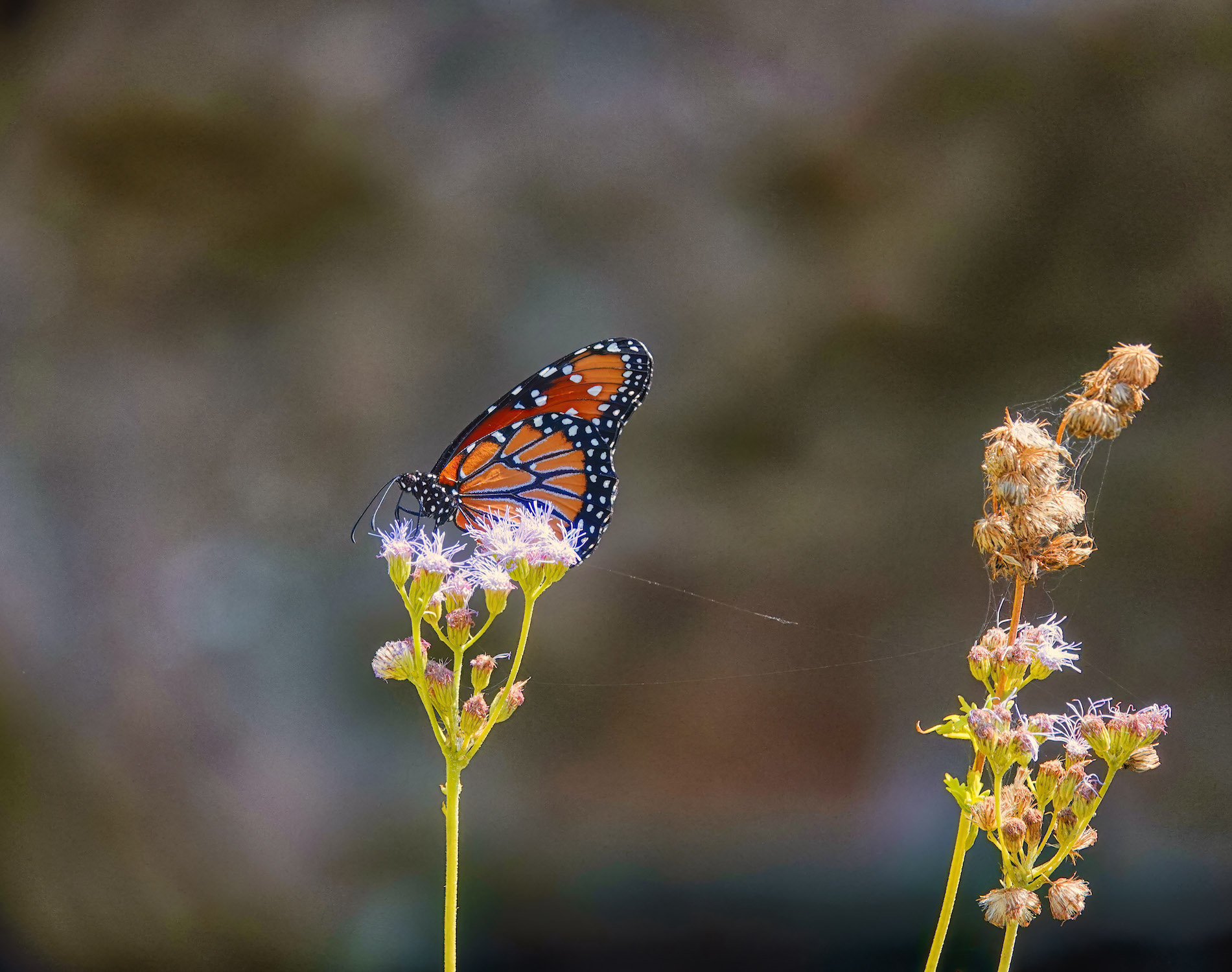
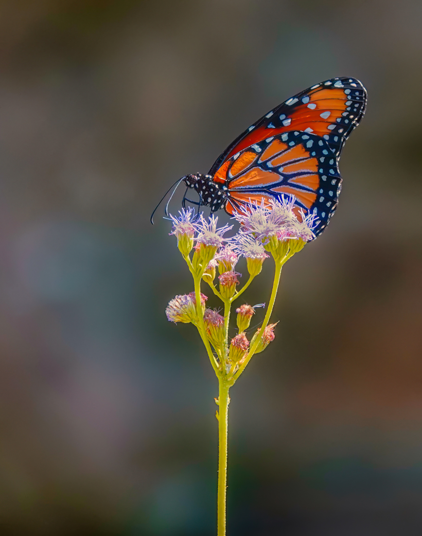
Your crop has provided a nice composition for this butterfly. However the overall image looks very grainy to me. If you are wanting to print it I think you need to address the noise issue in your post-processing as well. I tried some things on your final image as possible options, but the edits might work better on your raw file. All were done in Lightroom.
I removed the spiderwebs on the right side of the image.
I masked the background and reduced the clarity completely and also darkened it a bit.
I masked the flower heads and reduced the whites and highlights a bit as they seemed blown out.
I masked the lower right dark corner and lightened that area.
Then I reduced luminance noise by 77 to give the overall image a more creamy feeling.
Posted: 11/16/2024 15:11:42
This is beautiful. Thank you so much for your comments and work. I rarely take butterfly photos, so I am glad it intrigued you. Can you send me the large jpg, if you kept it? The size limitation here is hard for me to see all. It is much improved, and I love what you have done. I was wondering about the spider web, which does not make much sense without the other flower in the original. Thank you so much! Posted: 11/16/2024 19:04:48
I'll email you a larger image. However, when I click on this image I can make it large on my screen but just pressing Ctrl and the plus key on my PC keyboard. If that helps you in any way. Posted: 11/16/2024 19:12:33
You did a great job of getting the butterfly tack sharp and that's the hardest part. The colors are lovely. I would have deleted the spider webs, as my eye keeps being drawn there. Posted: 11/23/2024 15:38:25
You captured a lovely sharp image of the butterfly and the portrait format works well. I agree with Denise's suggested improvements for the image. Posted: 11/30/2024 11:02:05
