Sophie Pouillon, PPSA
February 2025 - Monument Valley
About the Image(s)
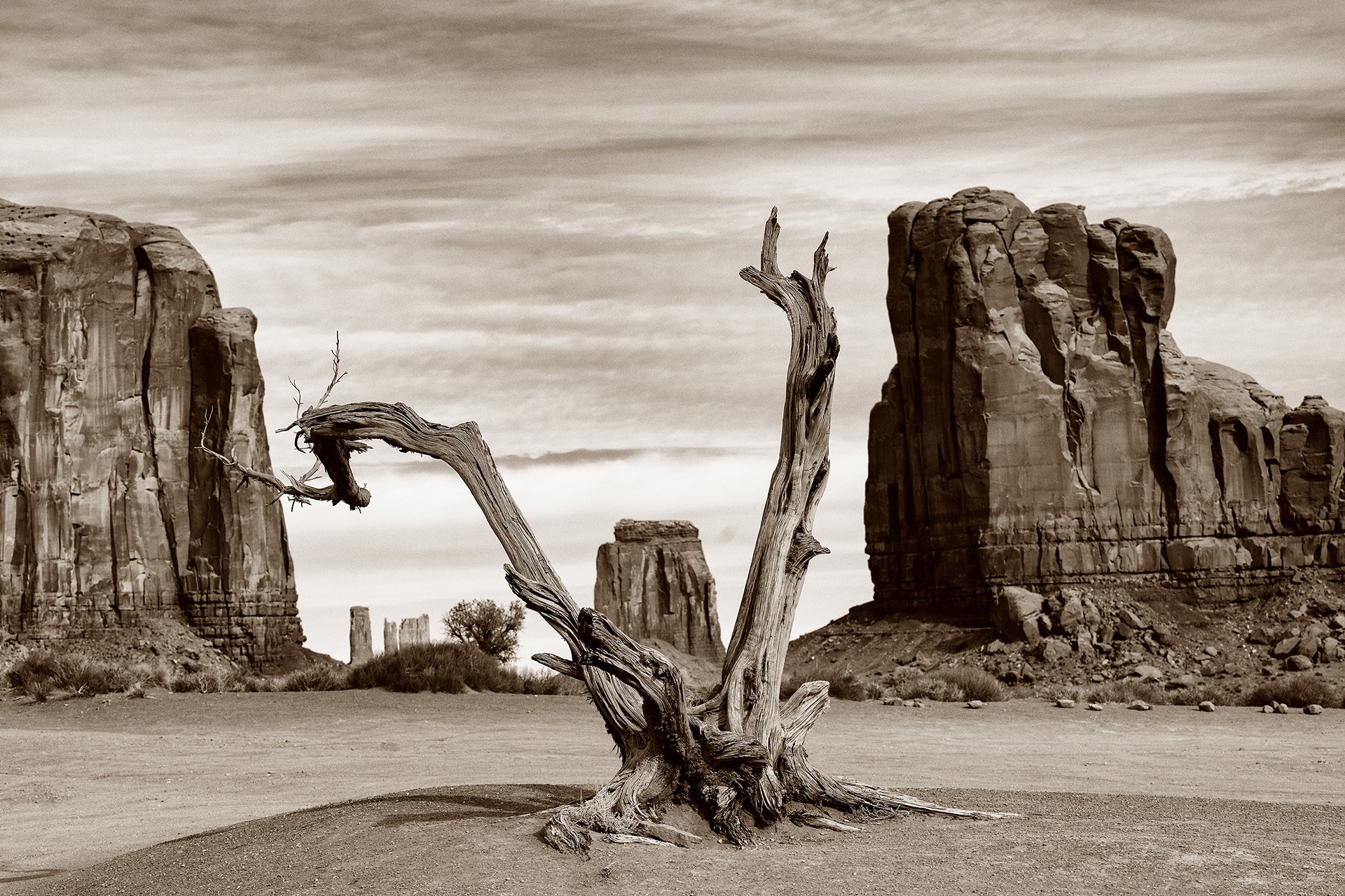
It's a photo of Monument Valley that I've processed in sepia; it's a magical place, but difficult to shoot. The sunrise and sunset are a complete mess. So I tried to play with the trees and rocks to make the photo more attractive.
The sepia tones reflect the color of the stone and the warmth of the scene.
6 comments posted
very interesting composition, and sepia is the way to go. Posted: 02/13/2025 16:41:36
A stunning image Sophie. Your composition, use of elements in the frame and low angle of view all work together to make this an outstanding image. Your processing and presenting it to us with a sepia tone is great. Bravo Sophie. Posted: 02/16/2025 02:50:28
Great photo Sophie. I have never processed an image in sepia, it really makes the image pop. Great composition and sharpness of the image throughout. Well done. Posted: 02/16/2025 23:47:36
I really like the subject of the dead tree and your composition with the central tree bounded by the rocks. It is your image to present as you wish, but unfortunately I am not so keen on the processing - a bit too contrasty and bright for my taste, and I am not so keen on sepia. I do like the image, so I have attached an alternative, reverting to B&W, softened out the contrast in the sky, added quite a strong vignette to push the interest into the central tree, and also applied a slight skew adjustment. Just my suggestion - obviously it's your image and your vision. Posted: 02/17/2025 12:37:07
Sophie, I like your artistic choice here. The only question I would ask is did you try and move about to see if you could get that left branch off the cliff face? Other than that, I like the detail in the deadwood and the DOF you created within the image. An Old Western flavor here! Posted: 02/22/2025 17:57:56
Thank you all for your comments:
Why Sepia? I didn't want to forget the color of the rock there, but the overly blue sky in color looks much better to me in Black and Bank (or sepia). As for the position of the branch, I chose this one because the branch makes continuity in the reading direction. What's more, in the sand in a wheelchair, it's not easy to position yourself correctly, not to mention the cars that keep driving past. In short, I know it's a magnificent place, but it's not easy to photograph to capture all its grandeur and beauty. Posted: 02/23/2025 09:44:35
Why Sepia? I didn't want to forget the color of the rock there, but the overly blue sky in color looks much better to me in Black and Bank (or sepia). As for the position of the branch, I chose this one because the branch makes continuity in the reading direction. What's more, in the sand in a wheelchair, it's not easy to position yourself correctly, not to mention the cars that keep driving past. In short, I know it's a magnificent place, but it's not easy to photograph to capture all its grandeur and beauty. Posted: 02/23/2025 09:44:35