Ed Taje
September 2023 - The Deal
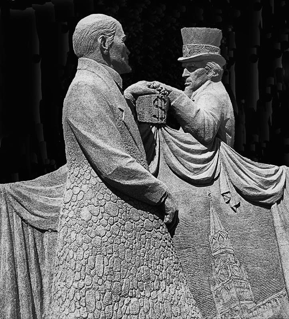
Original
About the Image(s)
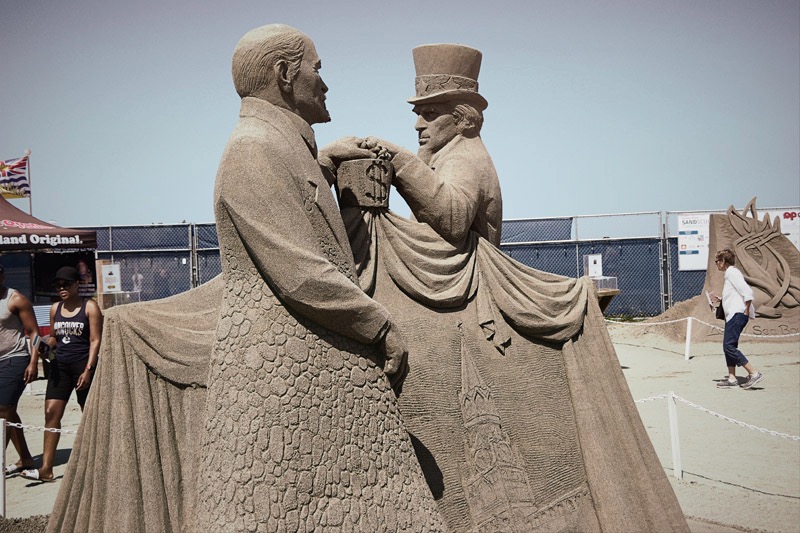
This image was taken at the Parksville, BC sand sculpture competition which draws competitors from around the world. This image is unique in that in looking at the subjects it shows the sculpture's view of two ecomomic views and shows the common ground between them. The image was taken with my K3 and my 18-55mm lens. I processed it in lightroom and Silver EFex. It was cropped to put the attetion on the subjects and in Elements I removed all the other background elements then darkened the background.
This round’s discussion is now closed!
6 comments posted
Ed - I can't believe this is sand! It is obvious in the color image, but this mono - it is really splendid! All the textures stand out, and the exposure is wonderful - great lighting. Quick - enter this one in a contest !!!
Posted: 09/05/2023 13:02:32
Posted: 09/05/2023 13:02:32
Ed - I just looked at this one again, and still love the B&W version just as it is. Perhaps identifying itqas "Sand Sculpture of THE DEAL" would help clarify the scene. I just love it - wish I had taken it. Maybe try to put a shade of some color behind it, or some soft grey. I don't know. I wish I could see how it did in a salon... -Melissa Posted: 09/19/2023 18:06:09
Hi Ed,
Thank you for sharing.
I think BW conversion turned out to be successful in this case. Dark background helps to stand out the main subject well.
On the other hand, the statue in BW looks flat to my eye conpared with the one in the color version. The statue in color version looks really 3D.
And the texture looks rough (especially the sleeves) in BW, again compared with the original. Maybe it is because it is over done in clarity, but not sure.
Posted: 09/07/2023 01:32:32
Interesting story about the image, Ed! It's a tough one for B&W conversion, though. There's very little contrast in the sand, so the conversion appears more two-dimensional (flat) than the color image and almost all one value. With that said, I still prefer the B&W over the color because the color has too much background activity that distracts from the main subject. Thanks for sharing! Posted: 09/09/2023 13:02:56
(Group 40)
Hey Ed. Nice shot. I think Haru is on to something. I wonder if standing two feet to the right would have helped. These things are hard to judge especially when this is not permanent (or at least it did not sound permanent). I also wonder if there is someway to use any of the background to make this more, self-explanatory. it looks more like sand in the original. If the image was on a wall with no explanation, it might make a difference. Anyway, very nice image. Posted: 09/18/2023 19:53:12
I love the level of detail in the image, I prefer the mono to the colour. Looking at the original image I would never have guessed it was sand without your explanation. I love your crop to bring the focus to the main subject - nicely done. Posted: 09/19/2023 14:53:19