Ed Palaszynski
About the Image(s)
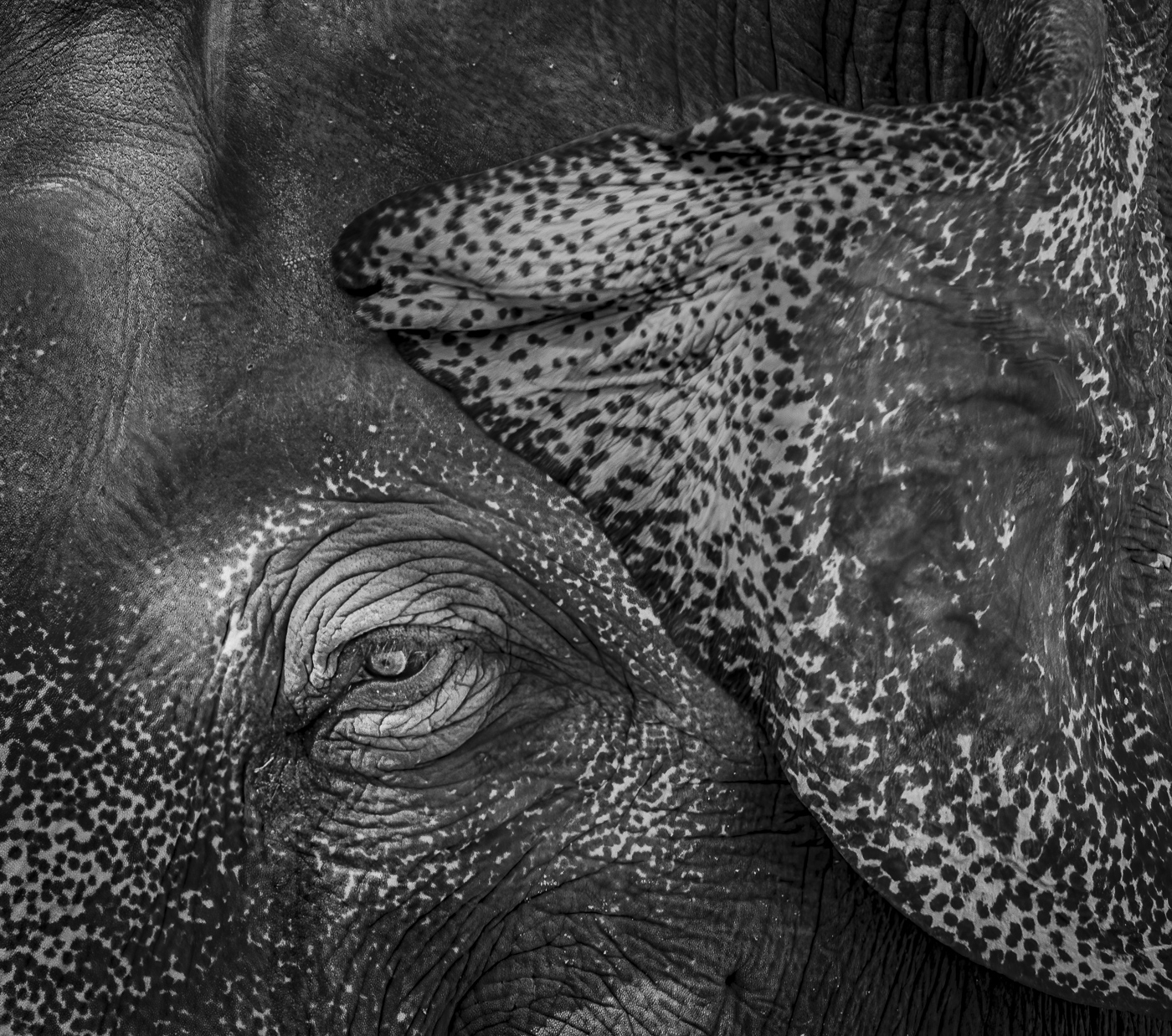
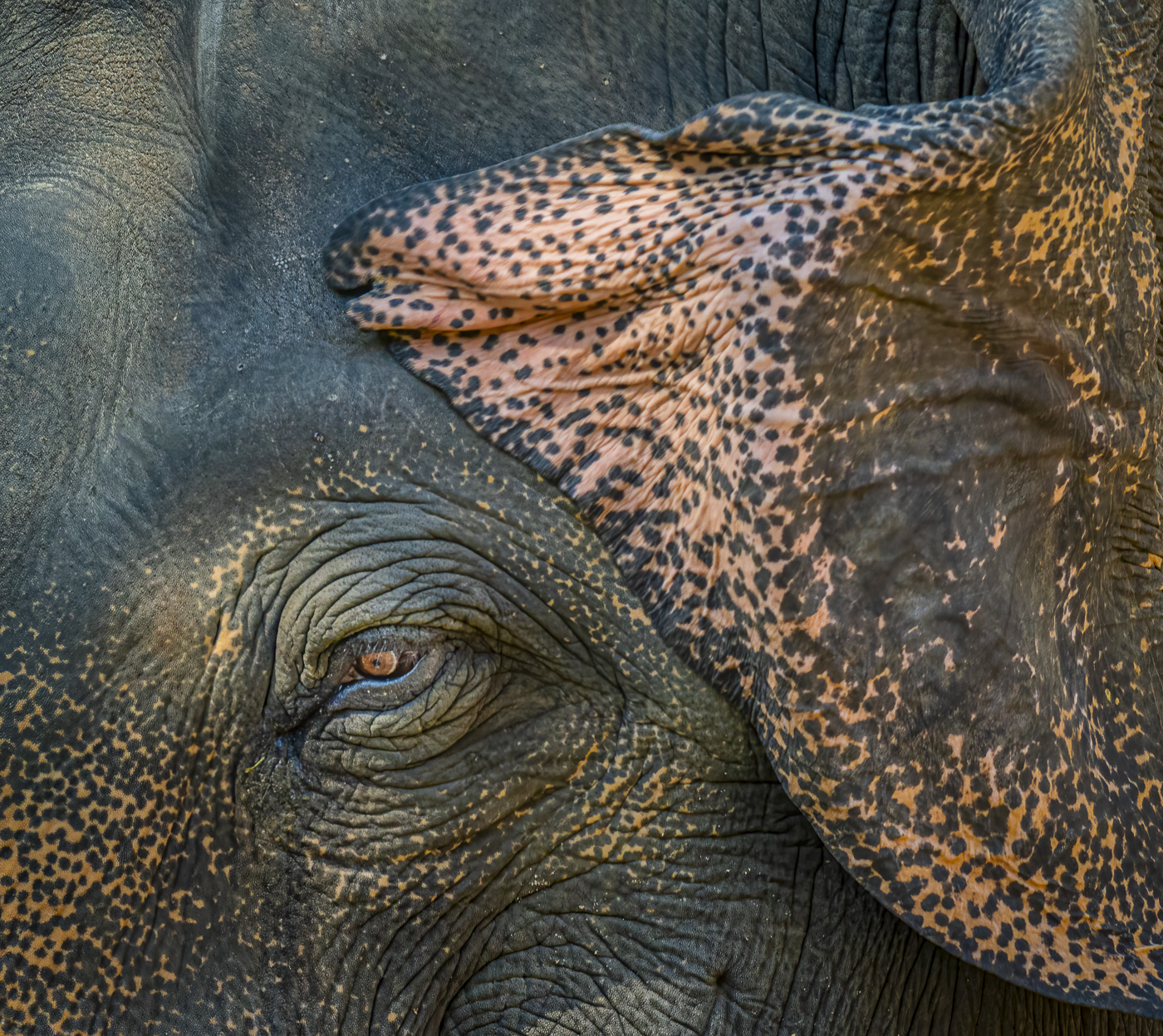
Last image from the zoo images. I was intrigued by the geometry of the flapped ear from the elephant. High lighting the ear as well as the eye made for a nice geometric composition. D500, F7.1, 1/600 shutter. Comments please.
3 comments posted
The BW is my favourite of the two. It has good detail in the shadows and the whites are not overpowering. I did three edits in mono that changed the toning, and none of them did anything for the image. I think you nailed it with this one. Posted: 11/05/2024 18:14:35
For me, the color is really hard to distinguish what this is (at first gance). But there is no doubt with the mono. I agree that highlighting the eye, especially, made the head of this guy have more inmpact so it is not only about the ear. Nice crop job. Posted: 11/06/2024 16:22:50
Hi Ed, thank you for sharing.
I like color version better. For me, the highlight of the image is the colored eye and the sensitive pattern of colors. The ear is not sharp, maybe it is motion blur. That's helps my eye focusing on the eye. I might try to crop the top a bit, maybe 3x2 format. It might help to make it dramatic. Posted: 11/19/2024 12:46:33
I like color version better. For me, the highlight of the image is the colored eye and the sensitive pattern of colors. The ear is not sharp, maybe it is motion blur. That's helps my eye focusing on the eye. I might try to crop the top a bit, maybe 3x2 format. It might help to make it dramatic. Posted: 11/19/2024 12:46:33

