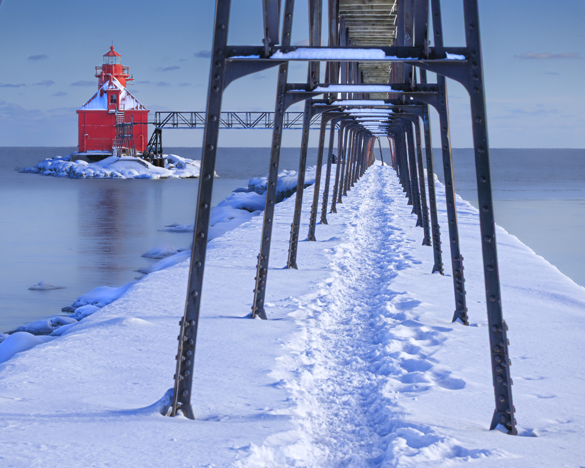
About the Image(s)
The image was taken on February 9th, 2026, using a Canon R5, 70-200mm lens at 70mm and f10. I used manual settings with auto ISO and auto white balance. Shutter speed was 1/800 and hand held.
The subject is the lighthouse on the Lake Michigan side of the Sturgeon Bay, WI, shipping channel. The lake rarely freezes any more, but we do get plenty of snow through the winter months. My goal with the image was to frame the snow covered walkway with the lighthouse on the left side. I had to do some cropping to eliminate some of the walkway stanchions. I used the path through the snow as a leading line to the end of the walkway. The image has many blue colors which emphasize the cold and the empty lake highlights the lack of boating activity during the winter months.
I used Adobe Lightroom for post processing with an 8X10 crop and masks the manage the colors and eliminate shadows.

Butch Mazzuca
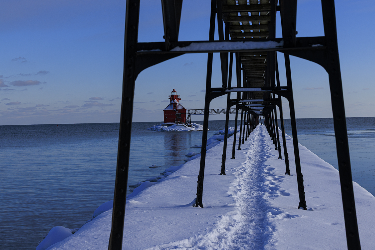
Gary - first of all you did a terrific job in bringing the power of color out in post. Meanwhile, there's a contradiction, i.e., what makes this image compelling at first glance is also what ultimately weakens it. The pier creates a textbook leading line-strong, centered, immersive, and reinforced by repetition of the steel framework. It pulls the viewer straight into the frame with purpose. But that visual journey is interrupted by the lighthouse, which is not just off-axis-it's dominant in color and contrast. That saturated red becomes a second entry point, not a destination. So instead of a clean visual hierarchy, you get a split experience
The pier says: "Come with me." The lighthouse says: "Look at me." So, the viewer ends up doing both - in essence this is where cohesion breaks down. Ideally, a leading line should serve the subject. Here, it competes with it unless the leading line is your subject.
The eye travels down the pier, but never quite lands because the lighthouse sits outside that path. It feels visually important but compositionally disconnected. With all that said, he's what really, really works -
• The repetition of the steel structure is excellent
• The snow texture adds a ton of interest and reinforces the path.
• The color contrast is outstanding
However, those strengths aren't unified around a single idea. You've created a high-impact image with two very strong but non-integrated ideas. It presents as two compositions sharing the same frame rather than one cohesive visual statement
Posted: 04/01/2026 19:34:27

Gary Jones
Thanks for your feedback Butch. I agree! I've taken many photos of this particular light and hadn't quite seen the problem that you have described it so well. Posted: 04/02/2026 00:39:28
Butch Mazzuca
Gary - I'm writing to ask a favor - but don't want to do it "LIVE" - could you send me an email, my address is
bmazz68@iCloud.com - thanks, I look forward to hearing from you.
Posted: 04/15/2026 15:22:52
Raymond Tice
Gary, Butch is spot on - my eyes keep switching back between the lighthouse and the pier, both of which I find interesting. So, I have bene sitting at my desktop looking at this image and wondering where could I move to (left or right) that would remove the "contradiction" while keeping both objects in the image but not knowing the shape of the shore line makes it impossible for me to figure that out. Yet, if you move to the left, is there a place where you can have the lighthouse and pier appear as a triangle. Just speculating with no knowledge whatsoever and we all know whatthat leads to - nothing. I do like the colors a lot. Ray
Posted: 04/08/2026 01:01:50
Gary Jones
The pier is part of the Coast Guard station and access is restricted to a narrow path through the the CG grounds to the pier. There is another pier on the other side of the channel, but from there the light is obscured by the walkway. It's an interesting conundrum. I have taken photos standing on the left of the stanchions, but not as interesting to me. Thanks for your feedback. Posted: 04/15/2026 18:21:28

Sherry Icardi
I guess Im a little more simplistic and don't really find the image troubling....I get that the lighthouse is shouting "look at me" ....but its a metal pier with legs holding it up and nothing of huge interest. The footprints in the snow take my eyes toward the Lighthouse and the vibrant red draws my attention..to the Lighthouse! Sometimes it is just all in the eye of the beholder!
It is a realistic image of what exists ...I love the bright red against white snow and the contrast they present is what I would consider a necessary evil. Ugly black metal. It also makes me wonder why is that there....clearly to provide access to the door on the lighthouse. but how do they get up there? I don't see stairs. So a little mystery thrown in. Posted: 04/15/2026 19:54:09
Gary Jones
Hi Sherry, there is no stairs to prevent people like me from climbing up and taking photos (and falling off). It's an active lighthouse, but they need to bring a ladder for a coast guard person to climb up and walk to the light. Posted: 04/15/2026 19:58:29

Larry Conly
I agree with others that the lighthouse itself could be its own picture, but I have to admit I'm immediately drawn to and really enjoy this composition. The colors are absolutely beautiful.
I find my eye follows the foot prints to the end of the jetty/pier and then follow the metal work over to the lighthouse, and then I stay at the lighthouse given the brightness of it and the color.
I could easily see this framed and on the wall. Posted: 04/17/2026 14:54:16
Gary Jones
Thanks for your comments Larry. I probably have more photo's of this lighthouse than any other individual subject. It changes from season to season and is one of the more popular sites for visitors and photographers to Door County. The most popular is Cana Island. We have 7 different lighthouses on the peninsula, so there are lots of opportunities. Posted: 04/17/2026 15:45:58