Larry Conly
December 2025 - Sawtooths
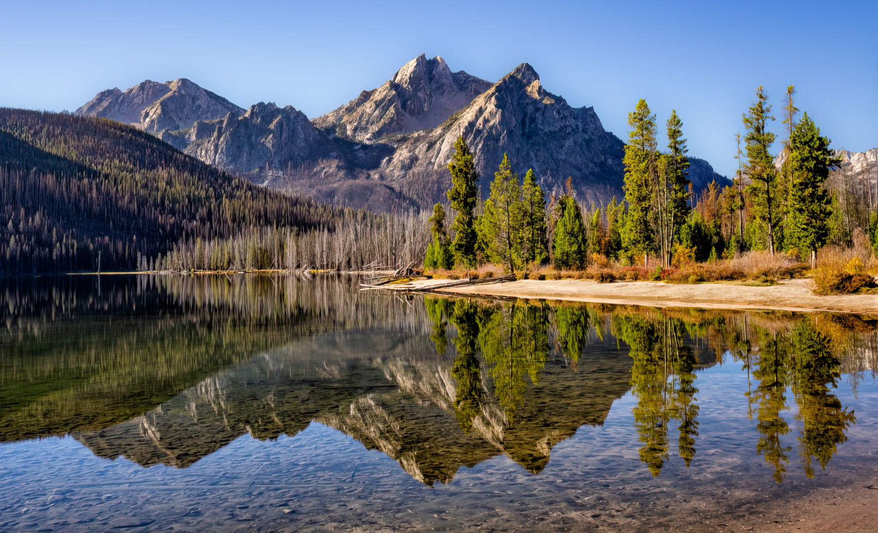
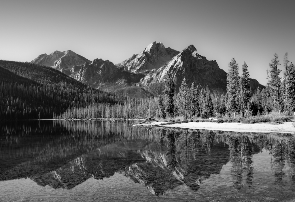
Original
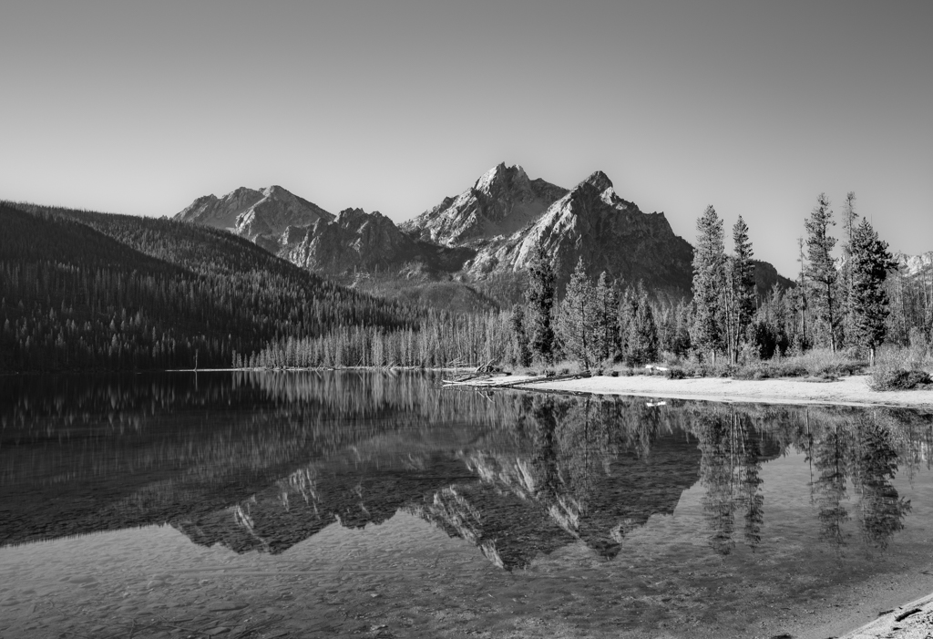
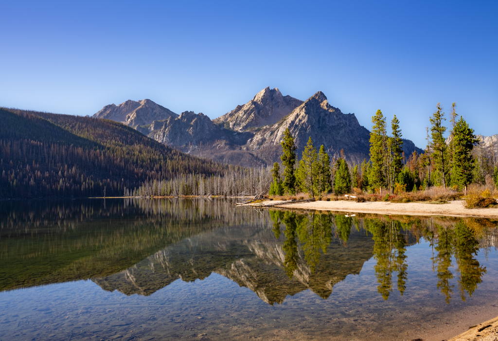
Original 2
About the Image(s)
How I did it:
Shot on a Sony A7R5 at 28mm with the Sony 16-35 GM lens, with a long exposure of 30 second, a ND filter, and a polarizer in order to capture the rocks under the water. I converted to black-and-white during post-processing in Lightroom.
Some feedback I’ve received is that the foreground is too busy and that I should crop it. I’ve tried this composition but have to admit I like the little bit of beach in the lower-right corner as I find that my brain then perceives the entire beach even though it is not fully visible. I’ve also struggled with the amount of contrast trying a darker/moodier picture, but find myself back with this coloring. I worry this might be too much in the middle-grays. I also have another version in which I’ve removed the blown-out log on the beach.
1 comment posted
I realize you submitted the BxW version, but I think the color version has far more impact and visual interest. Meanwhile, what I don't understand is the different crops (color version v the submitted monochrome.)
But a few comments on what you submitted - great subject, perspective and technically well done, but the monochrome version is a touch flat. Also, in the version you submitted, I feel there's a bit too much uninteresting sky and not enough interesting foreground - whereas your color version is more balanced compositionally.
In my VF I used the color version because I LOVE the image - that said, I did modify it a touch. I cropped in from the left, sent the image into the Nik Suite and used Color Efex Pro's Tonal Contrast for the entire image then ran it thru Photoshop, masked everything but the sky and returned to the original sky without the Tonal Contrast. I also removed the bright white distraction offshore and its reflection and darkened the "beach area" as I thought it grabbed the eye too much. I think it's a sterling image and again, welcome.
Posted: 12/12/2025 22:06:56