John Zhu
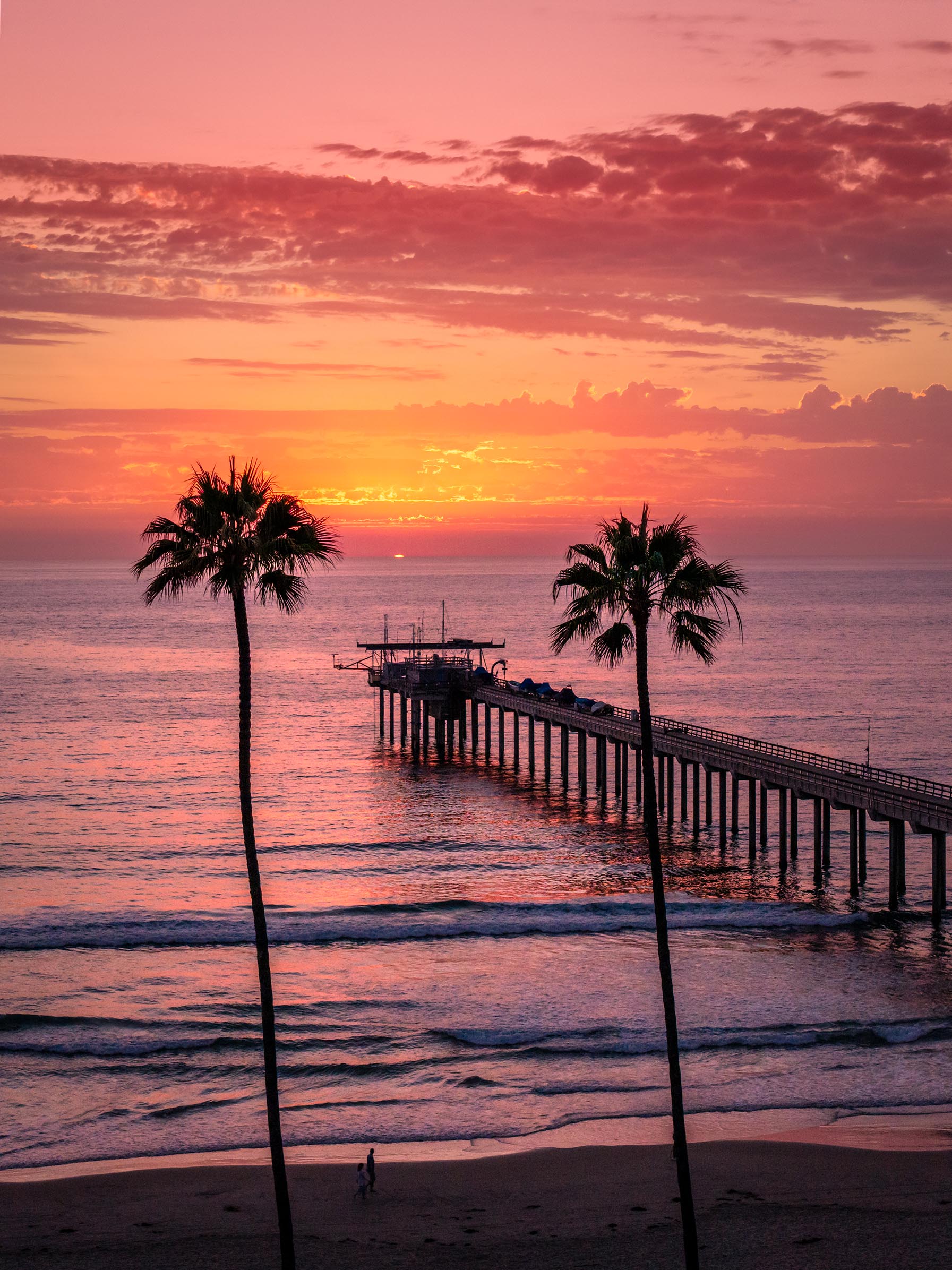
July 2026 - Scripps Pier of UC San Diego
About the Image(s)
This is my most visited place in San Diego. Took with DJI Mavic pro 4 of three 3 HDR shots. Processed with my normal LR and PS flow. I am not sure with the composition especially with two trees in the middle. Like to see your thoughts.
More from https://youtu.be/hMzfimPdLs8?si=cTGtkTsZEauJSN7mScripps Pier of UC San Diego
12 comments posted
This is a wonderful image and perfectly exposed and focused throughout. The two trees work perfectly here. They frame the pier and the setting sun. In other instances, something in the middle of the image wouldn't be appropriate. But you showcase an instance where they actually serve as a big asset in making this a very nice composition. I do suggest you remove the people walking along the beach. They look like little stick figures and I found them distracting. Posted: 07/01/2026 13:46:06
Great comments. Thanks! Posted: 07/09/2026 01:06:25
John,
Mother Nature has given you a wonderful canvas to work with for one of those sunsets that people have grown to love. You have great light, some clouds, a pier, a beach, and two palm trees.
That said, there may be too many elements competing for attention, and I don't find the composition of this image particularly compelling. The two trees divide the image into thirds. The pier crosses the frame diagonally from right to left, occupying the middle section and the right third of the image. The left side of the frame is largely empty.
Perhaps if you had been able to position the people on that side, it would have created a more balanced composition. I think the two people could have been used effectively to provide a sense of scale, but one of them is in shadow, while only the upper part of the other person's body is illuminated.
Best wishes
Michele Posted: 07/03/2026 11:25:37
Mother Nature has given you a wonderful canvas to work with for one of those sunsets that people have grown to love. You have great light, some clouds, a pier, a beach, and two palm trees.
That said, there may be too many elements competing for attention, and I don't find the composition of this image particularly compelling. The two trees divide the image into thirds. The pier crosses the frame diagonally from right to left, occupying the middle section and the right third of the image. The left side of the frame is largely empty.
Perhaps if you had been able to position the people on that side, it would have created a more balanced composition. I think the two people could have been used effectively to provide a sense of scale, but one of them is in shadow, while only the upper part of the other person's body is illuminated.
Best wishes
Michele Posted: 07/03/2026 11:25:37
Love your comments. Thanks
Posted: 07/09/2026 01:06:05
Posted: 07/09/2026 01:06:05
This is a beautiful sunset photo. I like how the two palm trees frame the pier and the setting sun like Mike said. It is also nice that the two trees have slightly different heights making the two elements a bit less boring. I wonder how much you saturated the sky, I find the overall pink a bit unnatural. Posted: 07/06/2026 05:09:23
Maybe I over stressed the color. Thanks for the feedback. Posted: 07/09/2026 01:05:40
This image gives off the classic California sunset postcard vibe. The pier serves as a leading line, guiding the viewer's eye from the lower right straight into the glowing horizon. The two palm trees frame the subject beautifully, while the tiny people in the foreground add scale to the landscape. The warm, saturated color palette is beautiful and the exposure is well balanced. The vertical composition also works well here. Posted: 07/08/2026 04:58:06
Your comments is my original thoughs for this photo. Thanks for the feedback. Posted: 07/09/2026 01:04:57
John, I'm afraid I can't add much to all the wonderful comments above-they've already said it so well. Is this pier a weather pier and not a people pier? I did try lightening the beach slightly, but that's just a personal preference. This is beautifully done, with a great composition and atmosphere. Excellent work! Posted: 07/08/2026 11:39:11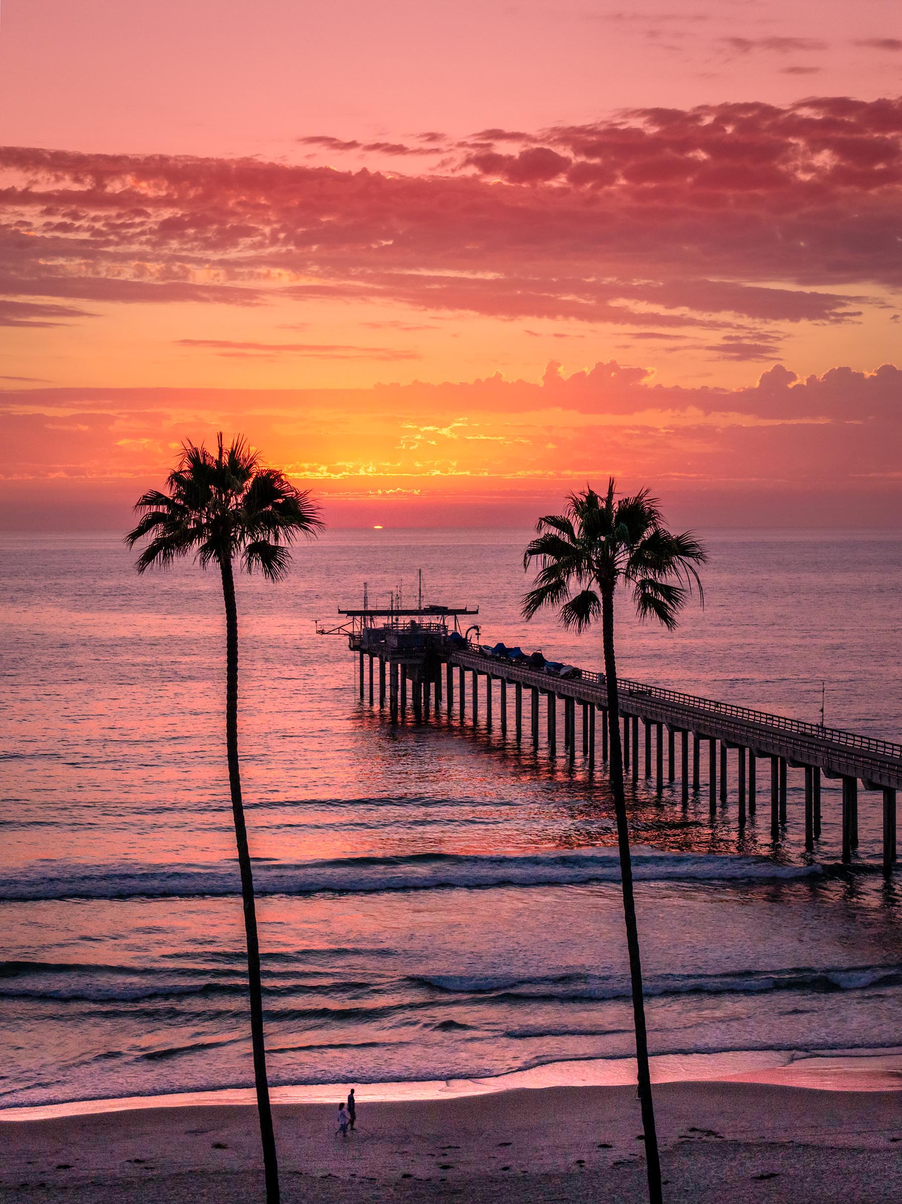
This is only for researcher to launch their vessels only. Great update. Thanks for the feedback. Posted: 07/09/2026 01:03:50
I thought the pastel shades on this were a bit pale so I decided to go the whole hog and crop a bit of the external area out to focus on the middle. I made a duplicate layer and put it into multiply mode.
I think my edit is OTT but it was great fun having a play. Well taken John.
Posted: 07/08/2026 14:51:32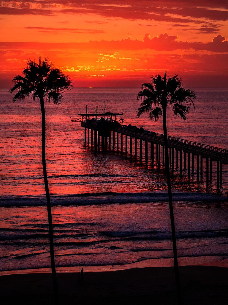
I think my edit is OTT but it was great fun having a play. Well taken John.
Posted: 07/08/2026 14:51:32
Great update. Thanks for the feedback. Posted: 07/09/2026 01:02:50