David Kepley
About the Image(s)
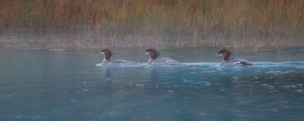
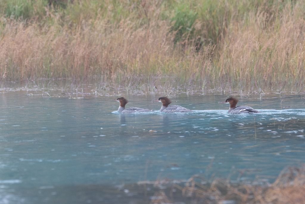
I took this shot on a workshop in AK. This is a group of common mergansers. I really like how the colors of the background mimic the colors of the birds. I cropped it to get rid of the foreground and give it a pano look.
Canon R7, 150-500mm lens shot at 229mm, 1/400 sec, f6.3, ISO 2000. I used the usual LRC sliders, as well as Topaz denies and sharpen.
5 comments posted
You sure got you ducks in a row on this one. I would try dehazing a bit and increasing vibrance and/or saturation (Lightroom). Nice shot! Posted: 11/12/2024 16:24:28
I've been looking over this image for the last couple of days. I've tried the enlarged version, but that does not actually enlarge anything. Anyway I try to look at the image it just seems to lack sharpness. These are beautiful birds but the necessary detail is just not there. I think the composition is fine, but I do wonder why you only shot this at 229mm when you have a 500mm lens? For the R7 2000 ISO should not be a problem. I'm assuming you didn't use a tripod so perhaps holding the long lens at only 1/400 seconds introduced some camera shake. Posted: 11/15/2024 23:56:05
Good points, Larry. The ducks are not particularly sharp. I guess what I liked about the image was the soft impresionistic colors of the ducks and the background. Not sure if that worked, which is why I submitted it to the group for discussion. Posted: 11/18/2024 16:20:13
Hi David, I see what you were trying to do. Adding fog to the overall image might have helped accomplish your artistic intent. Posted: 11/20/2024 16:30:57
Mergansers always look like they are on the verge of having a bad hair day. . .
I like the Bud's idea of adding the fog, but I wouldn't have the first clue as to how to do it. I kinda like the original in that the colors are a bit more intense. But both are worthwhile shots and tell a story of the long, wet road ahead for these ducks. Posted: 11/20/2024 17:04:13
I like the Bud's idea of adding the fog, but I wouldn't have the first clue as to how to do it. I kinda like the original in that the colors are a bit more intense. But both are worthwhile shots and tell a story of the long, wet road ahead for these ducks. Posted: 11/20/2024 17:04:13

